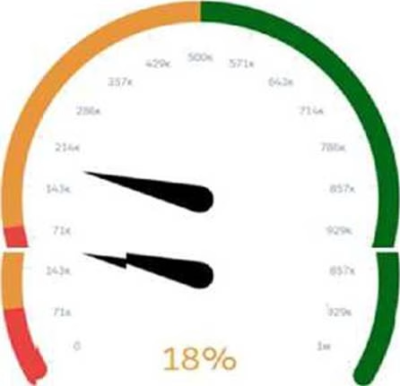
Universal Containers has a dashboard for sales managers. They need to visualize the percentage of their opportunities in the pipeline in a Gauge chart. They want to customize the chart to keep track if they are below or beyond the target.
Which widget parameters should a consultant use?
A . Range Values, Angle, Conditional Formatting
B . Reference Line, Angle, Range Values
C . Reference Line, Markers, Conditional Formatting
Answer: C
Explanation:
In the scenario described, the sales managers at Universal Containers require a Gauge chart that not only shows the current percentage of opportunities in their pipeline but also indicates whether they are below or beyond their set targets. The appropriate widget parameters to achieve this visualization in Salesforce CRM Analytics (formerly known as Einstein Analytics) are:
Reference Line: This parameter is crucial for defining a specific target value on the gauge chart. It visually marks a point that represents the target goal, providing an immediate visual cue as to whether the current percentage is below or above this point.
Markers: Markers are used to represent and highlight specific values on the gauge chart. They can be utilized to emphasize the current percentage level of the pipeline, making it instantly visible how close or far the current value is from the reference line or target.
Conditional Formatting: This feature allows the chart to change color or style based on whether the current values meet, exceed, or fall below the target. It is a critical visual tool for quickly communicating performance against targets. Conditional formatting can be set to alter the appearance of the gauge’s fill color based on whether the values are above, equal to, or below the reference line, thereby providing an intuitive visual representation of performance relative to targets.
The combination of these three parameters enables a highly effective visualization for sales managers to monitor their performance against key metrics and targets directly on their dashboards. This setup is aligned with Salesforce’s best practices for creating meaningful and actionable insights within CRM dashboards, ensuring that users can easily interpret and react to the data presented. For more details on configuring these parameters, you can refer to Salesforce documentation and specific Trailhead modules that cover dashboard creation and customization:
Wave Analytics Explorer
Building Lenses, Dashboards, and Apps in CRM Analytics
These resources provide in-depth training and examples to help users effectively use Salesforce CRM Analytics for a wide range of data visualization needs.
Latest ANC-201 Dumps Valid Version with 242 Q&As
Latest And Valid Q&A | Instant Download | Once Fail, Full Refund
