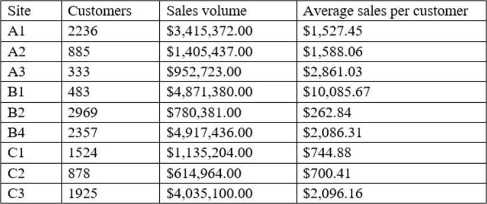
A data analyst is designing a dashboard that will provide a story of sales and determine which site is providing the highest sales volume per customer. The analyst must choose an appropriate chart to include in the dashboard.
The following data is available:

Which of the following types of charts should be considered?
A . Include a line chart using the site and average sales per customer.
B . Include a pie chart using the site and sales to average sales per customer.
C . Include a scatter chart using sales volume and average sales per customer.
D . Include a column chart using the site and sales to average sales per customer.
Answer: C
Explanation:
A scatter chart using sales volume and average sales per customer is the best type of chart to include in the dashboard. A scatter chart is a type of chart that displays the relationship between two numerical variables using dots or markers. A scatter chart can show how one variable affects another, how strong the correlation is between them, and how the data points are distributed. In this case, a scatter chart can show the story of sales and determine which site is providing the highest sales volume per customer by plotting the sales volume on the x-axis and the average sales per customer on the y-axis. Each dot on the chart will represent a site, and the analyst can easily compare the sites based on their position on the chart. A site with a high sales volume and a high average sales per customer will be in the upper right quadrant, indicating a high performance. A site with a low sales volume and a low average sales per customer will be in the lower left quadrant, indicating a low performance. A site with a high sales volume and a low average sales per customer will be in the lower right quadrant, indicating a high volume but low value. A site with a low sales volume and a high average sales per customer will be in the upper left quadrant, indicating a low volume but high value. A scatter chart can also show if there is a positive or negative correlation between the two variables, or if there is no correlation at all. A positive correlation means that as one variable increases, so does the other. A negative correlation means that as one variable increases, the other decreases. No correlation means that there is no relationship between the two variables.
The other types of charts are not as suitable for this purpose. A line chart is a type of chart that displays the change of one or more variables over time using lines. A line chart can show trends, patterns, and fluctuations in the data. However, in this case, there is no time variable involved, so a line chart would not be appropriate. A pie chart is a type of chart that displays the proportion of each category in a whole using slices of a circle. A pie chart can show how each category contributes to the total and compare the relative sizes of each category. However, in this case, there are two numerical variables involved, so a pie chart would not be able to show their relationship. A column chart is a type of chart that displays the comparison of one or more variables across categories using vertical bars. A column chart can show how each category differs from each other and rank them by size. However, in this case, a column chart would not be able to show the relationship between sales volume and average sales per customer, as it would only show one variable for each site.
Latest DA0-001 Dumps Valid Version with 180 Q&As
Latest And Valid Q&A | Instant Download | Once Fail, Full Refund
