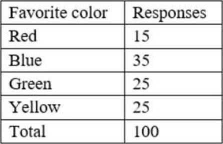
Which of the following charts would be BEST to use?
An analyst needs to provide a chart to identify the composition between the categories of the survey response data set:

Which of the following charts would be BEST to use?
A . Histogram
B . Pie
C . Line
D . Scatter pot
E . Waterfall
Answer: B
Explanation:
A pie chart is the best choice to show the composition between the categories of the survey response data set. A pie chart represents the whole with a circle, divided by slices into parts. Each slice shows the relative size of each category as a percentage of the total. A pie chart is useful when the categories are mutually exclusive and add up to 100%. The table shows the favorite color and the number of responses for each color, which can be easily converted into percentages. A pie chart can show how each color contributes to the total number of responses.
Option A is incorrect because a histogram is used to show how data points are distributed along a numerical scale. The survey response data set is not numerical, but categorical.
Option C is incorrect because a line chart is used to show trends or changes over time. The survey response data set does not have a time dimension.
Option D is incorrect because a scatter plot is used to show the relationship between two numerical variables. The survey response data set does not have two numerical variables.
Option E is incorrect because a waterfall chart is used to show how an initial value is increased or decreased by a series of intermediate values. The survey response data set does not have an initial value or intermediate values.
Reference:
How to Choose the Right Chart for Your Data – Infogram
How to Choose the Right Data Visualization | Tutorial by Chartio Find the Best Visualizations for Your Metrics – The Data School How to choose the best chart or graph for your data
Latest DA0-001 Dumps Valid Version with 180 Q&As
Latest And Valid Q&A | Instant Download | Once Fail, Full Refund

