Which code segment should you use?
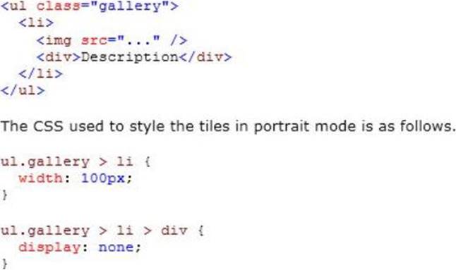
You are developing an ASP.NET MVC web application for viewing a photo album. The application is designed for devices that support changes in orientation, such as tablets and smartphones. The application displays a grid of photos in portrait mode.
When the orientation changes to landscape, each tile in the grid expands to include a description. The HTML that creates the gallery interface resembles the following markup.

If this CSS is omitted, the existing CSS displays the tiles in landscape mode.
You need to update the portrait mode CSS to apply only to screens with a width less than 500 pixels.
Which code segment should you use?
A . @media resolution(max-width: 500px) {. . .}
B . @media screen(min-width: Opx, max-width: 500px) {. . .}
C . @media screen and (width <= 500px) {. . .}
D . @media screen and (max-width: 500px) {. . .}
Answer: D
Explanation:
Screen is used for computer screens, tablets, smart-phones etc.
max-width is the maximum width of the display area, such as a browser window.
References: http://www.w3schools.com/cssref/css3_pr_mediaquery.asp
Latest 70-486 Dumps Valid Version with 255 Q&As
Latest And Valid Q&A | Instant Download | Once Fail, Full Refund

