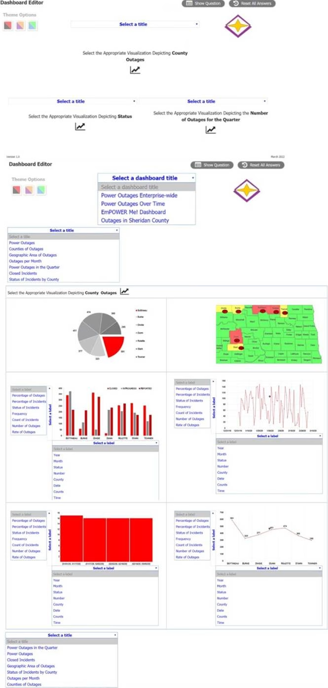
The director of operations at a power company needs data to help identify where company resources should be allocated in order to monitor activity for outages and restoration of power in the entire state.
The director of operations at a power company needs data to help identify where company resources should be allocated in order to monitor activity for outages and restoration of power in the entire state.
Specifically, the director wants to see the following:
* County outages
* Status
* Overall trend of outages
INSTRUCTIONS:
Please, select each visualization to fit the appropriate space on the dashboard and choose an appropriate color scheme. Once you have selected all visualizations, please, select the appropriate titles and labels, if applicable. Titles and labels may be used more than once.
If at any time you would like to bring back the initial state of the simulation, please click the Reset All button.

Answer: This is a simulation question that requires you to create a dashboard with visualizations that meet the director’s needs.
Here are the steps to complete the task:
Drag and drop the visualization that shows the county outages on the top left space of the dashboard. This visualization is a map of the state with different colors indicating the number of outages in each county. You can choose any color scheme that suits your preference, but make sure that the colors are consistent and clear. For example, you can use a gradient of red to show the counties with more outages and green to show the counties with less outages.
Drag and drop the visualization that shows the status of the outages on the top right space of the dashboard. This visualization is a pie chart that shows the percentage of outages that are active, restored, or pending. You can choose any color scheme that suits your preference, but make sure that the colors are distinct and easy to identify. For example, you can use red for active, green for restored, and yellow for pending.
Drag and drop the visualization that shows the overall trend of outages on the bottom space of the dashboard. This visualization is a line graph that shows the number of outages over time. You can choose any color scheme that suits your preference, but make sure that the color is visible and contrasted with the background. For example, you can use blue for the line and white for the background.
Select appropriate titles and labels for each visualization. Titles and labels may be used more than once. For example, you can use “County Outages” as the title for the map, “Status” as the title for the pie chart, and “Trend” as the title for the line graph. You can also use “County”, “Number of Outages”, “Active”, “Restored”, “Pending”, “Time”, and “Number of Outages” as labels for the axes and legends of the visualizations.
Latest DA0-001 Dumps Valid Version with 180 Q&As
Latest And Valid Q&A | Instant Download | Once Fail, Full Refund

