Tableau TDS-C01 Tableau Desktop Specialist Online Training
Tableau TDS-C01 Online Training
The questions for TDS-C01 were last updated at Nov 23,2024.
- Exam Code: TDS-C01
- Exam Name: Tableau Desktop Specialist
- Certification Provider: Tableau
- Latest update: Nov 23,2024
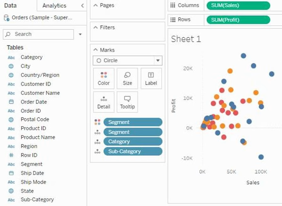
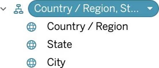
What term is used to describe the following picture?
- A . Larger image
- B . Parameter
- C . Set
- D . Hierarchy
- E . Group
C
Explanation:
When you connect to a data source, Tableau automatically separates date fields into hierarchies so you can easily break down the viz. You can also create your own custom hierarchies. For example, if you have a set of fields named Region, State, and County, you can create a hierarchy from these fields so that you can quickly drill down between levels in the viz.
Reference: https://help.tableau.com/current/pro/desktop/en-us/qs_hierarchies.htm
Which of the following are valid ways to italicize Tooltip content in Tableau?
- A . Click on Format in the Menu bar, choose Font, and then edit the Tooltip options to italicize the font
- B . Click on Tooltip in the Marks card, select the text, and then use the Italics option
- C . Click on Worksheet in the Menu bar, select Tooltip, and then use the italics option
- D . Click on Dashboard in the Menu bar, select Tooltip, and then use the italics option
A,B,C
Explanation:
The only incorrect option is – Click on Dashboard in the Menu bar, select Tooltip, and then use the italics option.
This option doesn’t exist. See below:
The rest of the options do exist, and therefore are correct:
Graphical user interface, text, application
Description automatically generated
Larger image
What is this view referred to as in Tableau?
- A . Analytics Pane
- B . Window Pane
- C . Data Pane
- D . Dimensions & Measures
C
Explanation:
Tableau displays data source connections and data fields for the workbook in the Data pane on the left side of the workspace.
The Data pane includes:
Dimension fields C Fields that contain qualitative values (such as names, dates, or geographical data). You can use dimensions to categorize, segment, and reveal the details in your data. Dimensions affect the level of detail in the view. Examples of dimensions include dates, customer names, and customer segments.
Measure fields C Fields that contain numeric, quantitative values can be measured. You can apply calculations to them and aggregate them. When you drag a measure into the view, Tableau applies an aggregation to that measure (by default). Examples of measures: sales, profit, number of employees, temperature, frequency.
For more information on what dimensions and measures are, see Dimensions and Measures, Blue and Green.
Calculated fields C If your underlying data doesn’t include all of the fields you need to answer your questions, you can create new fields in Tableau using calculations and then save them as part of your data source. These fields are called calculated fields.
For more information on calculated fields, see Create Custom Fields with Calculations. Sets C Subsets of data that you define. Sets are custom fields based on existing dimensions and criteria that you specify. For more information, see Create Sets.
Named sets from an MS Analysis Services server or from a Teradata OLAP connector also appear in Tableau in this area of the Data pane. You can interact with these named sets in the same way you interact with other custom sets in Tableau.
Parameters C Values that can be used as placeholders in formulas, or replace constant values in calculated fields and filters. For more information, see Create Parameters.
Reference: https://help.tableau.com/current/pro/desktop/en-us/datafields_understanddatawindow.htm
- A . Bullet
- B . Line
- C . Gantt
- D . Area
D
Explanation:
According to the official Tableau documentation:
An example of an area chart is shown below:
The calculation [Ship Date] – [Order Date] will return _______________
- A . Number of orders placed in that duration
- B . Number of days between these dates
- C . Number of unique orders placed between these dates
- D . Number of orders shipped between these dates
B
Explanation:
As the names suggest, if we subtract the order date from the shipping date, we simply get the number of days between these 2 dates.
We can these use this calculated field in our charts, and can use COUNT, SUM, AVG etc with them according to our need.
True or False: It is possible to add a field to more than one hierarchy
- A . True
- B . False
A
Explanation:
Yes! It is possible to duplicate a field and add it to more than one hierarchy. Right click and choose duplicate.
Reference: https://www.tableau.com/about/blog/2016/8/take-note-these-10-handy-tableau-shortcuts-57561
Using the Time Series Table, create a Line chart showing the Monthly Year over Year Growth for the Sales, broken down by Assortment.
For the Electronics assortment, which Month had the most NEGATIVE value of Year over Year Growth?
- A . October
- B . September
- C . July
- D . June
A
Explanation:
Follow along:
1) Drag Assortment and Year ID (choose Discrete Month) to Columns shelf, and Sales to the Columns Shelf.
For sales, click on the pill -> choose Quick Table calculation -> Year over Year growth.
The view should now look like:
It is clear that October with -55.3% had the lowest Year on Year growth.
When working with Excel, text file data, JSON file, .pdf file data, you can use _________________ to union files across folders, and worksheets across workbooks.
Search is scoped to the selected connection.
- A . Regex Search
- B . Union Search
- C . Pattern Search
- D . Wildcard Search
D
Explanation:
You can use Wildcard Search to set up search criteria to automatically include tables in your union. Use the wildcard character, which is an asterisk (*), to match a sequence or pattern of characters in the Excel workbook and worksheet names, Google Sheets workbook and worksheet names, text file names, JSON file names, .pdf file names, and database table names.
When working with Excel, text file data, JSON file, .pdf file data, you can also use this method to union files across folders, and worksheets across workbooks. Search is scoped to the selected connection. The connection and the tables available in a connection are shown on the left pane of the Data source page.
Reference: https://help.tableau.com/current/pro/desktop/en-us/union.htm
Suppose I have the following view.
What will be the total number of marks if I drag a new measure to the row shelf vs the column shelf?
- A . If dragged to row shelf: 14 marks; If dragged to column shelf: 7 marks
- B . If dragged to row shelf: 7 marks; If dragged to column shelf: 14 marks
- C . If dragged to row shelf: 14 marks; If dragged to column shelf: 14 marks
- D . If dragged to row shelf: 7 marks; If dragged to column shelf: 7 marks
A
Explanation:
This is a tricky question often asked in the exam.
If we drag a new measure to the row shelf, the following happens:
We now have 2 rows, and the same 7 columns for both these rows. Therefore, 2×7 = 14 marks!
Graphical user interface, chart, bar chart
Description automatically generated with medium confidence
But if we drag the same measure to the column shelf, we have just 1 row and a chart created for each of the columns. So (1×7) = 7 marks!
Graphical user interface, text, application
Description automatically generated
Reference and notes: https://medium.com/@justindixon91/tableau-specialist-exam-notes-part-4-understanding-tableau-concepts-f78de83fdd35
Which of the following are valid Dashboard size options?
- A . Range
- B . Fixed Size
- C . Automatic
- D . Scaled
A,B,C
Explanation:
Scaled is NOT a valid size options when creating Dashboards in Tableau!
After you create a dashboard, you might need to resize and reorganize it to work better for your users.
Reference: https://help.tableau.com/current/pro/desktop/en-us/dashboards_organize_floatingandtiled.htm