

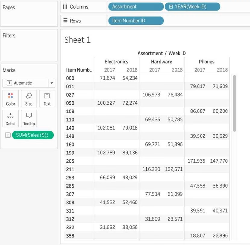
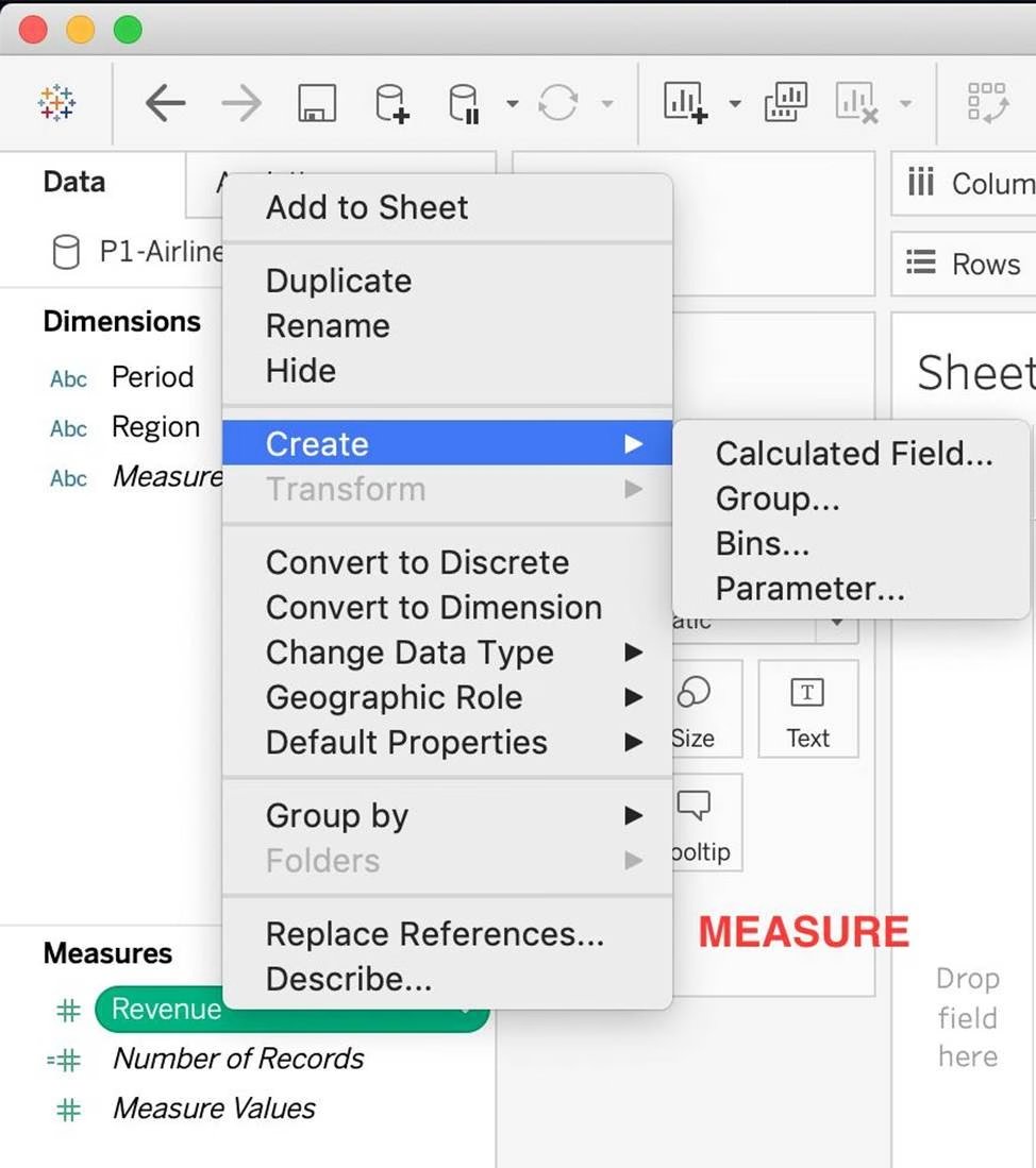
True or False: Bins can be created on dimensions
- A . False
- B . True
B
Explanation:
Bin are a user-defined grouping of numerical data in the data source.
According to the official Tableau documentation: It’s sometimes useful to convert a continuous measure (or a numeric dimension) into bins.
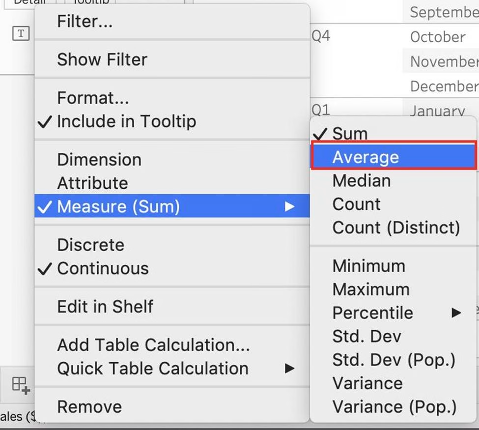
Have a look at the following image.
When we right click a measure, we get the following options:
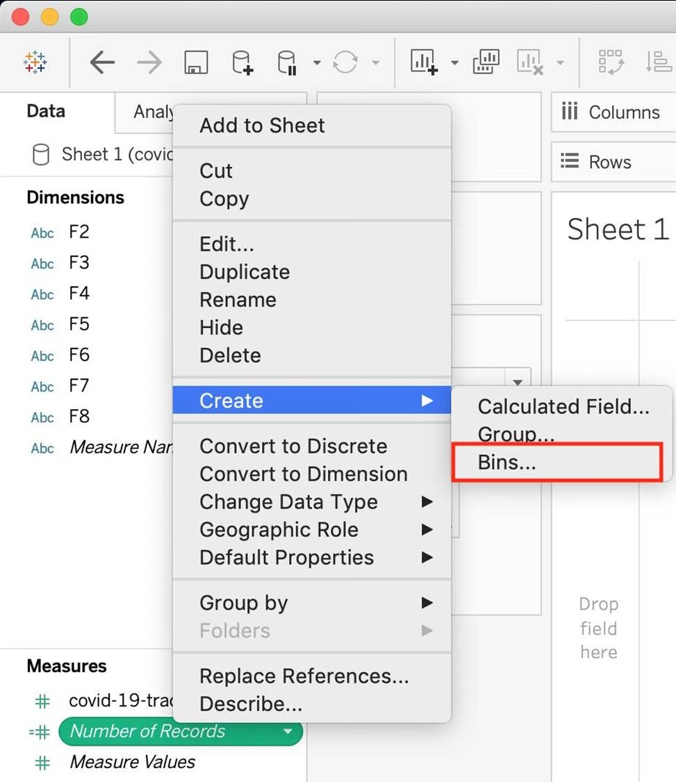

However, for a dimension (this is because the DATA TYPE of this dimension is a string:

But what if we have a dimension of type NUMBER (NUMERIC DIMENSION)? See below:

We can clearly create bins from dimensions too – they just have to be numeric 🙂
For more information, please refer to: https://help.tableau.com/current/pro/desktop/en-us/calculations_bins.htm
True or False: The Highlighting action can be disabled for the entire workbook.
- A . True
- B . False
A
Explanation:
Yes, it is possible to disable highlighting for the entire workbook.
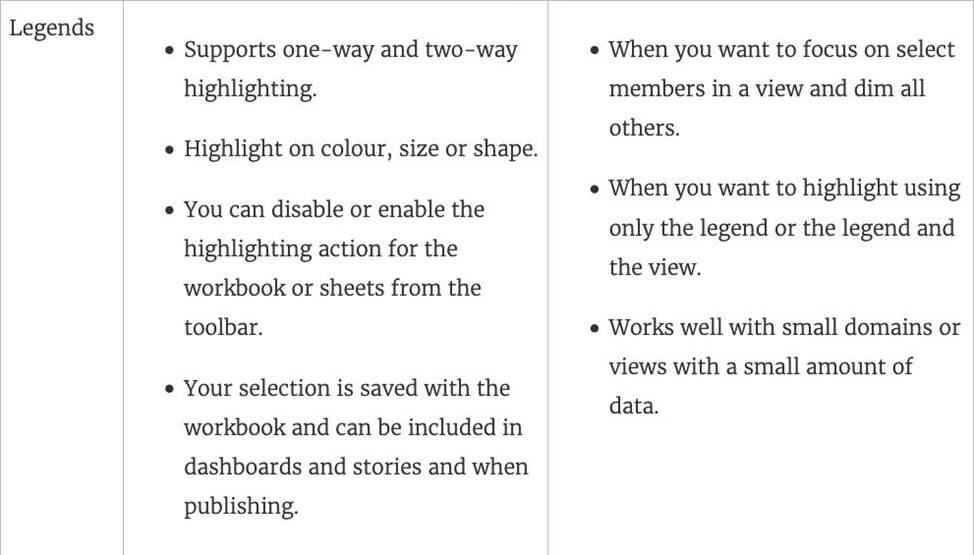

For more information: https://help.tableau.com/current/pro/desktop/en-gb/actions_highlight.htm
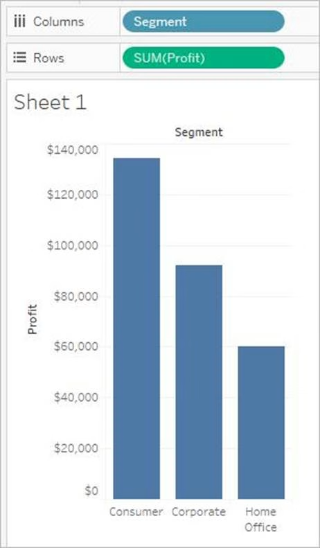
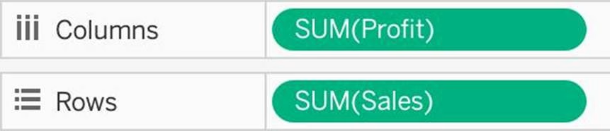
Is it possible to use measures in the same view multiple times (e.g. SUM of the measure and AVG of the measure)?
- A . Yes
- B . No
A
Explanation:
Yes, it is very much possible to use measures in the same view multiple times.
For example, refer to the image below:
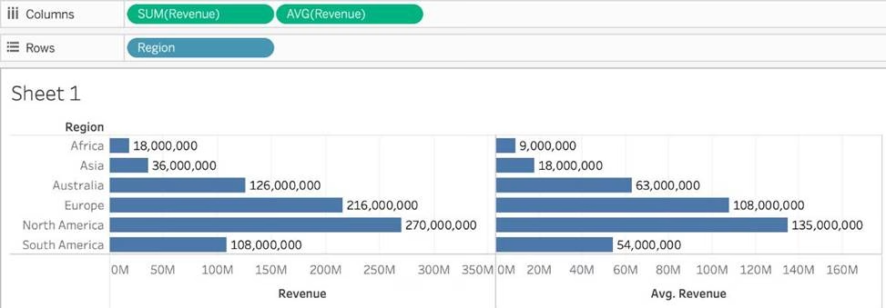

We are using BOTH the Sum of the revenue and the AVG of the revenue in the same view!
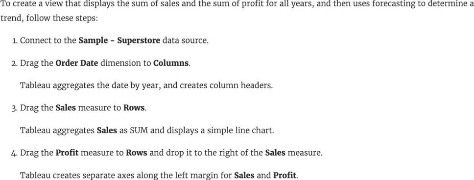
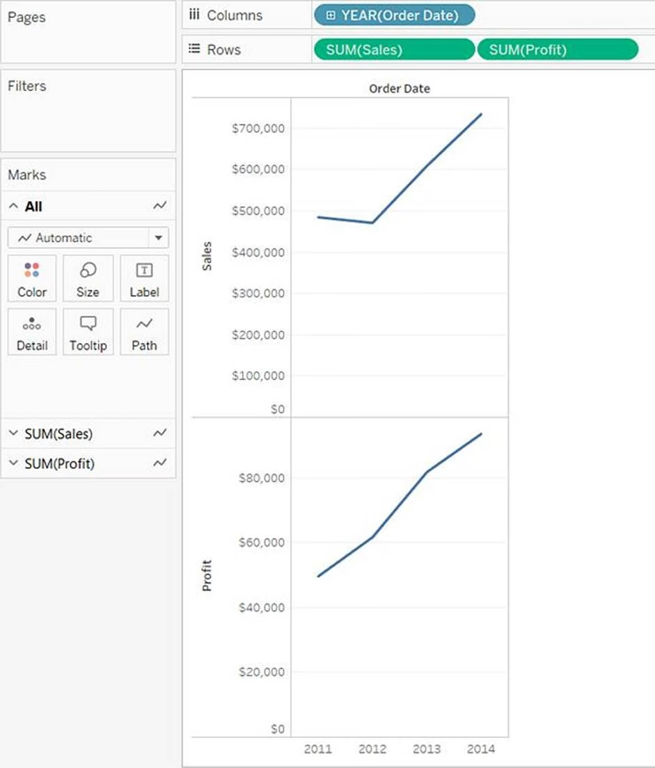
By definition, Tableau displays measures over time as a ____________
- A . Packed Bubble
- B . Bar
- C . Stacked Bar
- D . Line
D
Explanation:
Line charts connect individual data points in a view. They provide a simple way to visualize a sequence of values and are useful when you want to see trends over time, or to forecast future values.
Please refer to the images below:


Reference: https://help.tableau.com/current/pro/desktop/en-us/buildexamples_line.htm
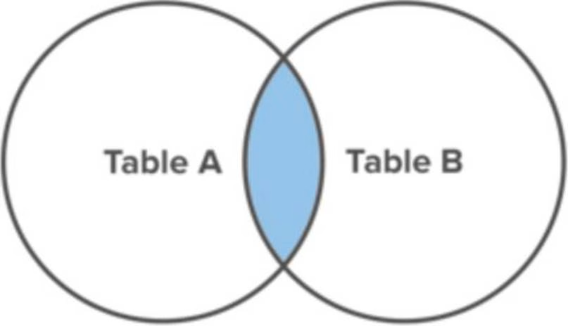
Which of the following would you use to connect to multiple tables in a single data source at once?
- A . A Blend
- B . A Hierarchy
- C . A Set
- D . A Join
D
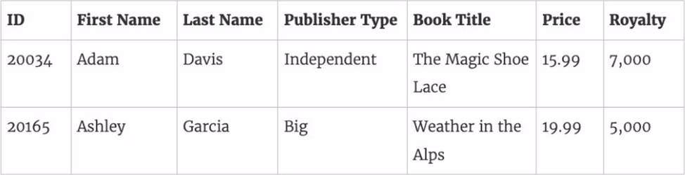
Explanation:
The data that you analyze in Tableau is often made up of a collection of tables that are related by specific fields (that is, columns). Joining is a method for combining data on based on those common fields. The result of combining data using a join is a virtual table that is typically extended horizontally by adding columns of data.
For example, consider the following two tables originating from a single data source:
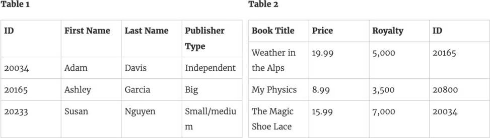

We can combine these 2 tables, simply by joining the tables on ID to answer questions like, "How much was paid in royalties for authors from a given publisher?". By combining tables using a join, you can view and use related data from different tables in your analysis.

Reference: https://help.tableau.com/current/pro/desktop/en-us/joining_tables.htm
What is the minimum amount of RAM recommended for any production use of Tableau Server?
- A . 8GB
- B . 16GB
- C . 32GB
- D . 64GB
B
Explanation:
The computer on which you are installing or upgrading Tableau Server must meet the minimum hardware requirements. If the Setup program determines that your computer does not meet the following requirements, you will not be able to install Tableau Server.
These minimum requirements are appropriate for a computer that you use for prototyping and testing of Tableau Server. They apply to single-node installations and to each computer in a distributed installation.
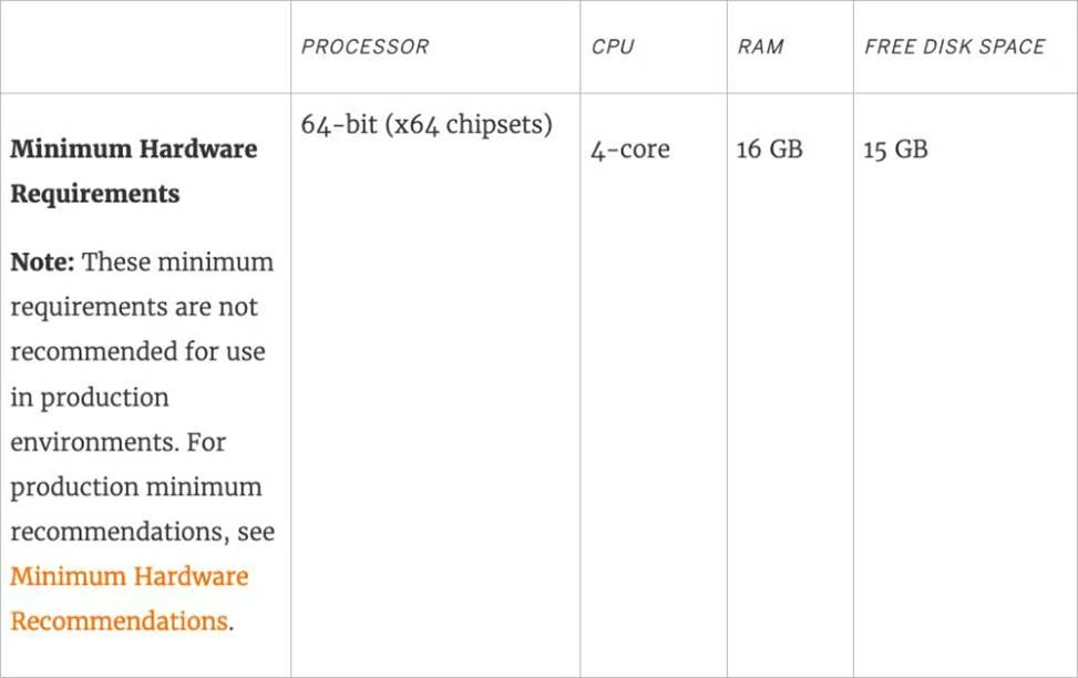

Reference: https://help.tableau.com/current/server/en-us/server_hardware_min.htm
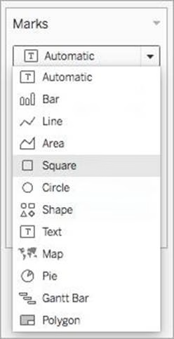
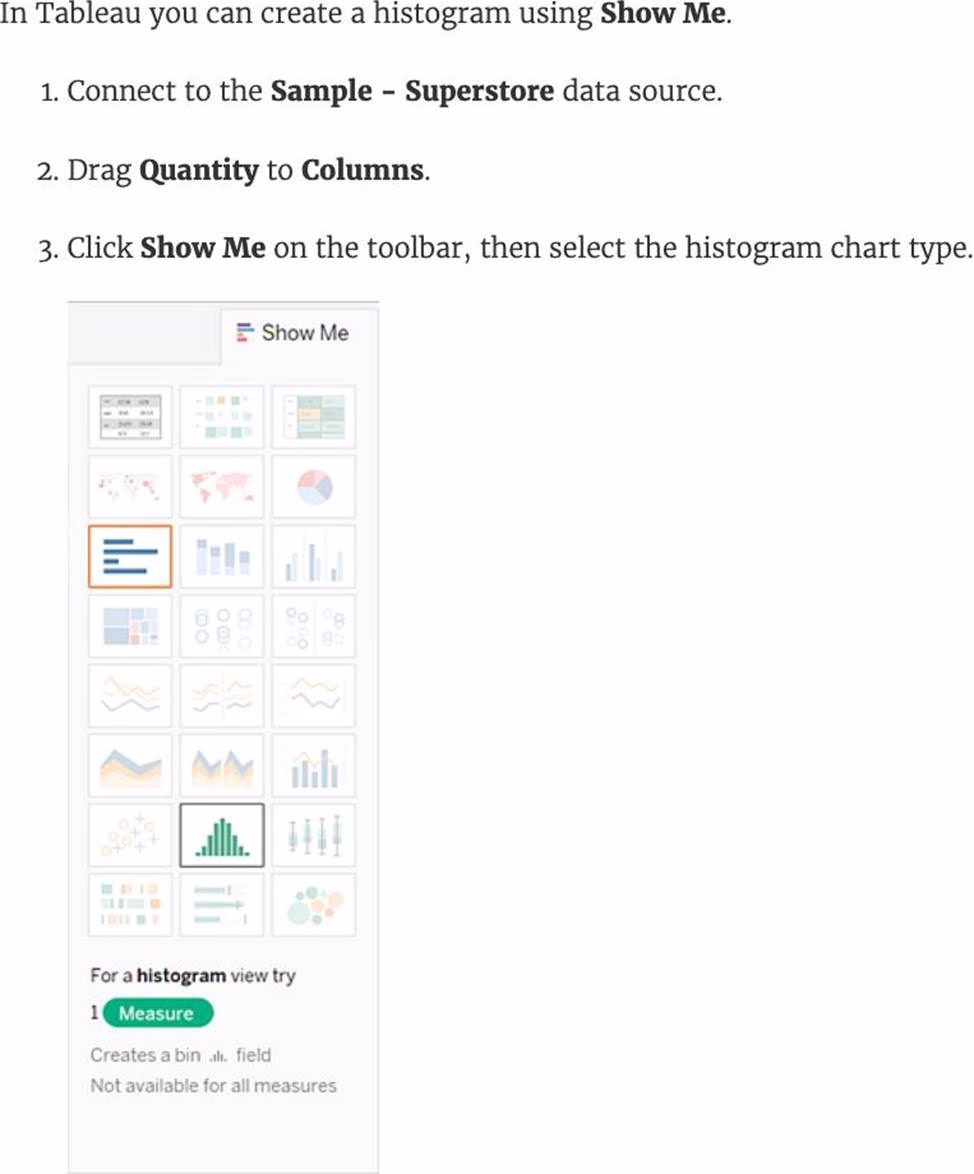
Which of the following chart type makes use of ‘binned’ data?
- A . Gantt Chart
- B . Bullet chart
- C . Histogram
- D . Treemaps
C
Explanation:
A histogram is a chart that displays the shape of a distribution. A histogram looks like a bar chart but groups values for a continuous measure into ranges, or bins.
The basic building blocks for a histogram are as follows:
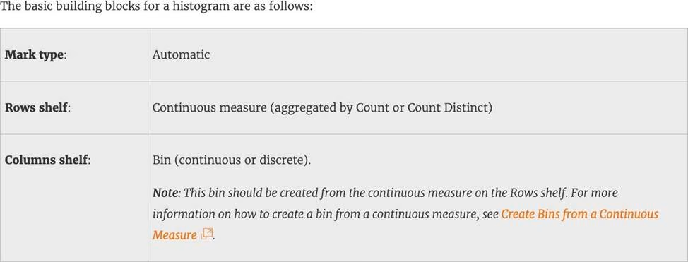

Reference: https://help.tableau.com/current/pro/desktop/en-us/buildexamples_histogram.htm
True or False: Trend lines can only be used with numeric or date fields
- A . True
- B . False
A
Explanation:
You can show trend lines in a visualization to highlight trends in your data.
To add trend lines to a view, both axes must contain a field that can be interpreted as a number. For example, you cannot add a trend line to a view that has the Product Category dimension, which contains strings, on the Columns shelf and the Profit measure on the Rows shelf.
However, you can add a trend line to a view of sales over time because both sales and time can be interpreted as numeric values.
Reference: https://help.tableau.com/current/pro/desktop/en-us/trendlines_add.htm
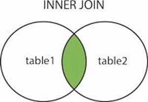
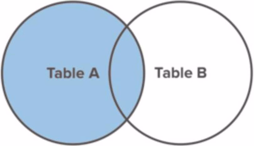
True or False: All rows from both tables are returned in an INNER JOIN
- A . True
- B . False
B
Explanation:
The INNER JOIN keyword selects all rows from both tables as long as there is a match between the columns. Consider 2 tables "Orders" and "Customers".
If there are records in the "Orders" table that do not have matches in "Customers", these orders will not be shown!

Reference: https://www.w3schools.com/sql/sql_join_inner.asp
Is SUM a table calculation?
- A . Yes
- B . No
B
Explanation:
SUM is an aggregate function, not a table calculation!
A table calculation is a transformation you apply to the values in a visualization. Table calculations are a special type of calculated field that computes on the local data in Tableau. They are calculated based on what is currently in the visualization and do not consider any measures or dimensions that are filtered out of the visualization.
The most common Table calculations are:
Running Total
Percent Difference
Difference
Percent of Total
Rank
Percentile
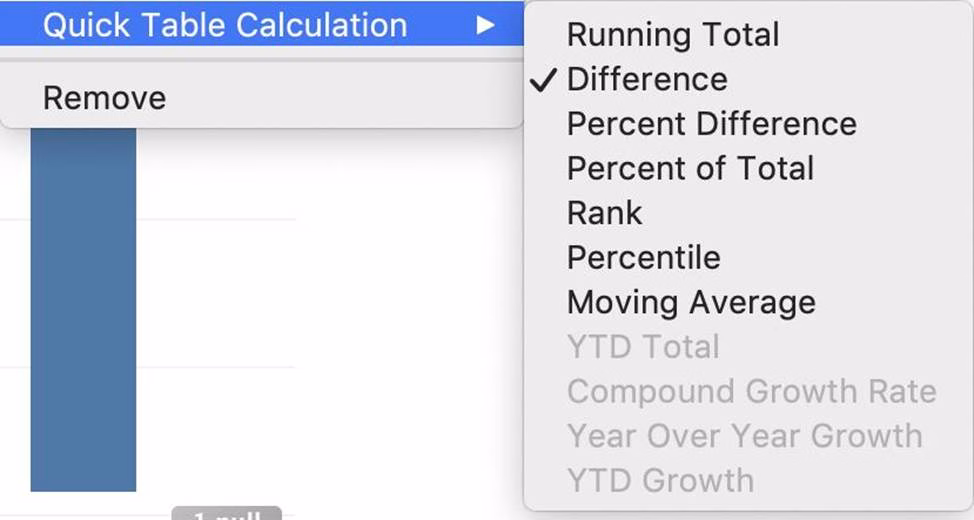

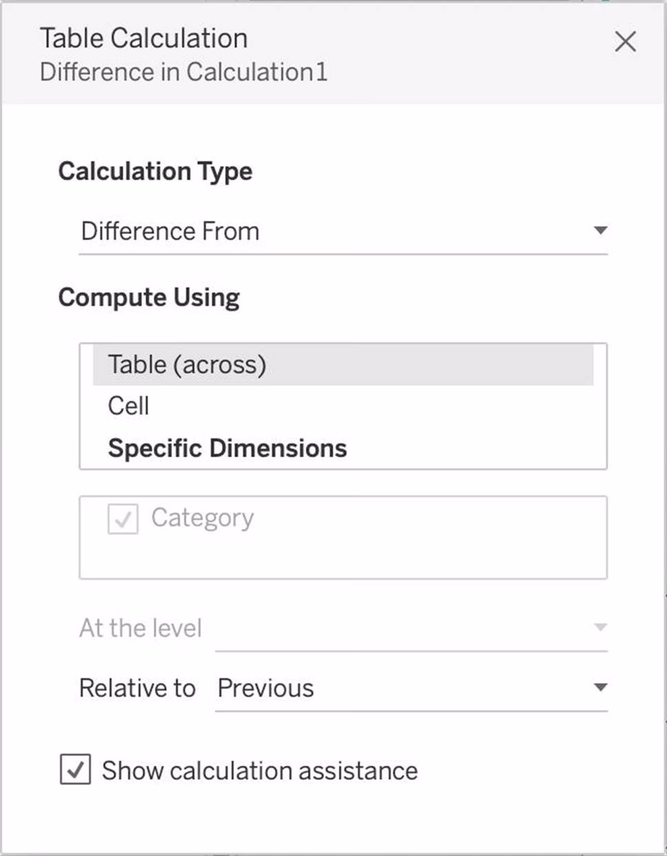

These can be calculated using: Table(across), Cell, or Specific dimensions!
Reference: https://help.tableau.com/current/pro/desktop/en-us/calculations_tablecalculations_definebasic_runningtotal.htm
By default, measures placed in a view are aggregated by ______________
- A . COUNT
- B . AVERAGE
- C . MEDIAN
- D . SUM
D
Explanation:
By default, measures placed in a view are aggregated by SUM, which means that the data for that field in all of the rows is combined. Measures can also be aggregated as average, median, count, or count distinct.
Reference: https://help.tableau.com/current/pro/desktop/en-us/calculations_aggregation.htm
______________ refers to the level of detail for a piece of data, wherever you are looking.
- A . Data Cleanliness
- B . Data granularity
- C . Data connectivity
- D . Data LOD
B
Explanation:
Data is generated and analyzed at many different levels of granularity. Granularity is the level of detail of the data. For example, when looking at graduation data, granularity would describe whether a row in the data set represents a single person or the graduating class of a university.
Reference: https://www.tableau.com/about/blog/2018/6/data-prep-101-what-aggregate-function-and-how-do-you-combine-aggregated-data-89244
For Bullet Graphs we need at least ____________ measures
- A . 3
- B . 1
- C . 2
- D . 4
C
Explanation:
A bullet graph is a variation of a bar graph developed to replace dashboard gauges and meters. A bullet graph is useful for comparing the performance of a primary measure to one or more other measures.
Therefore, we need at least 2 measures for creating bullet graphs.

Reference: https://help.tableau.com/current/pro/desktop/en-us/qs_bullet_graphs.htm
The default path for all supporting files, data sources, icons, logs etc is in ______________________
- A . Documents -> Tableau Files
- B . Documents -> Tableau
- C . Documents -> My Tableau Repository
- D . Downloads -> Tableau Support Files
C
Explanation:
By default, all of the above mentioned are stored in Documents -> My Tableau Repository
Reference: https://help.tableau.com/current/pro/desktop/en-us/environ_filesandfolders.htm
Tableau auto-generates ____________ dimension(s) and _____________ measure(s) for us
- A . 1,4
- B . 2,2
- C . 2,3
- D . 1,2
A
Explanation:
Tableau auto-generates:
1 Dimension – Measure Names
4 Measures – Latitude, Longitude, Number of records, Measure Values
Starting with Tableau 2020.2, every table in a data source has a Count field, in the form of NameofTable(Count). The table count field is an automatically generated, calculated field.
(THIS IS NOT PRESENT IN VERSION 2020.1 ON WHICH THE EXAM IS CURRENTLY BASED)
Reference: https://help.tableau.com/current/pro/desktop/en-us/datafields_understanddatawindow.htm
We can join a maximum of ______ tables in Tableau
- A . 16
- B . 32
- C . 64
- D . 128
B
Explanation:
It is possible to join a maximum of 32 tables in Tableau!
Reference: https://www.mytectra.com/interview-question/tableau-interview-question-and-answers
Which of the following are benefits of using Data Extracts in Tableau?
- A . Improved Performance
- B . Ability to use the data offline
- C . Working with freshest data at all times
- D . Faster to work with
A, B, D
Explanation:
Extracts are advantageous for several reasons:
1) Supports large data sets: You can create extracts that contain billions of rows of data.
2) Fast to create: If you’re working with large data sets, creating and working with extracts can be faster than working with the original data.
3) Help improve performance: When you interact with views that use extract data sources, you generally experience better performance than when interacting with views based on connections to the original data.
4) Support additional functionality: Extracts allow you to take advantage of Tableau functionality that’s not available or supported by the original data, such as the ability to compute Count Distinct.
5) Provide offline access to your data: Extracts allow you to save and work with the data locally when the original data is not available. For example, when you are traveling.
To work with the MOST up-do-date data, use a live connection instead!
Reference: https://help.tableau.com/current/pro/desktop/en-us/extracting_data.htm
When you want to first apply a filter and THEN show the Top N or Bottom N elements, which of the following filters would you use?
- A . Data source Filter
- B . Extract Filter
- C . Context Filter
- D . None of the these
C
Explanation:
By default, all filters that you set in Tableau are computed independently. That is, each filter accesses all rows in your data source without regard to other filters. However, you can set one or more categorical filters as context filters for the view. You can think of a context filter as being an independent filter. Any other filters that you set are defined as dependent filters because they process only the data that passes through the context filter. You may create a context filter to:
1) Improve performance C If you set a lot of filters or have a large data source, the queries can be slow. You can set one or more context filters to improve performance.
2) Create a dependent numerical or top N filter C You can set a context filter to include only the data of interest, and then set a numerical or a top N filter.
Reference: https://help.tableau.com/current/pro/desktop/en-us/filtering_context.htm
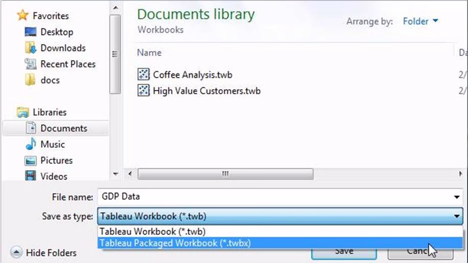
You have cleaned a data source properly, created some calculated fields and renamed some columns. You want to save these changes for future use cases.
Which of the following would BEST satisfy this requirement?
- A . Save it as a .twm file
- B . Save it as a .twb file
- C . Save it as a .tds file
- D . Save it as a .twbx file
C
Explanation:
After making changes to Data, we can save that new data source as a .tds file. To do so, go to data menu on top and then choose your current connected data source. Then next click on Add to Saved Data sources. This will save all calculated fields, changes to fields etc. It will be saved in My Tableau Repository -> Mydatasources. This will then also appear on Tableau Home Page under saved data sources like SampleSuperStore.
Note: Data source files do not contain the actual data but rather the information necessary to connect to the actual data as well as any modifications you’ve made on top of the actual data such as changing default properties, creating calculated fields, adding groups, and so on.
.twb and .twbx are not the BEST solutions since the questions nowhere mentions that we need to store our workbooks as well.
.twm is a bookmark which contains a single worksheet and are an easy way to quickly share your work.
Reference: https://help.tableau.com/current/pro/desktop/en-us/environ_filesandfolders.htm
True or False: It is possible to add a field to more than one hierarchy
- A . True
- B . False
A
Explanation:
Yes! It is possible to duplicate a field and add it to more than one hierarchy. Right click and choose duplicate.
Reference: https://www.tableau.com/about/blog/2016/8/take-note-these-10-handy-tableau-shortcuts-57561
How would you calculate GDP per capita in Tableau?
- A . SUM([GDP]/[POPULATION])
- B . SUM([Population]/[GDP]])
- C . SUM([GDP]*[POPULATION])
- D . SUM([GDP]) / SUM([Population])
D
Explanation:
GDP / Population = GDP Per Capita
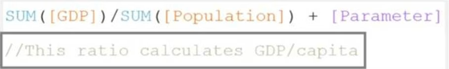

Here Sum is a function, / and + are operators. On the bottom there are comments.
_______________ enables us to create workbooks and views, dashboards, and data sources in Tableau Desktop, and then publish this content to our own server.
- A . Tableau Server
- B . Tableau Prep
- C . Tableau Public
- D . Tableau myServer
A
Explanation:
Tableau SERVER enables us to create workbooks and views, dashboards, and data sources in Tableau Desktop, and then publish this content to our own server.
Moreover, as a Tableau Server administrator you will control who has access to server content to help protect sensitive data. Administrators can set user permissions on projects, workbooks, views, and data sources.
Reference: https://www.tableau.com/learn/webinars/introduction-tableau-server
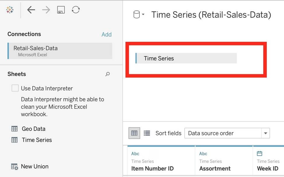
Download the Dataset from:
https://drive.google.com/file/d/12AYHfiPWkwBmvH0zbumOURgUX6Az00Rw/view?usp=sharing
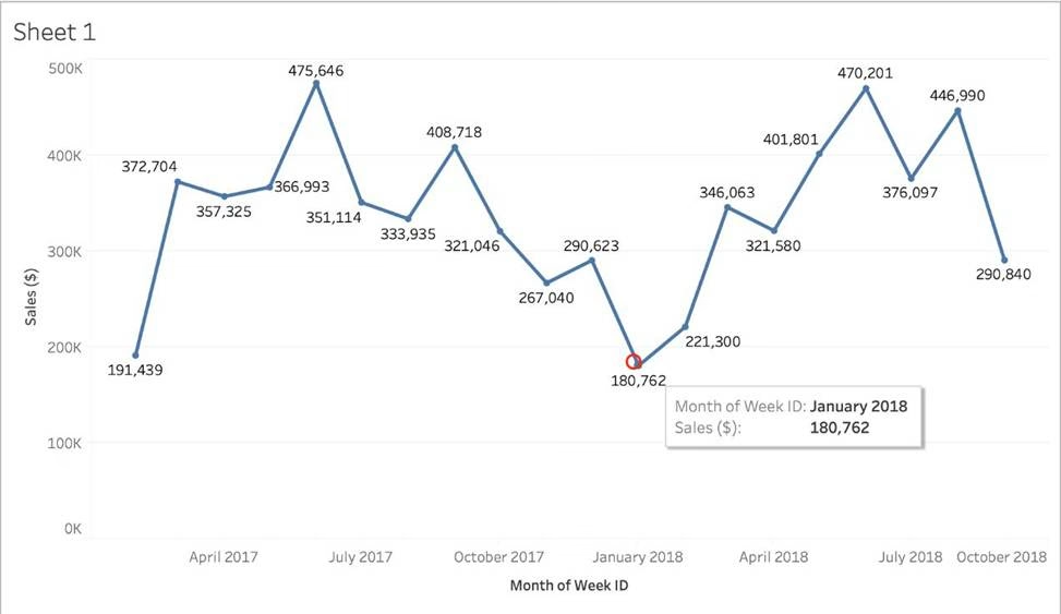
Using the Time Series Table, create a line chart to show Sales over time.
Which Month and Year witnessed the lowest Sales?
- A . September 2017
- B . March 2018
- C . December 2017
- D . January 2018
D
Explanation:
Follow the steps to get the correct answer: January 2018

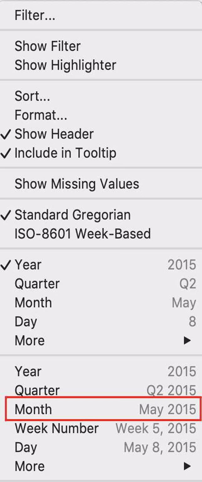
We are talking about dates, so use the Time series sheet as follows:

Next, the following should be your view and clearly, January 2018 is the lowest point:

Read more about dates: https://interworks.com/blog/rcurtis/2017/01/30/tableau-deep-dive-dates-introduction-dates/
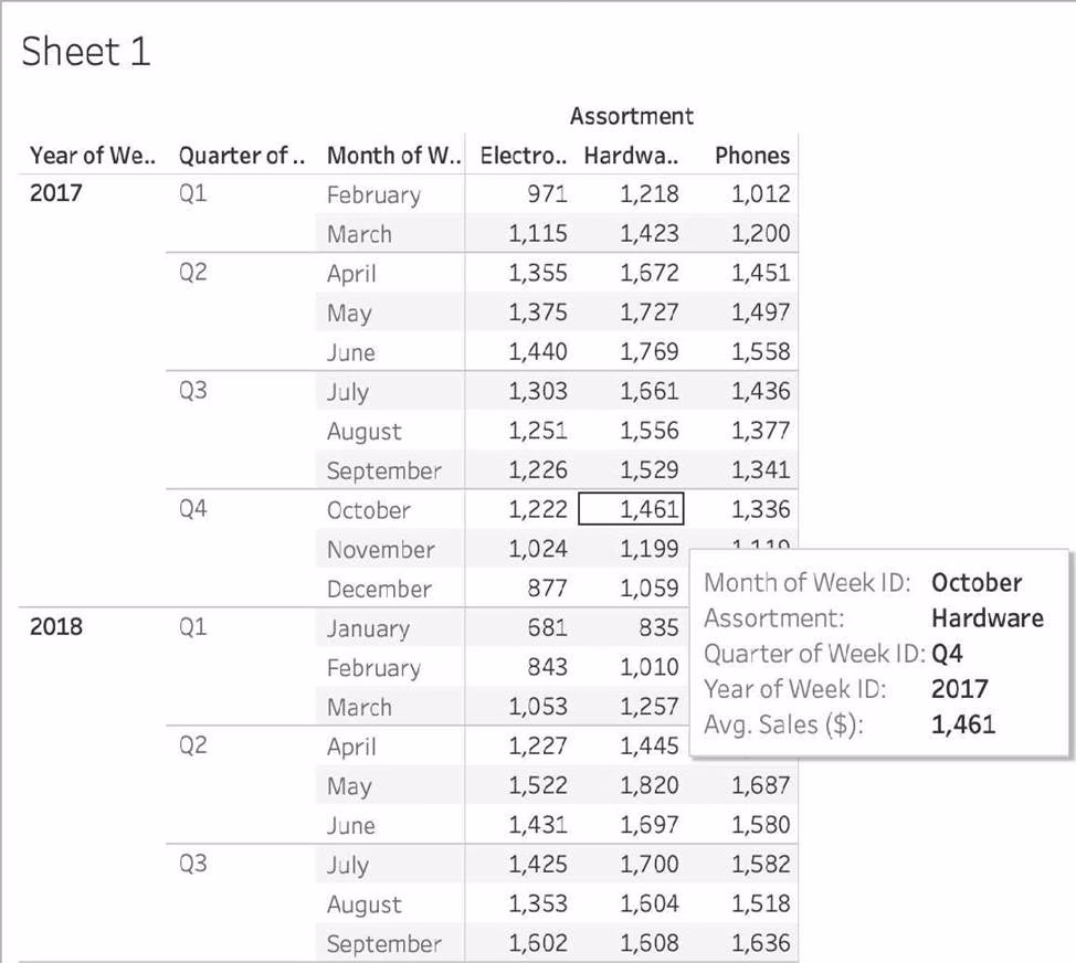
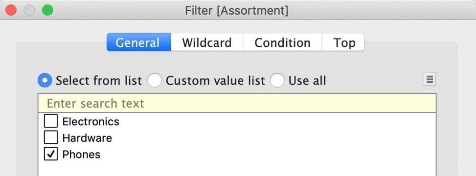
Using the Time Series table, create a cross-tab showing sales for each Assortment broken down by Year and Quarter.
In Q4 of October 2017, what was the Average sales amount for the Hardware assortment?
- A . 111,060
- B . 1,461
- C . 112,256
- D . 1,222
C
Explanation:
If you chose 111,060 you were SO close to the correct answer but made a small mistake – you didn’t change the aggregation to AVERAGE! This is one of the common mistakes many test takers make, so keep this in mind.
To reach the correct answer, follow the steps below:
1) Draw Assortment to the Column shelf, and drag Year to the Rows Shelf. Then Drill down further on Year to accomodate Quarters and Months as well!
Although this seems enough, DON’T FORGET to change the aggregation like in the next step, which will completely change the values!
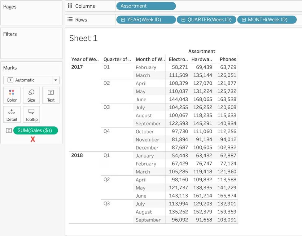


The correct answer as you can see is 1,461 – Sales for Harware Assortment in 2017 Q4, October

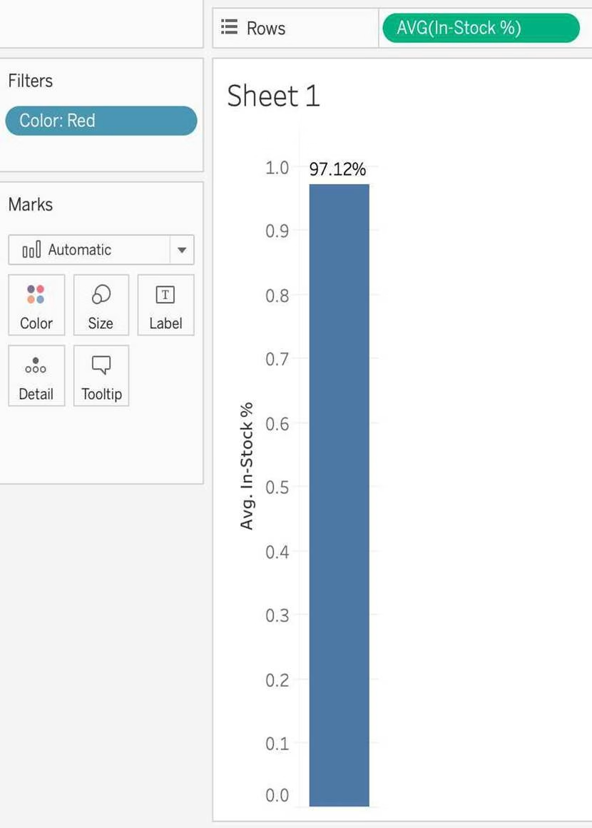
Using the Geo Data table, create a Bar chart showing the In-Stock percentage for each Color.
What is the Average In-Stock percentage for the Color Red? Present your answer correctly upto 2 decimal places.
- A . 96.46%
- B . 95.12%
- C . 97.12%
- D . 99.46%
C
Explanation:
Not too tough. Follow along the steps:
Drag Color to Filter and choose Red:


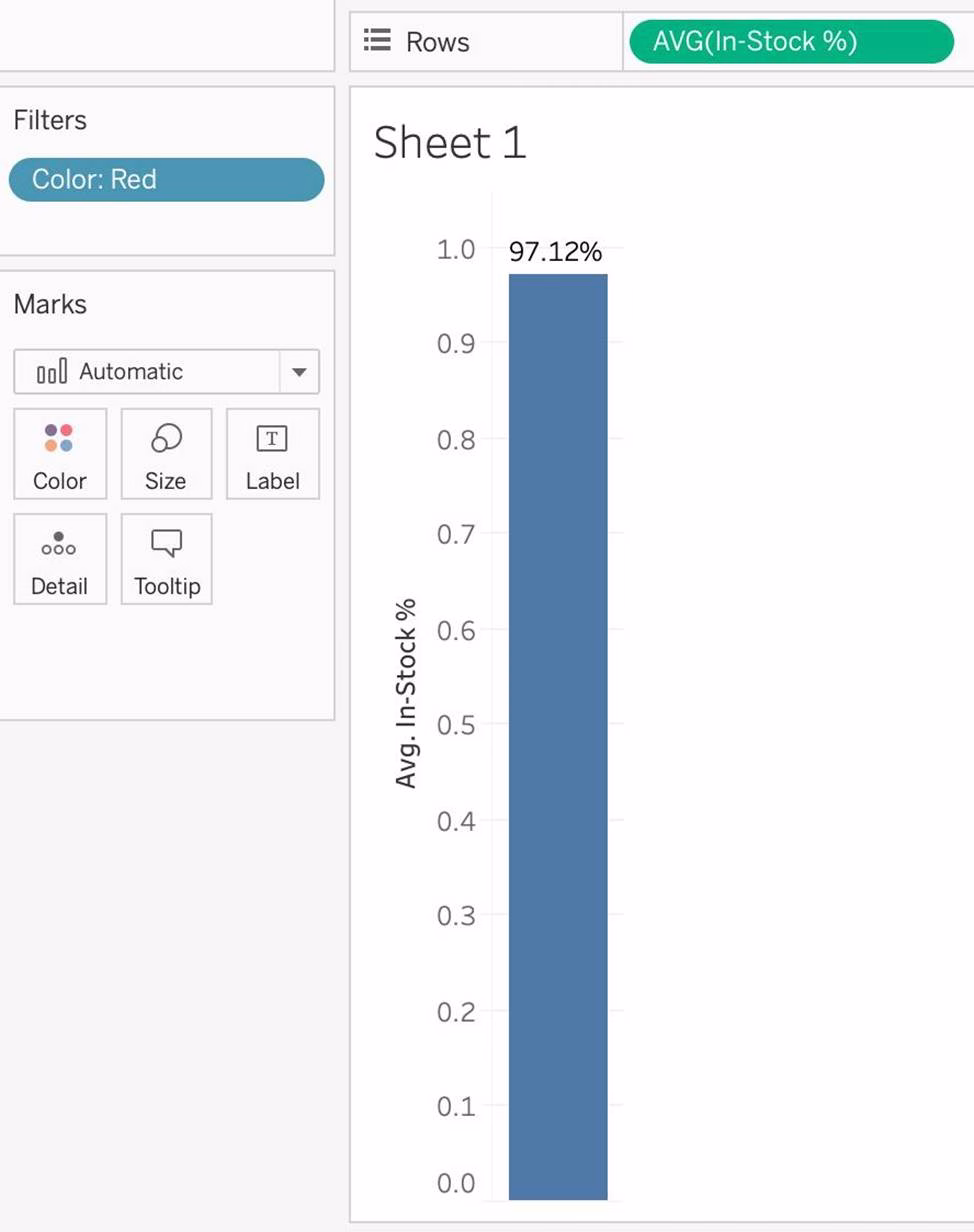

3) Now to display the percentage correctly, lets format it. Click on the In Stock % pill in the Row shelf, and select format:
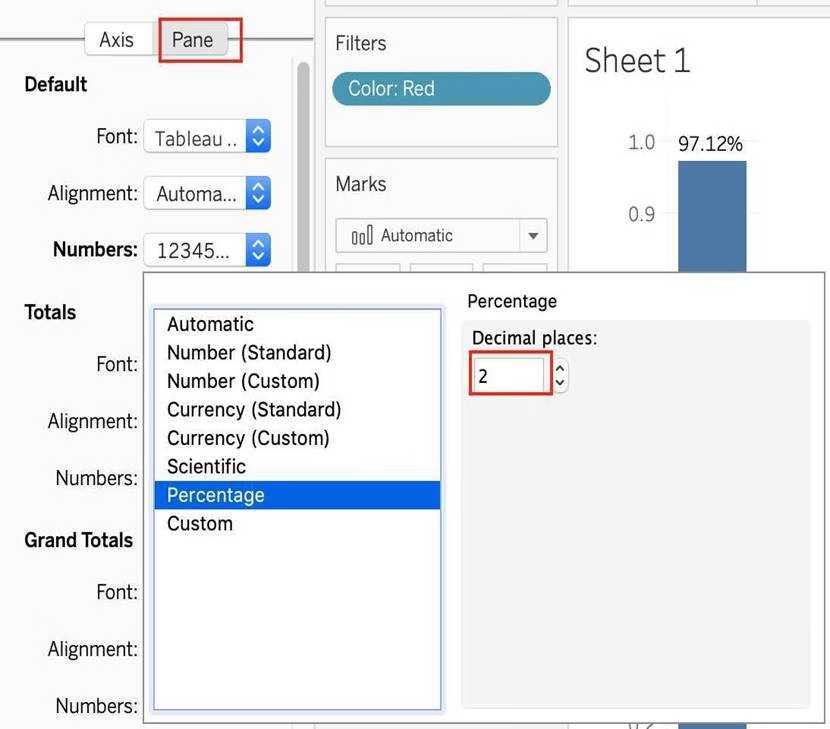

And your final view will look like :

Using the Time Series Table, create a Line chart showing the Monthly Year over Year Growth for the Sales, broken down by Assortment.
For the Electronics assortment, which Month had the most NEGATIVE value of Year over Year Growth?
- A . October
- B . September
- C . July
- D . June
A
Explanation:
Follow along:
1) Drag Assortment and Year ID (choose Discrete Month) to Columns shelf, and Sales to the Columns Shelf.
For sales, click on the pill -> choose Quick Table calculation -> Year over Year growth.
The view should now look like:
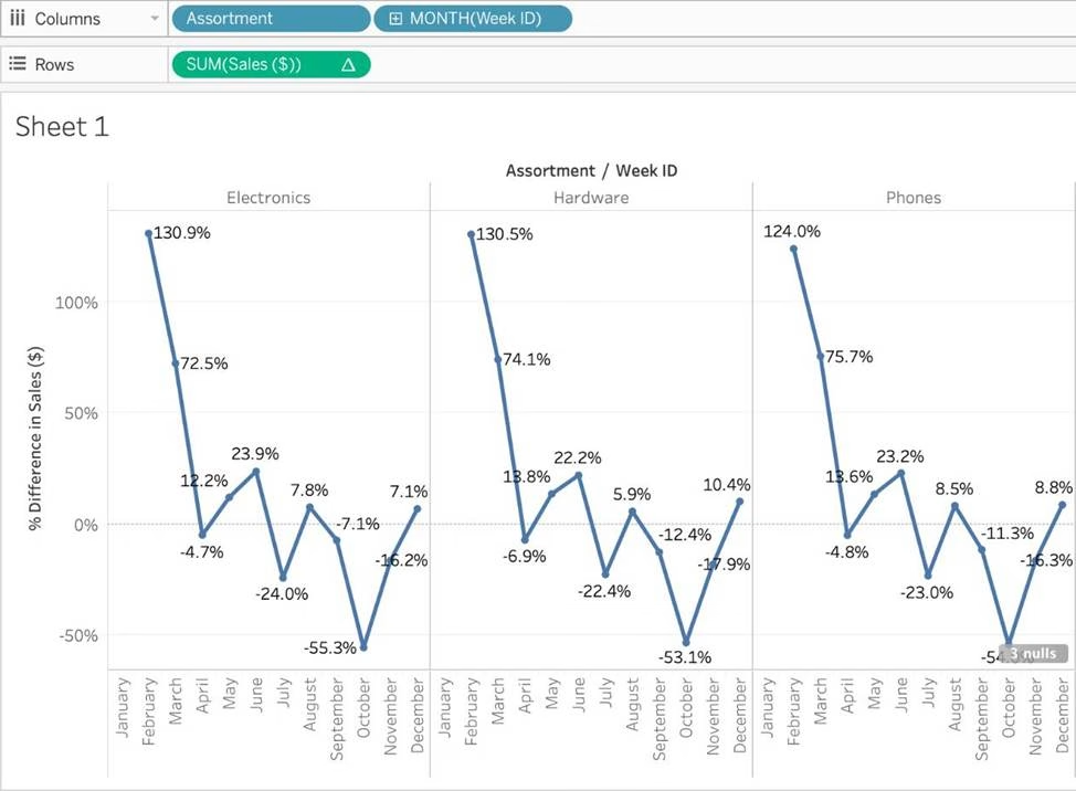

It is clear that October with -55.3% had the lowest Year on Year growth.
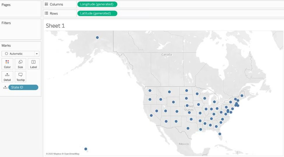
What was the Store count in 2017 for Texas (TX)?
Skipped Join the Geo Data and Time Series Table on the Item Number ID column, and display the Store count for every State on a Map.
What was the Store count in 2017 for Texas (TX)?
- A . 592,593
- B . 293,202
- C . 416,702
- D . 336,908
C
Explanation:
Since you need BOTH State and the YEAR, we need to use an Inner Join.
Follow the steps below:
Using the Geo Data Table, create a Map showing Sales made per State.
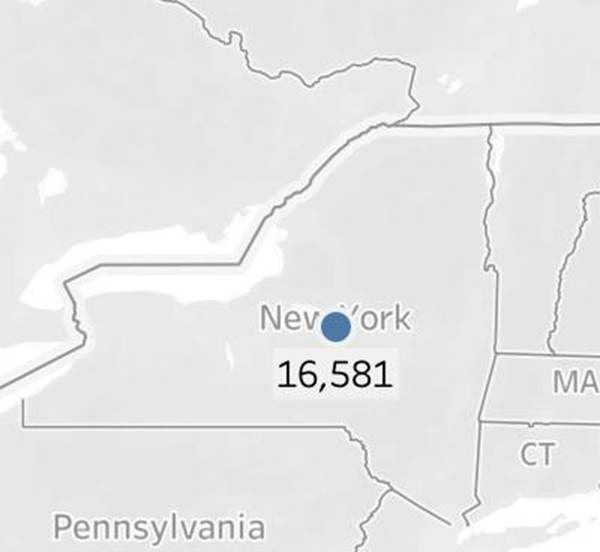
For the State of New York (NY), what was the amount in Sales ($) made for Phone Assortments with White color?
- A . $16,581
- B . (Correct)
- C . $147,950
- D . $48,115
- E . $33,768
A
Explanation:
Phew! Tricky one! You needed to use filters in this one.
Follow along:

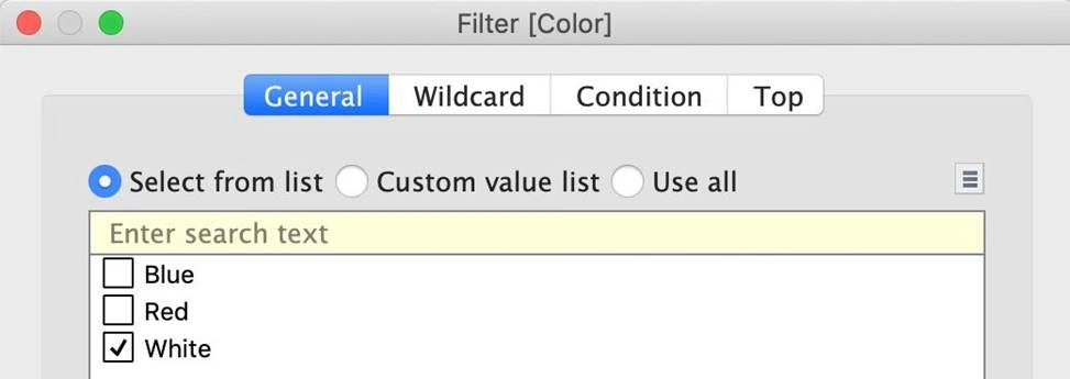
2) Next, as the question mentions, we need to focus on the Assortment PHONE, the color WHITE, and the state of NEW YORK. -> so we use filters for this!
i) First drag Assortment to Filters, and select only Phones:

ii) Next, drag Color to Filters and Choose only White:

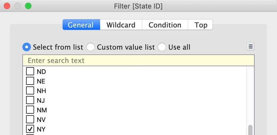
iii) Next, drag State ID to Filters, and choose New York (NY):


And Voila! We have our answer as follows:

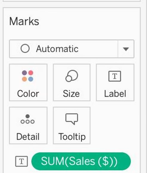
iv) Last, drag Sales to Label:
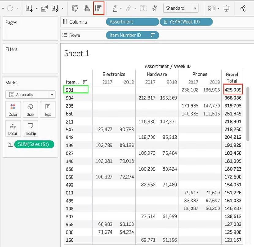
Using the Time-series table, create a cross tab showing the Sales for each Item Number-ID, broken down by Assortments, then add Grand totals to the view.
Which Item Number ID made the maximum sales across all assortments?
- A . 584
- B . 901
- C . Correct)
- D . 205
- E . 660
B
Explanation:
Follow along the steps below:
Drag Assortment and Year ID to the column shelf, and Item Number ID to the row shelf. Next, drag
Sales to the Text label to create a cross-tab as below:


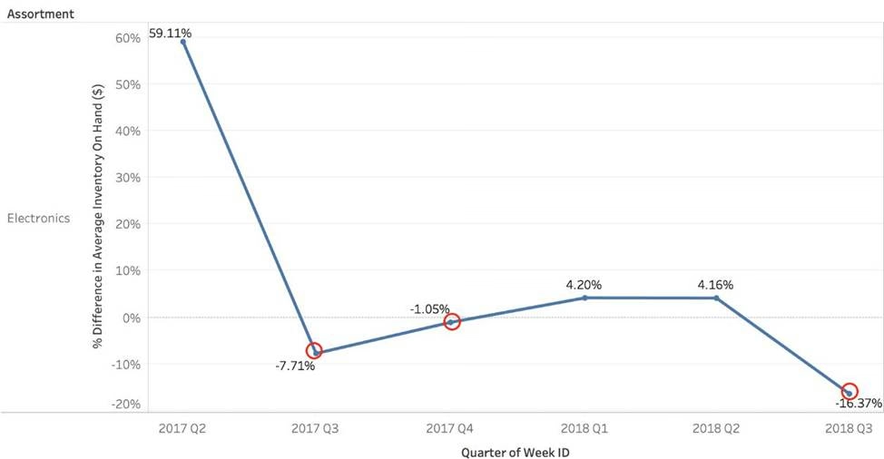
Using the Time Series table, create a chart that shows the percent difference in Average Inventory on Hand for each Assortment by year and quarter.
How many quarters did the Electronics Assortment show a negative percent difference in the Average Inventory On Hand?
- A . 1
- B . 2
- C . 3
- D . 4
C
Explanation:
If you chose 2, then you were very close but probably didn’t plot the actual Percent Difference on your view. (One of the marks is just over the line).
✑ Firstly, Drop the Week ID onto the column shelf, and convert it to continuous since we need both Year and Quarter as mentioned in the question.
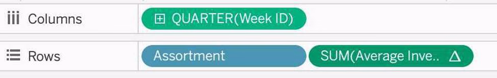

2) Next, Drop assortment to filters shelf so that we can focus on Electronics!

3) This should be your view now. Click on the Show Mark Labels icon as shown: The final view is as follows, with 3 points below 0 ( i.e negative )

Which of the following is not a Trend Line Model?
- A . Linear Trend Line
- B . Exponential Trend Line
- C . binomial Trend Line
- D . Logarithmic Trend Line
C
Explanation:
According to the official Tableau documentation, there are 5 types of trend lines which we can work with in Tableau:
1) Linear Trend Line
2) Logarithmic Trend Line
3) Exponential Trend Line
4) Polynomial Trend Line
5) Power Model
Hence, the correct answer is BINOMIAL trend line which is not present in Tableau.
See the following image:
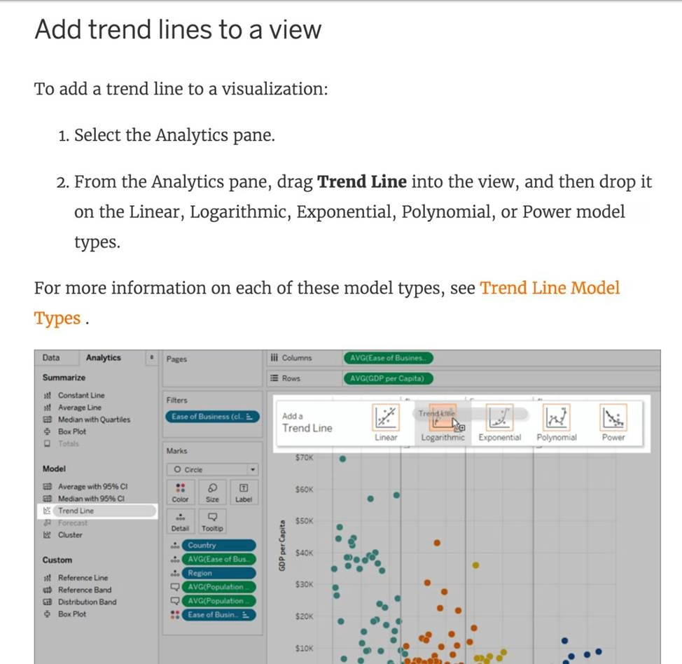

For more information, refer to: https://help.tableau.com/current/pro/desktop/en-us/trendlines_add.htm
True or False: A sheet cannot be used within a story directly. Either sheets should be used within a dashboard, or a dashboard should be used within a story.
- A . rue
- B . False
B
Explanation:
It is possible in Tableau to use a sheet within a story directly.
Moreover, in Tableau, a story is a sequence of visualizations that work together to convey information. You can create stories to tell a data narrative, provide context, demonstrate how decisions relate to outcomes, or to simply make a compelling case.
At the same time, a story is also a collection of sheets, arranged in a sequence. Each individual sheet in a story is called a story point.

Reference: https://help.tableau.com/current/pro/desktop/en-us/stories.htm
Which of the following is a good reason for using a bullet graph?
- A . Comparing the actual sales against the target sales
- B . Analysing the trend over a given time period
- C . Forecasting future sales
- D . Displaying the year-on-year growth in sales
A
Explanation:
A bullet graph is a variation of a bar graph developed to replace dashboard gauges and meters. A bullet graph is useful for comparing the performance of a primary measure to one or more other measures. Below is a single bullet graph showing how actual sales compared to estimated sales.

Reference: https://help.tableau.com/current/pro/desktop/en-us/qs_bullet_graphs.htm
True or False: We can disaggregate the data, to see all of the marks in the view at the most detailed level of granularity
- A . True
- B . False
A
Explanation:
Whenever you add a measure to your view, an aggregation is applied to that measure by default.
This default is controlled by the Aggregate Measures setting in the Analysis menu.
If you decide you want to see all of the marks in the view at the most detailed level of granularity, you can disaggregate the view. Disaggregating your data means that Tableau will display a separate mark for every data value in every row of your data source.
To disaggregate all measures in the view:
Clear the Analysis >Aggregate Measures option.
If it is already selected, click Aggregate Measures once to deselect it.

Reference: https://help.tableau.com/current/pro/desktop/en-us/calculations_aggregation.htm
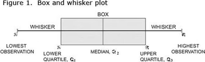
What does the box in a box plot represent?
- A . Maximum value of the data
- B . Minimum value of the data
- C . The interquartile range
- D . The median of the middle half of the data points
C
Explanation:
In a box and whisker plot:
1) The ends of the box are the upper and lower quartiles, so the box spans the interquartile range
2) The median is marked by a vertical line inside the box
3) The whiskers are the two lines outside the box that extend to the highest and lowest observations.

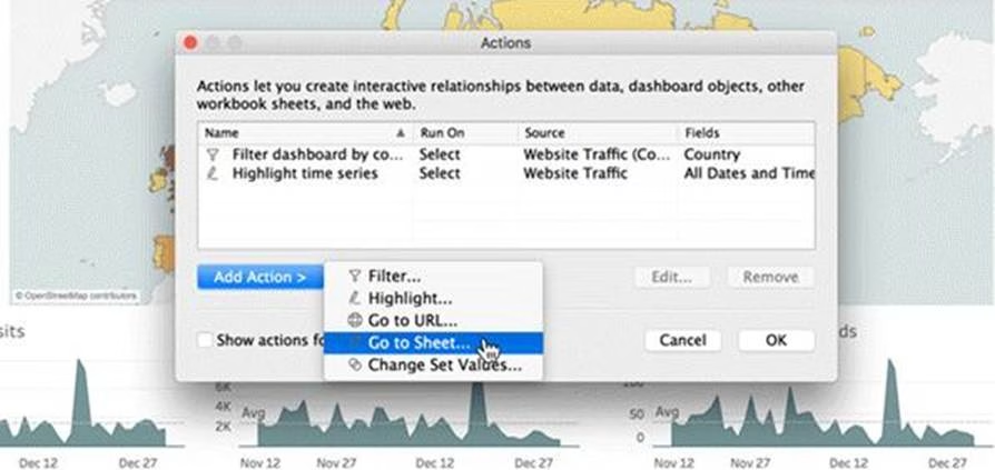
Which of the following are interactive elements that can be added to a dashboard for users?
- A . URL Action
- B . Filter Action
- C . Highlight Action
- D . Edit Tooltip Action
A, B, C
Explanation:
We can perform filter, URL and highlight actions out of the above given choices on a dashboard.
Please refer to the image below:

Reference: https://help.tableau.com/current/pro/desktop/en-us/actions_dashboards.htm
What does it imply if a field has a blue background?
- A . It is continuous
- B . It is discrete
- C . It is a dimension
- D . It is a measure
B
Explanation:
When you connect to a new data source, Tableau assigns each field in the data source as dimension or measure in the Data pane, depending on the type of data the field contains. You use these fields to build views of your data.
![]()

Reference: https://help.tableau.com/current/pro/desktop/en-us/datafields_typesandroles.htm
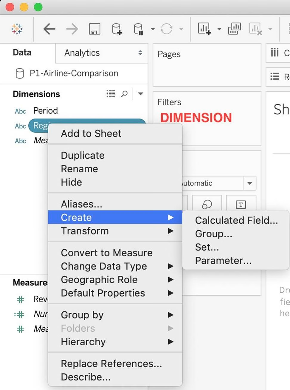
For creating variable sized bins we use __________________
- A . Calculated Fields
- B . Table Calculations
- C . Sets
- D . Groups
A
Explanation:
One way to view a measure in Tableau Desktop is to split it into bins. You can think of bins as buckets based on a range of values. For example, say you have a measure that represents age. Instead of aggregating the measure to calculate the average age, you can bin the measure to define age groups: 0C5, 6C10, 11C15, and so on. Then you can count the number of people in each age group.
Create a calculated field for variable bin size
Step 1
Select Analysis > Create Calculated Field.
Step 2
In the Calculated Field dialog box, complete the following steps:

Reference: https://riti-ritesh.blogspot.com/2016/07/creating-variable-sized-bins_8.html
True or False: A reference line cannot be added from the Analytics Pane
- A . True
- B . False
B
Explanation:
You can add a reference line to any continuous axis in the view.
To add a reference line:
Drag Reference Line from the Analytics pane into the view. Tableau shows the possible destinations.
The range of choices varies depending on the type of item and the current view.
In a simple case, the drop target area offers three options:
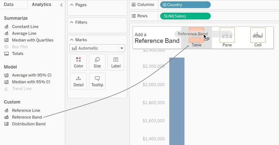
Reference: https://help.tableau.com/current/pro/desktop/en-us/reference_lines.htm
True or False: LEFT JOIN returns all rows from the left table, with the matching rows in the right table
- A . True
- B . False
A
Explanation:
This is true, indeed!
The LEFT JOIN keyword returns all records from the left table (table1), and the matched records from the right table (table2). The result is NULL from the right side, if there is no match.
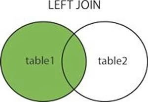
Reference: https://www.w3schools.com/sql/sql_join_left.asp
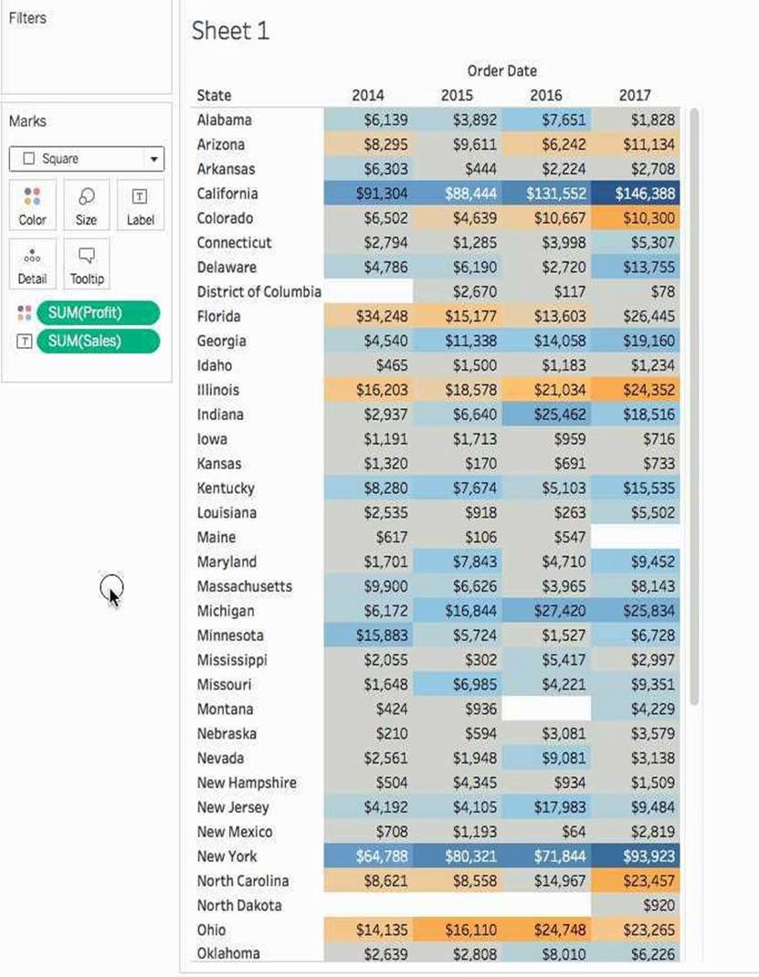
To use a quick table calculation, which of the following programming languages do you need to know?
- A . ython
- B . Java
- C . Javascript
- D . None of these
D
Explanation:
You don’t need to know ANY programming language to use quick table calculations!
Follow along with the steps below to learn how to apply a quick table calculation to a visualization:
1) Open Tableau Desktop and connect to the Sample-Superstore data source, which comes with Tableau.
2) Navigate to a new worksheet.
3) From the Data pane, under Dimensions, drag Order Date to the Columns shelf.
4) From the Data pane, under Dimensions, drag State to the Rows shelf.
5) From the Data pane, under Measures, drag Sales to Text on the Marks Card.
6) From the Data pane, under Measures, drag Profit to Color on the Marks Card.
7) On the Marks card, click the Mark Type drop-down and select Square.

The visualization updates to look like this:
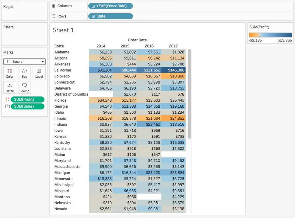

Apply the quick table calculation
1) On the Marks card, right-click SUM(Profit) and select Quick Table Calculation > Moving Average. Note: You can only perform quick table calculations on measures in the view.
A delta symbol appears on the field to indicate that a quick table calculation is being applied to the field. The colors in the visualization update to show the moving average of profit across the years.

Reference: https://help.tableau.com/current/pro/desktop/en-us/calculations_tablecalculations_quick.htm
Given a map, which of the following fields can be placed in Size,Shape,Detail,Color
- A . Profit, State, Number of Records, Sales
- B . Region, Country, Profit, State
- C . Longitude, Country, State, Sales
- D . Sales, State, Country, Profit
D
Explanation:
Since Sales is a measure, it can easily be depicted via size.
To drill down and change the level of detail, Country is the correct choice since it will contain STATE.
We can then depict the various states by different shapes such as circle, square etc.
Finally, the Profit can be depicted via a color! Eg – Red for poor and green for excellent profits!
Reference: https://www.tableau.com/learn/tutorials/on-demand/aggregation-granularity-and-ratio-calculations
When using a Blend, what is the color of tick-mark on the primary and secondary data sources respectively?
- A . Red, Blue
- B . Orange, Blue
- C . Blue, Red
- D . Blue, Orange
D
Explanation:
When using a Blend, the primary data source appears with a BLUE tick-mark and the secondary data source appears with a ORANGE tick-mark.
See below:

Reference: https://www.tutorialspoint.com/tableau/tableau_data_blending.htm
True or False: Context Filters are executed after Data Source filters
- A . True
- B . False
A
Explanation:
THIS IS A VERY IMPORTANT QUESTION
To answer this question, you need to understand Tableau’s Order of Operations. See below and remember this always:
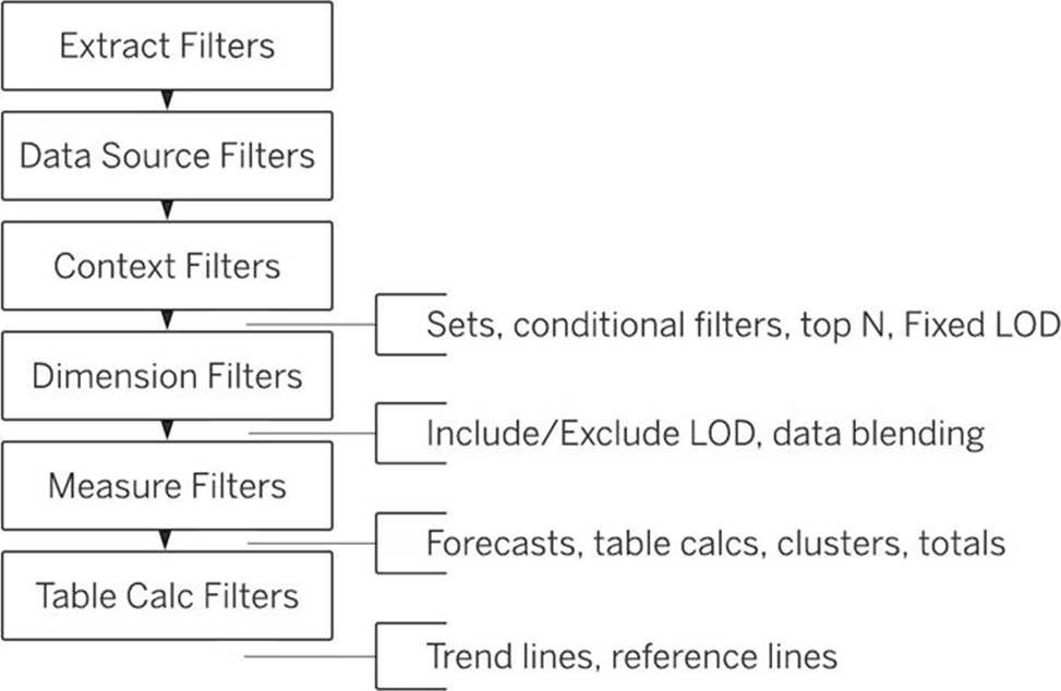

Reference: https://help.tableau.com/current/pro/desktop/en-us/order_of_operations.htm
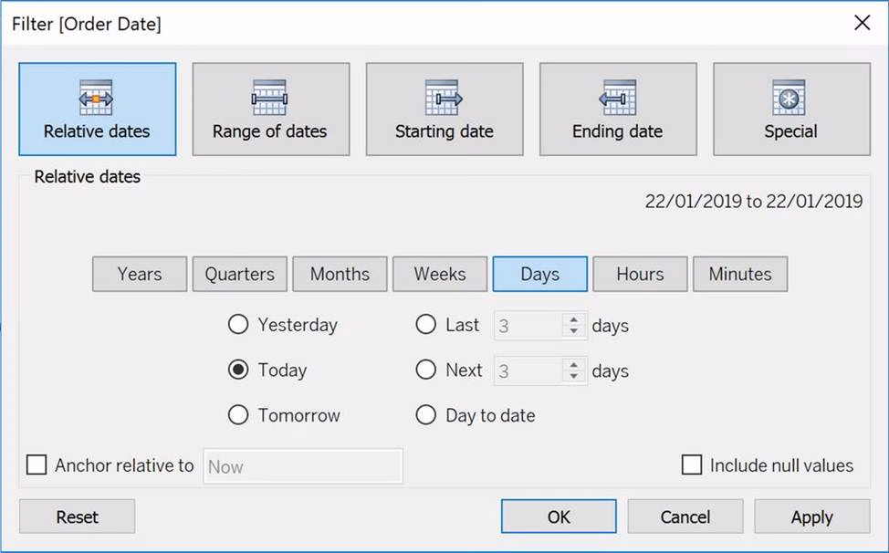
For a relative date filter, the default anchor is _________________
- A . The current time
- B . Today’s date
- C . The target date
- D . The date we specify
B
Explanation:
Relative date filters dynamically update to show a time period relative to when you open the view, such as the current week, the year to date, or the past 10 days. Relative date filters make it easy to create views that always show the most recent data.
Step 1: Drag a date field to the filter shelf
Right-click (control-click on Mac) and drag a date field from the Data window to the Filters shelf. In the Filter Field dialog box, click Relative Date, and then click Next.
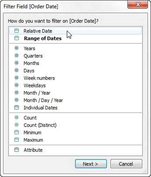

Step 2: Select a time unit
In the Filter dialog box, click Relative dates, and then select the unit of time for the filter.
For example, to show only the three most recent weeks, select Weeks.
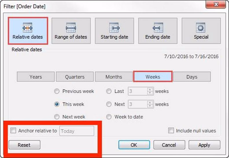

Here, you can clearly see that the default date is TODAY
Reference: https://help.tableau.com/current/pro/desktop/en-us/qs_relative_dates.htm
True or False: To concatenate fields, they must be of same data type
- A . True
- B . False
A
Explanation:
Yes! To concatenate fields, they must be of same data type. However, there is a workaround which we can use – Type casting. See below:
![]()

Here, State and City are Strings, but Postal Code? Nope. It’s an Integer. So we can simply use the STR() function to convert it into a String, and hence the entire equation becomes valid!
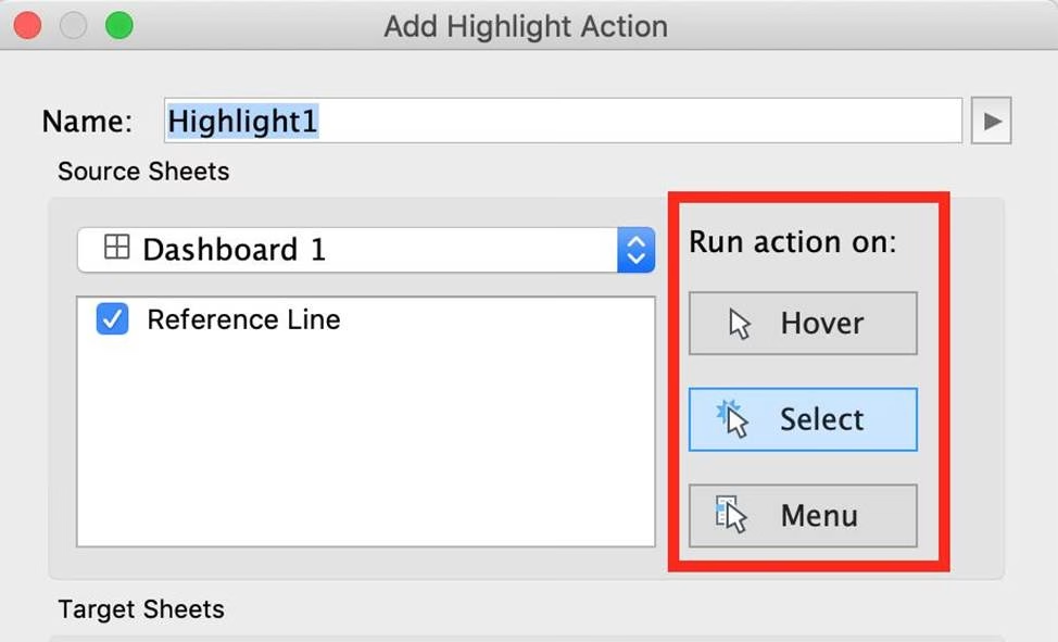
Which of the following are valid ways to trigger actions for a Dashboard?
- A . Hover
- B . Click
- C . Select
- D . Menu
- E . Double click
A, C, D
Explanation:
Whenever we want to add actions to a Dashboard, we can trigger then in the following 3 ways:
1) Select
2) Hover
3) Menu
Hover is best for highlighting, select for filtering. Menu action is added to the tooltip and user can decide whether to run that action or not (best for URL actions)

Reference: https://help.tableau.com/current/pro/desktop/en-us/actions_dashboards.htm
_____________ is a snapshot of the data that Tableau stores locally. Good for very large datasets of which we only need few fields.
- A . Tableau Packaged Workbook (.twbx)
- B . Tableau Workbook (.twb)
- C . Tableau Data Extract (.tde)
- D . Tableau Data Source (.tds)
C
Explanation:
Tableau Data Extract (TDE) is a snapshot of the data that Tableau stores locally. Good for very large datasets of which we only need few fields. Performance is optimised because it queries its own database engine instead of the local data source.
When you create an extract of your data, you can reduce the total amount of data by using filters and configuring other limits. After you create an extract, you can refresh it with data from the original data. When refreshing the data, you have the option to either do a full refresh, which replaces all of the contents in the extract, or you can do an incremental refresh, which only adds rows that are new since the previous refresh.
Extracts are advantageous for several reasons:
1) Supports large data sets: You can create extracts that contain billions of rows of data.
2) Fast to create: If you’re working with large data sets, creating and working with extracts can be faster than working with the original data.
3) Help improve performance: When you interact with views that use extract data sources, you generally experience better performance than when interacting with views based on connections to the original data.
4) Support additional functionality: Extracts allow you to take advantage of Tableau functionality that’s not available or supported by the original data, such as the ability to compute Count Distinct.
5) Provide offline access to your data: Extracts allow you to save and work with the data locally when the original data is not available. For example, when you are traveling.
We can use ______________ as a static tool to open and interact with packaged workbooks with extracted data sources that have been created in Tableau Desktop.
- A . Tableau Reader
- B . Tableau Online
- C . Tableau Server
- D . Tableau Desktop
A
Explanation:
The word ‘static tool’ gives it away.
According to the official website:
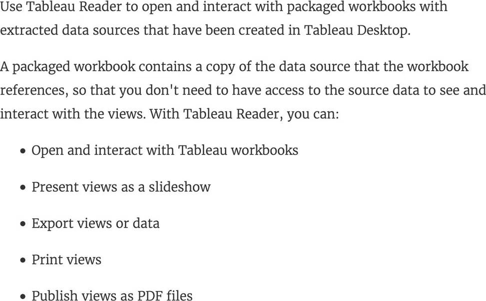

Reference: https://help.tableau.com/current/reader/desktop/en-us/reader_welcome.htm
Which of the following are the options to export the data used to build the view / visualisations?
- A . CSV file
- B . PDF File
- C . JSON format
- D . MS Access Database
AD
Explanation:
You can export the data in a Tableau data source, including all or part of the records from your original data. Alternatively, you can export only the portion of data used to generate the view.
Since the question mentions the data used to build the view, we’ll focus on that:
*Export data in the view to Microsoft Access or .csv*
Export the data that is used to generate the view as an Access database (Windows only) or.csv file (Mac only).
1) In Tableau Desktop, select Worksheet > Export > Data.
2) Select a location and type a name for your Access database or .csv file.
3) Click Save.
4) If you’re on Windows, the Export Data to Access dialog box displays to give you the option to immediately use the new Access database and continue working in Access without interrupting your work flow.
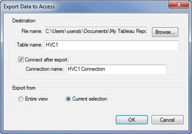

Reference: https://help.tableau.com/current/pro/desktop/en-us/save_export_data.htm
Dates in Tableau are typically treated as ______________
- A . Dimensions
- B . Measures
A
Explanation:
For relational data sources, dates and times are automatically placed in the Dimensions area of the Data pane and are identified by the date or date-time icon.
For example, the Order Date and Ship Date dimensions from an Excel data source are shown below:
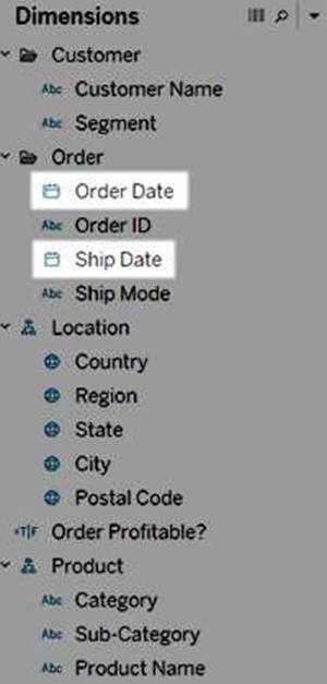

When you place a relational date on a shelf, the field name is automatically modified to reflect the default date level. Tableau defines the default date level to be the level at which there are multiple instances. For example, if the date field includes multiple years, the default level is year. However, if the date field contains data for just one year but includes multiple months, then the default level is month.
Reference: https://help.tableau.com/current/pro/desktop/en-us/dates.htm
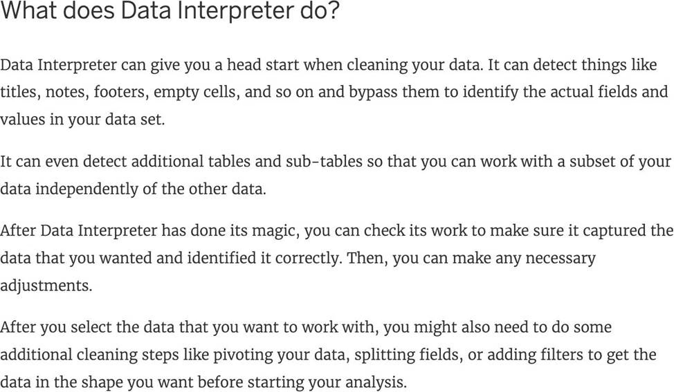
You can use the __________________ in Tableau to clean / organise your data.
- A . Data cleaner
- B . Data manager
- C . Data interpreter
- D . Data organiser
C
Explanation:
When you track data in Excel spreadsheets, you create them with the human interface in mind. To make your spreadsheets easy to read, you might include things like titles, stacked headers, notes, maybe empty rows and columns to add white space, and you probably have multiple tabs of data too.
When you want to analyze this data in Tableau, these aesthetically pleasing attributes make it very difficult for Tableau to interpret your data. That’s where Data Interpreter can help.

Reference: https://help.tableau.com/current/pro/desktop/en-us/data_interpreter.htm
Larger image
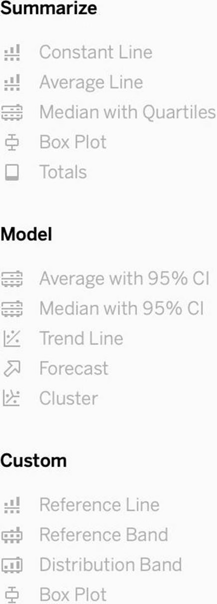

What is this entire view referred to as in Tableau?
- A . Data pane
- B . Analytics Pane
- C . Summary Pane
- D . Distribution Pane
B
Explanation:
Distribution Pane
This is the Analytics pane! Read more from the official documentation below:

Reference: https://help.tableau.com/current/pro/desktop/en-us/environ_workspace_analytics_pane.htm
DOWNLOAD THE DATASET FROM – https://drive.google.com/file/d/1F8L_Rl5B9LAz8RDi-DdjWx3Iv-SgzaBq/view?usp=sharing ( if you haven’t already from the test instructions page! )
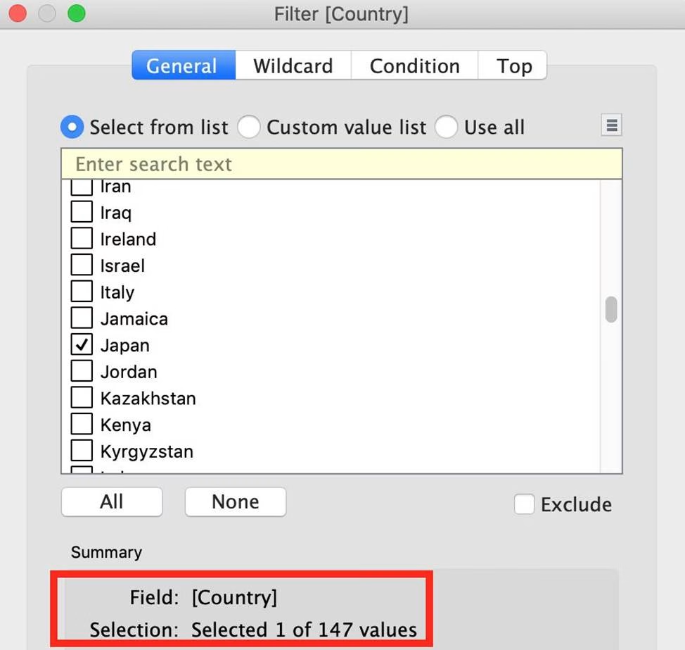
How many different countries are present in the dataset?
- A . 150
- B . 147
- C . 140
- D . 156
B
Explanation:
To reach the correct answer, follow these steps:
1) You can simply drag Country to the view, and look at the marks in the bottom left of Tableau Desktop – 147 marks!
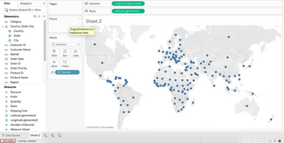

2) Or, you can simply go to Data Source -> Country Tab -> Describe
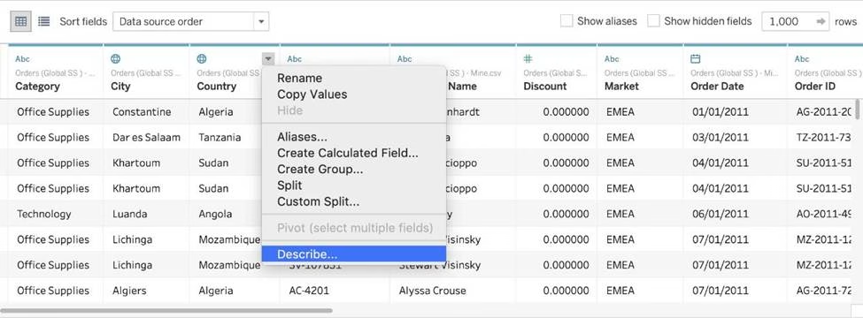

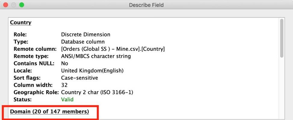

As you can see, 147 members exist in this Country column!
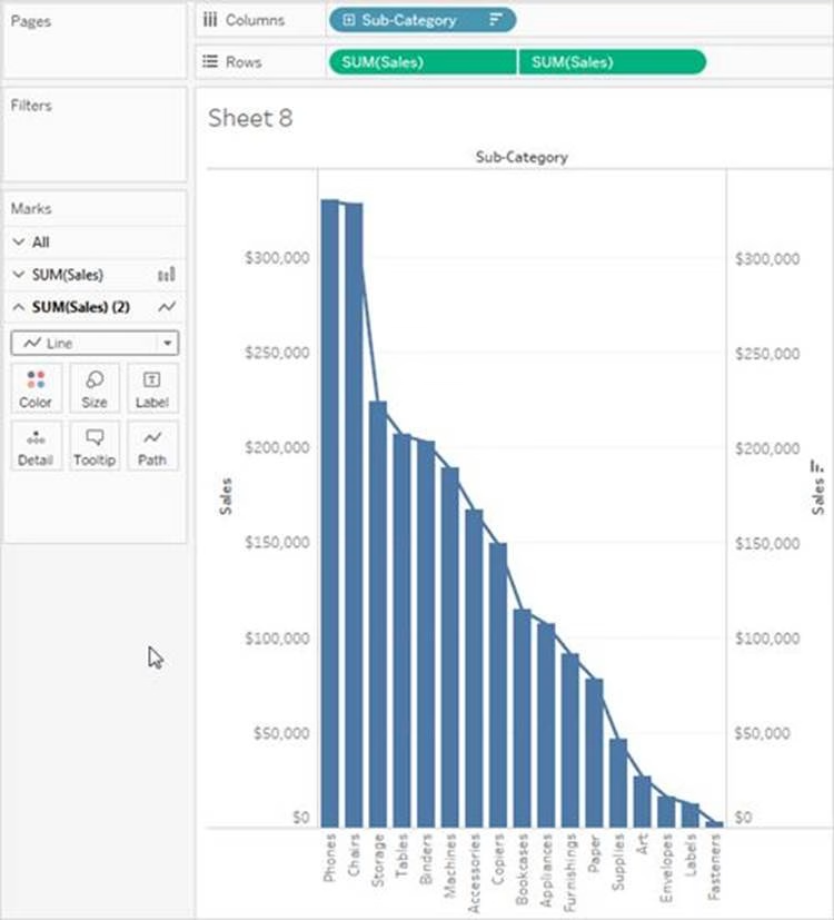
Which Sub-Category had the least Profit in the Office Supplies category?
- A . Fasteners
- B . Labels
- C . Envelopes
- D . Binders
A
Explanation:
To reach the correct answer, follow the steps below:
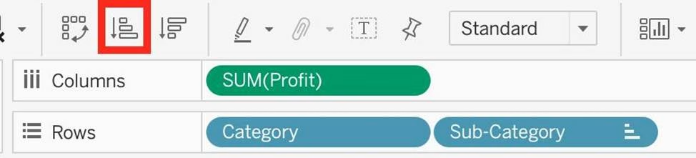

1) Drag Category, and sub-category to the row shelf. Drag Profit to the Column shelf
2) Click the Sort-ascending icon as shown above, to sort the profits from least to greatest as shown: Click the ‘Show mark labels icon’
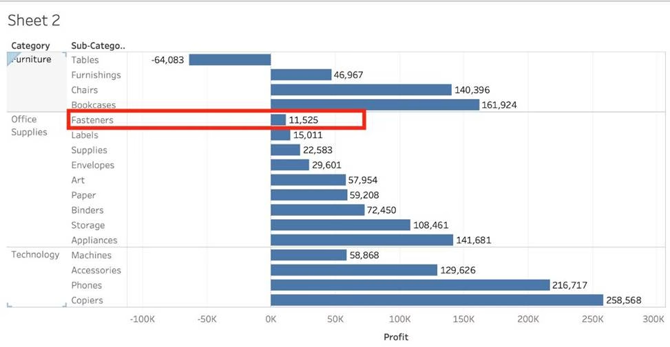
As we can see, Fasteners has the least Profit in the Office Supplies Category, and hence is our correct answer!
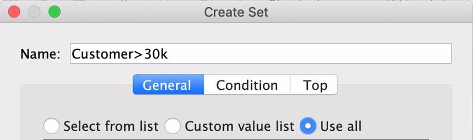
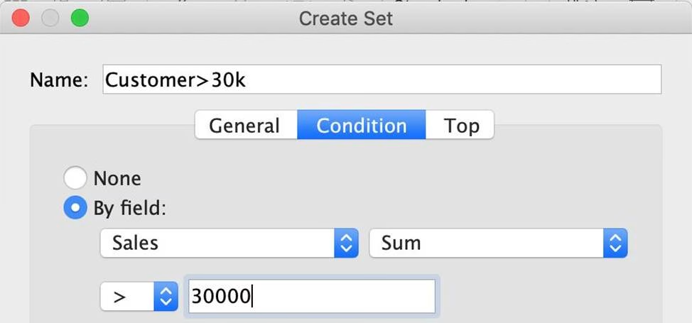
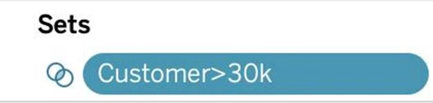
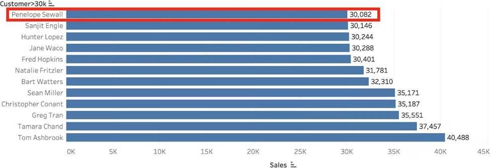
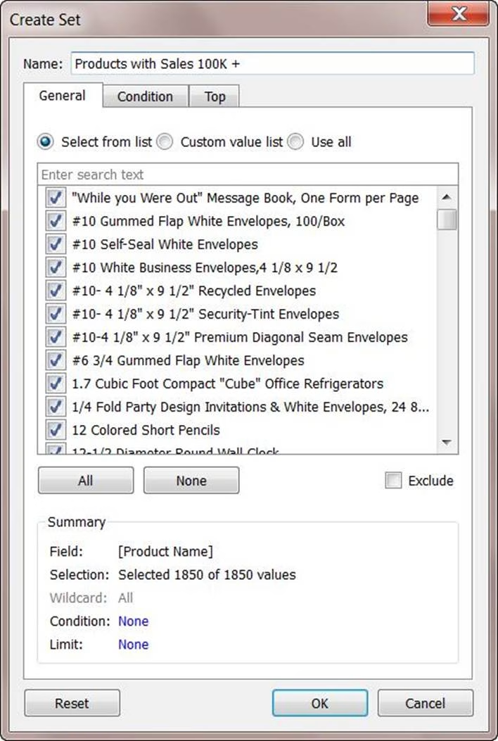
Create a Set containing Customer Names whose Sales are GREATER than 30,000.
Which customer had the LEAST sales in this set?
- A . Tom Ashbrook
- B . Sanjit Engle
- C . Penelope Sewall
- D . Tamara Chand
C
Explanation:
As the question mentions, we need to create a SET with the following conditions -> Choose only those customers whose Sales > 30,000
1) Right click on customer name –> Create –> Set
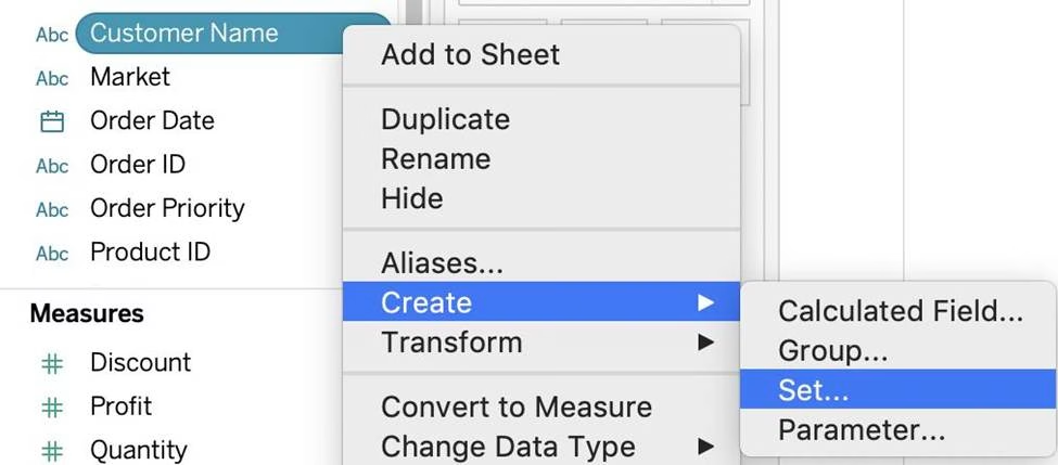

2) Let’s Name the Set – Customer>30k (you can name it anything you want :)) Select USE ALL, and then move to the CONDITION TAB:

3) In the Condition Tab, Choose BY FIELD -> Select Sales -> Sum -> Greater than 30000, and click OK

4) You should now have a new Set in the Data Pane as follows:

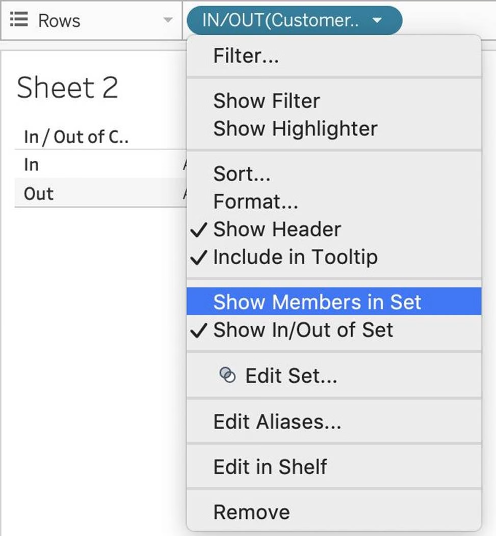
5) Drag this set to the rows shelf, and click on SHOW MEMBERS IN SET. Now drag Sales to the Column Shelf.

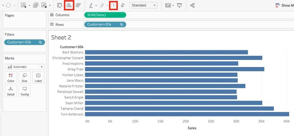
6) Click on the Show Mark Labels, and Sort ascending icons as shown:

7) Voila! We have our answer:

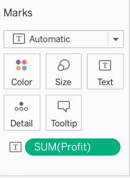
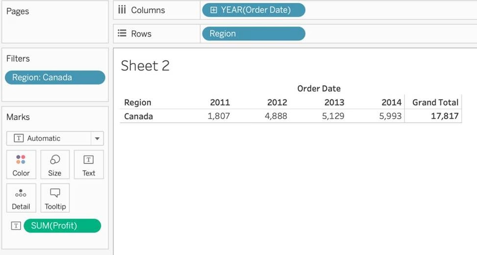
Using the dataset provided, create a crosstab showing the Profit of each Region per Year, then add grand totals to the view.
What was the total Profit for Canada in 2012 and the total Profit for Canada for 2011 through 2014, respectively?
- A . 5,129 and 88,872
- B . 52,678 and 311,404
- C . 1,807 and 34,571
- D . 4,888 and 17,817
D
Explanation:
To reach the correct answer, follow these steps:
1) Drag Order Date (Discrete Year) to the Column shelf, and Region to the Row Shelf as shown:


2) Drag Profit to Text in the Marks Shelf as shown:

3) Click on Analysis as shown -> Totals -> SELECT ROW GRAND TOTALS
The following will be the final view:
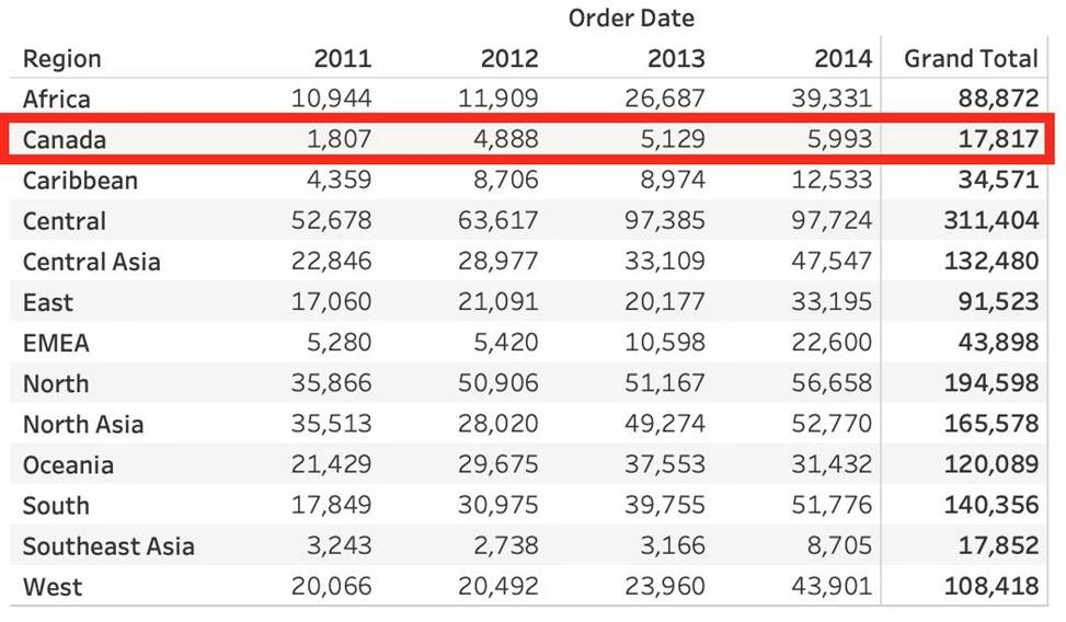

You could also Filter by Region to only Focus on Canada, but that’s your choice:
THEREFORE,
2012 = 4,888
2011 -> 2014 = 17,817
Using the dataset, create a bar chart showing the average Quantity broken down by Region, and filtered by Country to only show Japan.
What was the average Quantity in the State of Tokyo?
- A . 3.000
- B . 3.840
- C . 3.704
- D . 3.500
C
Explanation:
Since we need to focus on 1 country -> Japan, let’s filter on it first as follows:
1) Drag Country to the filter shelf, and choose only Japan. Click OK.

2) Read the Question Carefully, we need to break down the visualisation by Region, then by Country, and then by State. So let’s do that:
Drag Region to the column shelf, followed by Country. Drill down into Country to include
states as well.
Then drag Quantity to the Row Shelf, and change the Aggregation to AVERAGE.
The following is our visualisation:
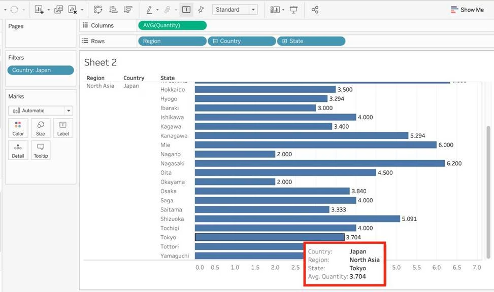

Now that you think of it, EVEN IF YOU REMOVE THE REGION, THE ANSWER REMAINS THE SAME. Such elements will be present in the actual exam too, just to make the question sound a little difficult, but actually it is pretty straightforward 🙂
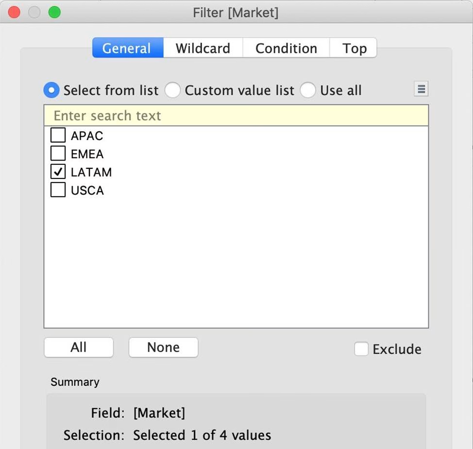
Using the dataset, plot a Map showing all the countries, filtered by Market to only include LATAM.
Which country in the LATAM Market has the highest shipping delay (sum of total number of days between the order date and the ship date)?
- A . Brazil
- B . Peru
- C . Argentina
- D . Mexico
D
Explanation:
VERY IMPORTANT QUESTION FOR THE EXAM, PAY ATTENTION
1) To find the number of days between order date and shipping date, we will make use of a calculated field:
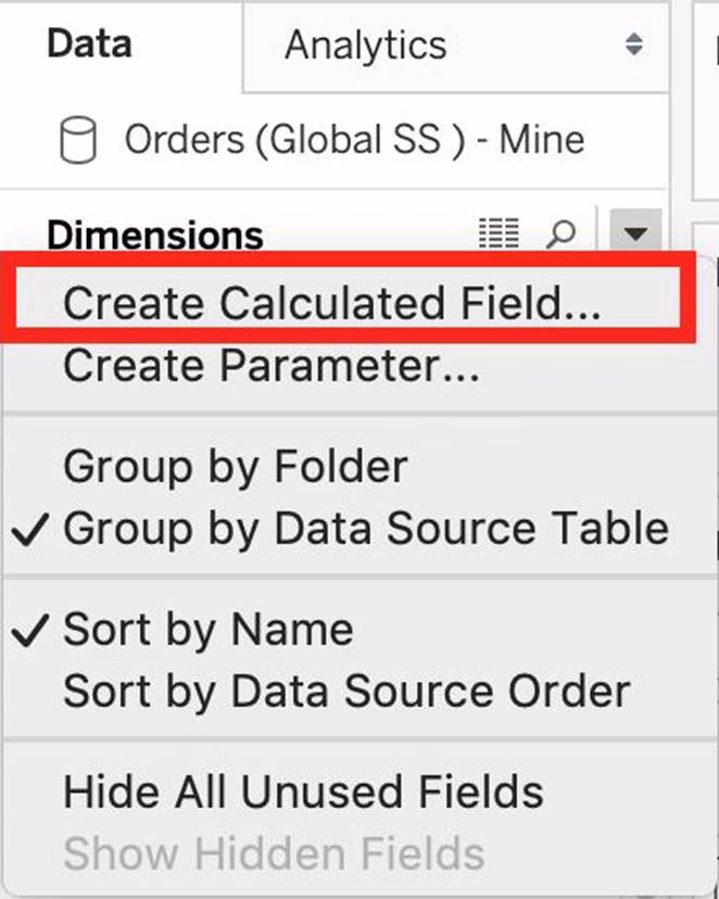

In the data pane, click on the dropdown arrow, and choose create calculated field.
Let’s name this calculated field "ShippingDelay" (you can name it anything you want 🙂 )
2) Use the DATEDIFF() function, and pass it the arguments as follows:
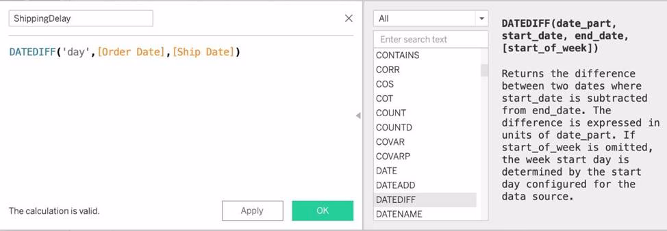

‘day’ depicts that we want to calculate the number of DAYS between the two dates. The first argument is ‘start_date’ which is the ORDER_DATE (day the order was placed), the second argument is ‘end_date’, which is the SHIP_DATE (date the order was shipped). So by subtracting as follows: SHIP_DATE – ORDER_DATE, we can find the delay in shipping.
Click OK.
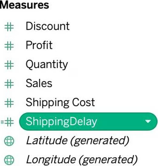
3) You should now have a new measure as follows:

4) Phew! The hard part is done! Now let’s filter by Market to include only LATAM:
5) Drag Country to the view, and the new calculated field ‘ShippingDelay’ to SIZE on the Marks Shelf as follows:
*You can also click on Show Text Labels to be sure that you’re choosing the Largest value*
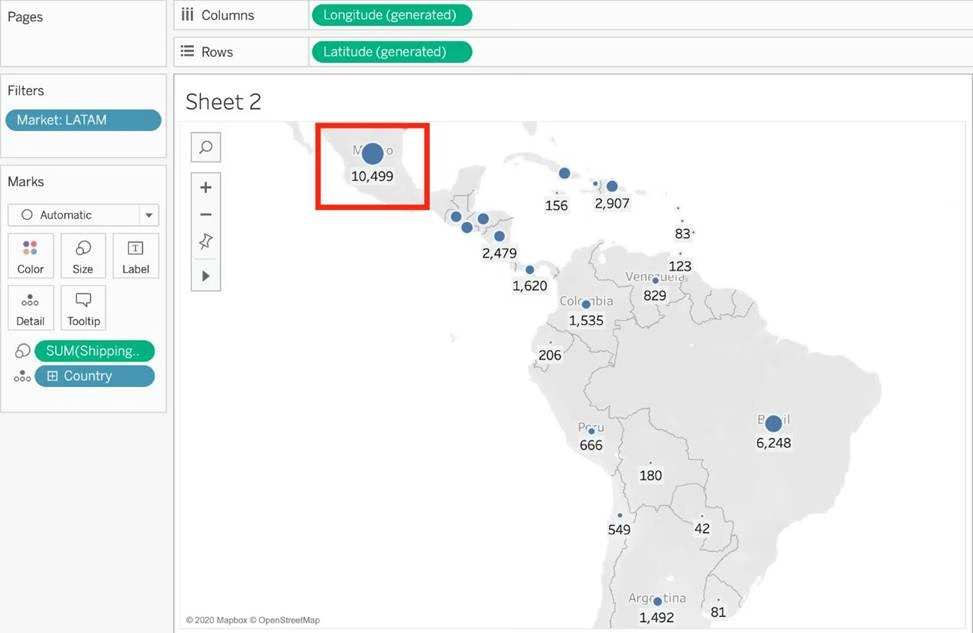

Clearly, Mexico has the highest Shipping Delay!
Is it possible to deploy a URL action on a dashboard object to open a Web Page within a dashboard rather than opening the system’s web browser?
- A . YES, we can do this with the help of a plugin
- B . NO, this is not currently possible in Tableau
- C . YES, we can do this with the help of a Web-Page object
- D . YES, we can do this with the help of Tableau Public
C
Explanation:
To interactively display information from the web INSIDE a dashboard, you can use a URL action with a web page object.
For example, you might have a dashboard that shows profits by country. In addition to showing the profit data in your dashboard, you also want to display supplemental information about the countries from a web site.
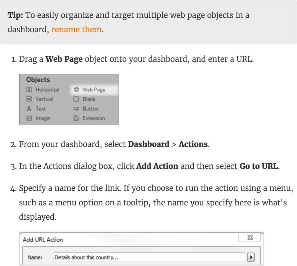

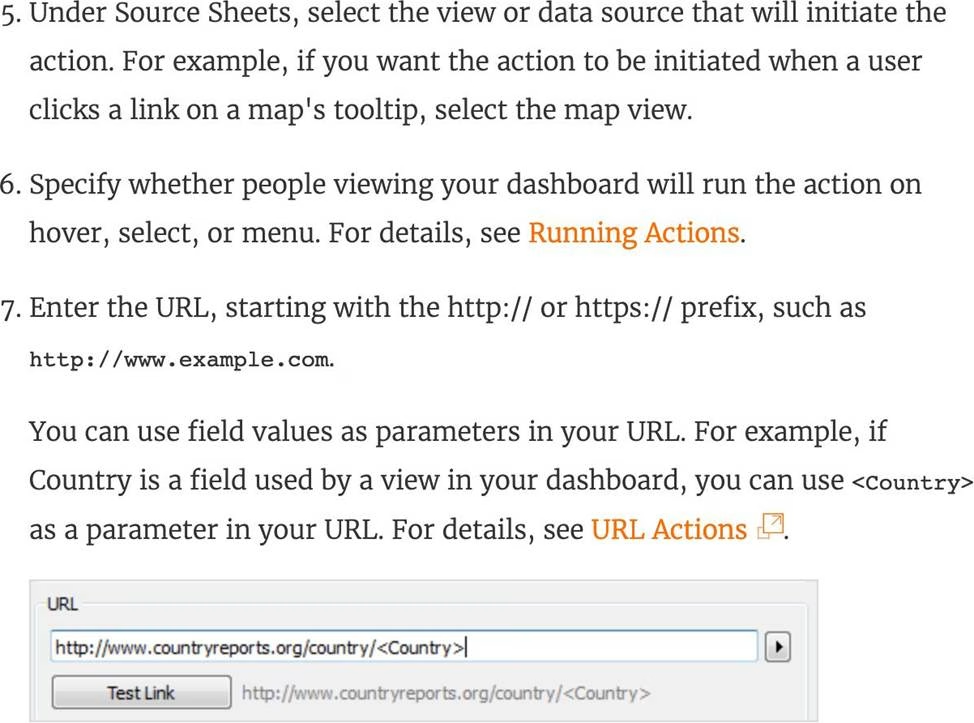

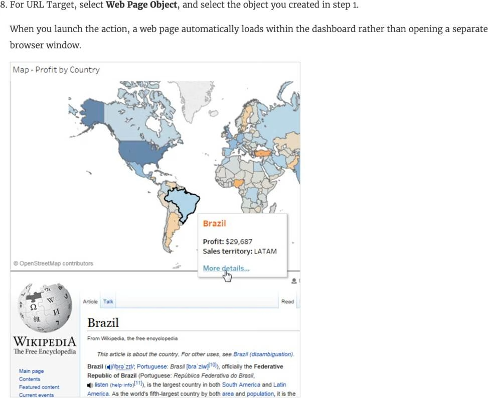

Reference: https://help.tableau.com/current/pro/desktop/en-us/actions_dashboards.htm
How do you identify a continuous field in Tableau?
- A . It is identified by a blue pill in the visualization
- B . It is identified by a green pill in a visualization
- C . It is preceded by a ‘=#’ symbol in the data window
- D . It is preceded by a ‘Abc’ symbol in the data window
B
Explanation:
When you connect to a new data source, Tableau assigns each field in the data source as dimension or measure in the Data pane, depending on the type of data the field contains. You use these fields to build views of your data.
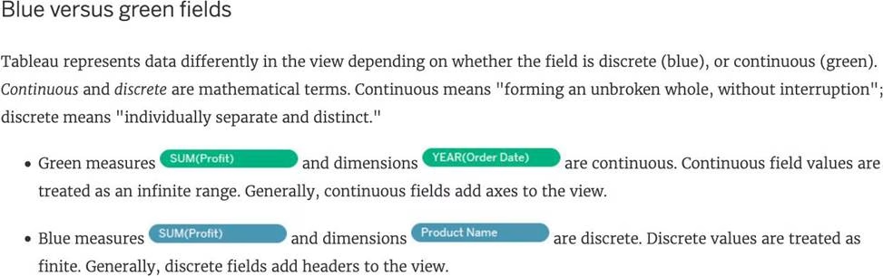

Reference: https://help.tableau.com/current/pro/desktop/en-us/datafields_typesandroles.htm
True or False: Sets can be created on Measures
- A . True
- B . False
B
Explanation:
Sets are custom fields that are created within Tableau Desktop based on dimensions from your data source. They are subsets of your data, which can be created manually or computed. Either dimensions or measures can be used to determine what is included or excluded from a set using conditional logic, but to CREATE a set we use dimensions.

Reference: https://interworks.com/blog/rcurtis/2016/10/26/tableau-deep-dive-sets-introduction-sets/
The icon associated with the field that has been grouped is a ______________
- A . Paper Clip
- B . Globe
- C . Intersection
- D . =#
A
Explanation:
You can create a group to combine related members in a field. The icon associated with a group is a paper clip!
![]()

A field that shows average home values for the United States in 2016 is most likely:
- A . A discrete date part dimension
- B . A continuous date value dimension
- C . A geographical dimension
- D . An aggregated measure
D
Explanation:
This question is directly from the Official Tableau Desktop Specialist exam guide.
Since we are talking about the AVERAGE home values for the United States in 2016, the question is directly offering us a hint that the answer has something to do with aggregation and that too the values tell us that we’re working with MEASURES.
Date part and Date values don’t really make much sense given the question, and neither does geography.
Therefore, the answer naturally is "An aggregated measure".
True or False: Tableau can create worksheet-specific filters
- A . True
- B . False
A
Explanation:
Yes, it is possible to create worksheet-specific filters in Tableau.
When you add a filter to a worksheet, by default it applies to the current worksheet. Sometimes, however, you might want to apply the filter to other worksheets in the workbook.
Then, you can select specific worksheets to apply the filter to or apply it globally to all worksheets that use the same data source or related data sources.
Reference: https://help.tableau.com/current/pro/desktop/en-us/filtering_global.htm
A Tableau Support case can be opened in which of the following valid ways?
- A . Using the Developer Community Forum
- B . Contacting Salesforce using their website
- C . Using the support option on the Tableau website
- D . Using the Tableau learn website
C
Explanation:
It is possible to open a Tableau support case by visiting the following link: https://www.tableau.com/support/case
Which of the following charts types always includes bars sorted in descending order?
- A . Pareto Chart
- B . Pie Chart
- C . Gantt Chart
- D . Stacked Bar Chart
A
Explanation:
A Pareto chart is a type of chart that contains both bars and a line graph, where individual values are represented in descending order by bars, and the ascending cumulative total is represented by the line.
On the primary axis, bars are used to show the raw quantities for each dimension member, sorted in descending order.
On the secondary axis, a line graph is used to show the cumulative total in percent format.

Reference: https://help.tableau.com/current/pro/desktop/en-us/pareto.htm
True or False: It is possible to change the Geographic Role of a dimension
- A . True
- B . False
A
Explanation:
A geographic role associates each value in a field with a latitude and longitude value. Assigning a geographic role based on the type of location (such as state versus postcode) helps ensure that your data is plotted correctly on your map view. For example, you can assign the City geographic role to a field that contains a list of city names.
To assign a geographic role to a field:
In the Data pane, click the data type icon next to the field, select Geographic Role, and then select the geographic role you want to assign to the field.
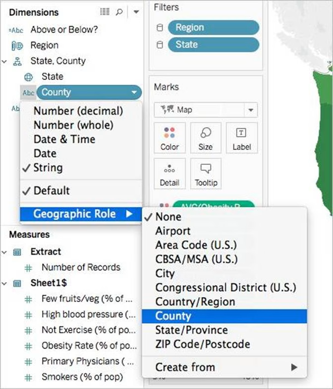

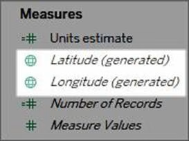
When you assign a geographic role to a field, Tableau adds two fields to the Measures area of the Data pane: Latitude (generated) and Longitude (generated).
These fields contain latitude and longitude values and are assigned the Latitude and Longitude geographic roles. If you double-click each of these fields, Tableau adds them to the Columns and Rows shelves and creates a map view using the Tableau background map.

Reference: https://help.tableau.com/current/pro/desktop/en-us/maps_geographicroles.htm
The calculation [Ship Date] – [Order Date] will return _______________
- A . Number of orders placed in that duration
- B . Number of days between these dates
- C . Number of unique orders placed between these dates
- D . Number of orders shipped between these dates
B
Explanation:
As the names suggest, if we subtract the order date from the shipping date, we simply get the number of days between these 2 dates.
We can these use this calculated field in our charts, and can use COUNT, SUM, AVG etc with them according to our need.
What term is used to describe the following picture?


- A . Larger image
- B . Parameter
- C . Set
- D . Hierarchy
- E . Group
C
Explanation:
When you connect to a data source, Tableau automatically separates date fields into hierarchies so you can easily break down the viz. You can also create your own custom hierarchies. For example, if you have a set of fields named Region, State, and County, you can create a hierarchy from these fields so that you can quickly drill down between levels in the viz.

Reference: https://help.tableau.com/current/pro/desktop/en-us/qs_hierarchies.htm
True or False: A LEFT JOIN or INNER JOIN creates a row each time the join criteria is satisfied, which can result in duplicate rows. One way to avoid this is to use data blending instead.
- A . True
- B . False
A
Explanation:
Joins combine tables by adding more columns of data across similar row structures. This can cause data loss or duplication if tables are at different levels of detail, and joined data sources must be fixed before analysis can begin.

Inner join

Left Join
Blends, unlike relationships or joins, never truly combine the data. Instead, blends query each data source independently, the results are aggregated to the appropriate level, then the results are presented visually together in the view.
Reference: https://help.tableau.com/current/pro/desktop/en-us/multiple_connections.htm
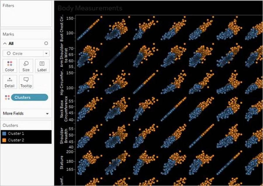
__________ is a technique in Tableau which will identify marks with similar characteristics
- A . Clustering
- B . Grouping
- C . Sets
- D . Union
A
Explanation:
Cluster analysis partitions marks in the view into clusters, where the marks within each cluster are more similar to one another than they are to marks in other clusters.

Reference: https://help.tableau.com/current/pro/desktop/en-us/clustering.htm
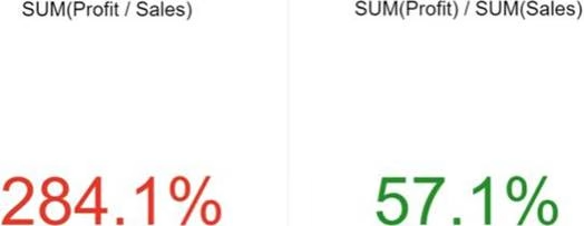
Which of the following is the correct way to calculate Profit Ratio in Tableau?
- A . Profit / Sales
- B . Sales / Profit
- C . SUM(Profit) / SUM(Sales)
- D . SUM(Sales)/SUM(Profit)
C
Explanation:
THIS IS A VERY IMPORTANT QUESTION
Aggregation is an important concept to consider when creating calculated fields. A calculated field for SUM([Profit]) / SUM([Sales]) will give you a very different answer than [Profit] / [Sales], even though both formulas are valid.
If you do not provide the aggregation within the calculated field, Tableau will calculate the equation for every record (row) in your analysis, then aggregate the answers for all of the rows together when the calculated field is added to the view.
In simple terms, if specify the aggregation such as SUM, what Tableau will do is that it will first calculate the sum of the Profit column (say x), then calculate the sum of the Sales column (say y), and then simply apply x/y —> This is what we expect! Perfect!
BUT, if you don’t specify the aggregation, it will go to every single ROW, perform Profit / Sales, and then aggregate the answers calculated for each row. This is simply NOT what we wan’t!
An example:

Reference: https://www.linkedin.com/pulse/tableau-tip-dont-make-error-ratio-calculations-bob-newstadt
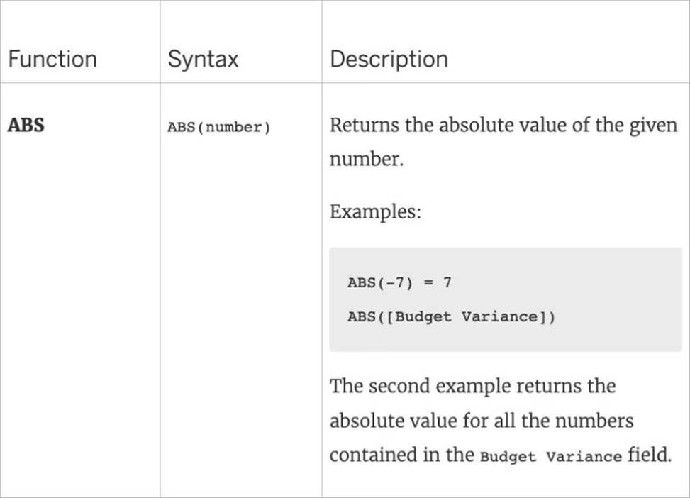
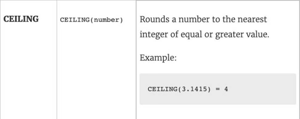
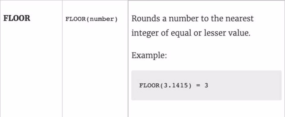
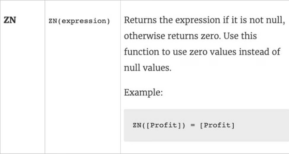
Which of the following returns the Absolute Value of a given number?
- A . ABS(Number)
- B . CEILING(Number)
- C . FLOOR(Number)
- D . ZN(Number)
A
Explanation:
From the official Tableau website:


Reference: https://help.tableau.com/current/pro/desktop/en-us/functions_functions_number.htm
Which of the following 2 columns CANNOT be deleted in Tableau?
- A . Measure Names
- B . Number of Records
- C . Measure Values
- D . Calculated Fields
A, C
Explanation:
Measure names and values CANNOT be deleted in Tableau like other columns can. These are auto-generated.
Calculated Fields, and Number of records can both be deleted.
_____________ contains the visualisations, info needed to build the visualisations, and a copy of the data source.
- A . Tableau Data Extract (.tde)
- B . Tableau Packaged Workbook (.twbx)
- C . Tableau Bookmark (.tbm)
- D . Tableau Workbook (.twb)
B
Explanation:
TWBX is all in one. It contains viz, info needed to build the viz, and a copy of the data source. It doesn’t contain extracts of the data but can contain both live and data extracts.
Best if want to eliminate the barrier of data access.
Create a .twbx with file-based data sources
1) Select File > Save As.
2) Specify a file name for the packaged workbook in the Save As dialog box.

3)Select Tableau Packaged Workbooks on the Save as type drop-down list.
4) Click Save.
5) The default location is the Workbooks folder of the Tableau repository. However, you can save packaged workbooks to any directory you choose.
The following files are included in packaged workbooks: –> Background images
–> Custom geocoding –> Custom shapes –> Local cube files
–> Microsoft Access files
–> Microsoft Excel files
–> Tableau extract files (.hyper or .tde)
–> Text files (.csv, .txt, etc.)
Reference: https://help.tableau.com/current/pro/desktop/en-us/environ_filesandfolders.htm
________________ is hosted by Tableau to share our visualisations publically with the world.
- A . Tableau Reader
- B . Tableau Desktop
- C . Tableau Server
- D . Tableau Public
D
Explanation:
Tableau Public is a free service that lets anyone publish interactive data visualizations to the web.
Visualizations that have been published to Tableau Public (“vizzes”) can be embedded into web pages and blogs, they can be shared via social media or email, and they can be made available for download to other users.
Check it out: https://public.tableau.com/en-us/s/
What will the following function return?
LEFT("Tableau", 3)
- A . An error
- B . Tab
- C . eau
- D . ble
B
Explanation:
The following is the official documentation for the String function LEFT:
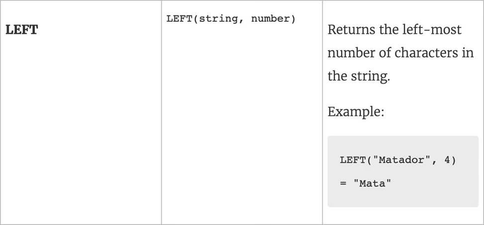

Reference: https://help.tableau.com/current/pro/desktop/en-us/functions_functions_string.htm
The row and column shelves contain ___________________
- A . Pills
- B . Grand Totals
- C . Filters
- D . Parameters
A
Explanation:
We can drag fields from the Data pane to create the structure for your visualizations.
The Columns shelf creates the columns of a table, while the Rows shelf creates the rows of a table.
You can place any number of fields on these shelves.
These FIELDS are also referred to as PILLS. See below:

Reference: https://help.tableau.com/current/pro/desktop/en-us/buildmanual_shelves.htm
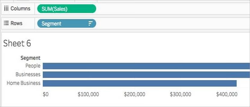
You can create _______________ for members in a dimension so that their labels appear differently in the view.
- A . parameters
- B . duplicates
- C . copies
- D . aliases
D
Explanation:
You can create aliases (alternate names) for members in a dimension so that their labels appear differently in the view.
Aliases can be created for the members of discrete dimensions only. They cannot be created for continuous dimensions, dates, or measures.
To create an alias:
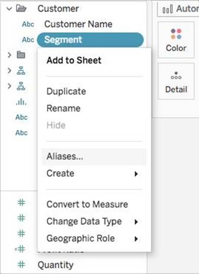

1) In the Data pane, right-click a dimension and select Aliases.
2) In the Edit Aliases dialog box, under Value (Alias), select a member and enter a new name.
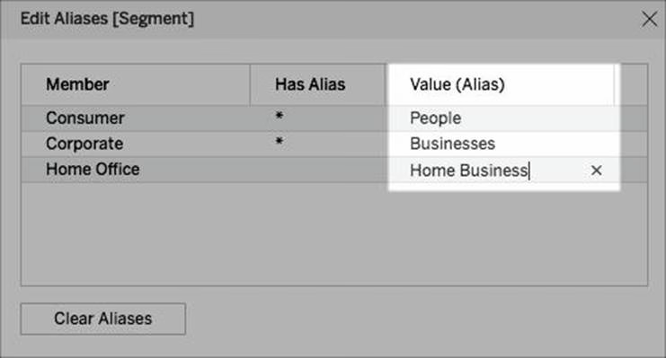

✑ To submit your changes: In Tableau Desktop, click OK.

On Tableau Server or Tableau Online, click the X icon in the top-right corner of the dialog box.
When you add the field to the view, the alias names appear as labels in the view. For example:
Reference: https://help.tableau.com/current/pro/desktop/en-us/datafields_fieldproperties_aliases_ex1editing.htm
You can _______________ your data to combine two or more tables by appending values (rows)
from one table to another
- A . join
- B . blend
- C . concatenate
- D . union
D
Explanation:
You can union your data to combine two or more tables by appending values (rows) from one table to another. To union your data in Tableau data source, the tables must come from the same connection.
For example, suppose you have the following customer purchase information stored in three tables, separated by month. The table names are "May2016," "June2016," and "July2016."
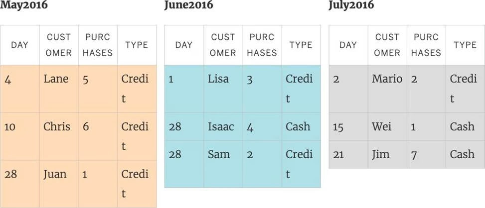

A union of these tables creates the following single table that contains all rows from all tables.
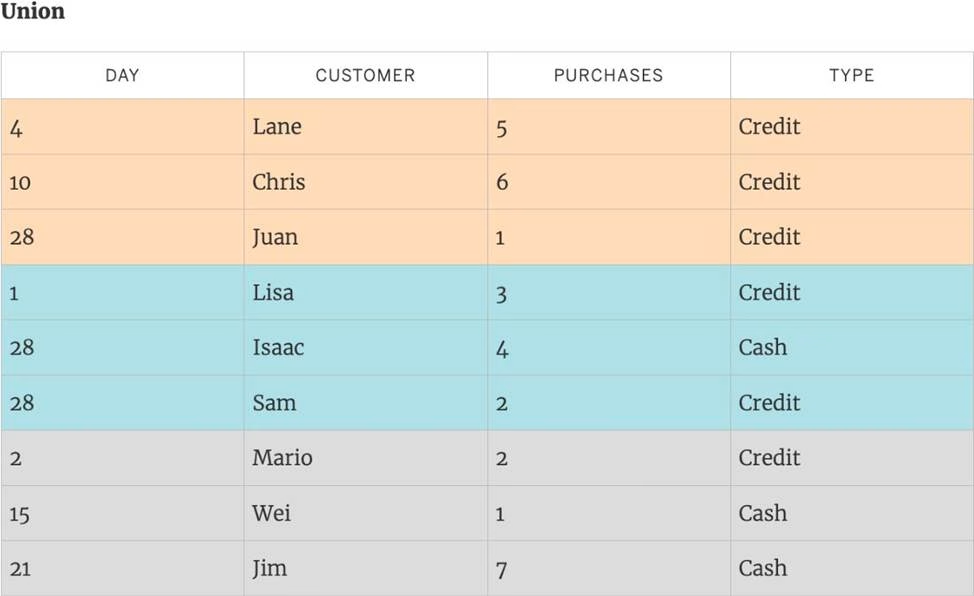

Reference: https://help.tableau.com/current/pro/desktop/en-us/union.htm
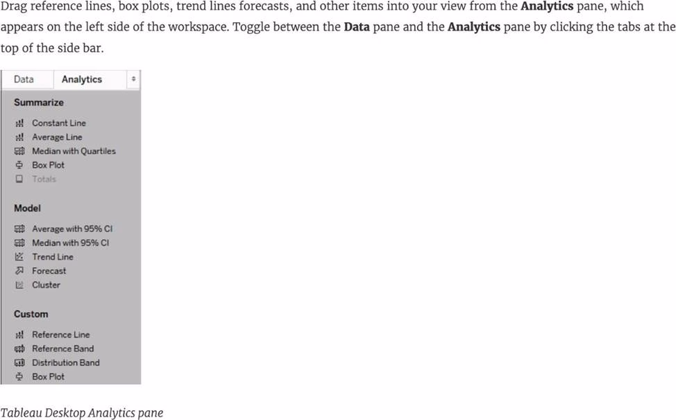
Larger image

What is this view referred to as in Tableau?
- A . Analytics Pane
- B . Window Pane
- C . Data Pane
- D . Dimensions & Measures
C
Explanation:
Tableau displays data source connections and data fields for the workbook in the Data pane on the left side of the workspace.
The Data pane includes:
Dimension fields C Fields that contain qualitative values (such as names, dates, or geographical data). You can use dimensions to categorize, segment, and reveal the details in your data. Dimensions affect the level of detail in the view. Examples of dimensions include dates, customer names, and customer segments.
Measure fields C Fields that contain numeric, quantitative values can be measured. You can apply calculations to them and aggregate them. When you drag a measure into the view, Tableau applies an aggregation to that measure (by default). Examples of measures: sales, profit, number of employees, temperature, frequency.
For more information on what dimensions and measures are, see Dimensions and Measures, Blue and Green.
Calculated fields C If your underlying data doesn’t include all of the fields you need to answer your questions, you can create new fields in Tableau using calculations and then save them as part of your data source. These fields are called calculated fields.
For more information on calculated fields, see Create Custom Fields with Calculations. Sets C Subsets of data that you define. Sets are custom fields based on existing dimensions and criteria that you specify. For more information, see Create Sets.
Named sets from an MS Analysis Services server or from a Teradata OLAP connector also appear in Tableau in this area of the Data pane. You can interact with these named sets in the same way you interact with other custom sets in Tableau.
Parameters C Values that can be used as placeholders in formulas, or replace constant values in calculated fields and filters. For more information, see Create Parameters.
Reference: https://help.tableau.com/current/pro/desktop/en-us/datafields_understanddatawindow.htm
DOWNLOAD THE DATASET FROM: https://drive.google.com/drive/folders/1WXzqsrNmXVdmQ-574wld4InEplyKT8RP?usp=sharing (if you haven’t already)
Using the cwurData table, plot a Map to see which country had the Second highest number of patents in the Year 2013?
- A . United States
- B . France
- C . United Kingdom
- D . Canada
B
Explanation:
Follow along to get the correct answer:
Drag Country to the view, and then Patents to the Size Mark on the Marks shelf as follows:
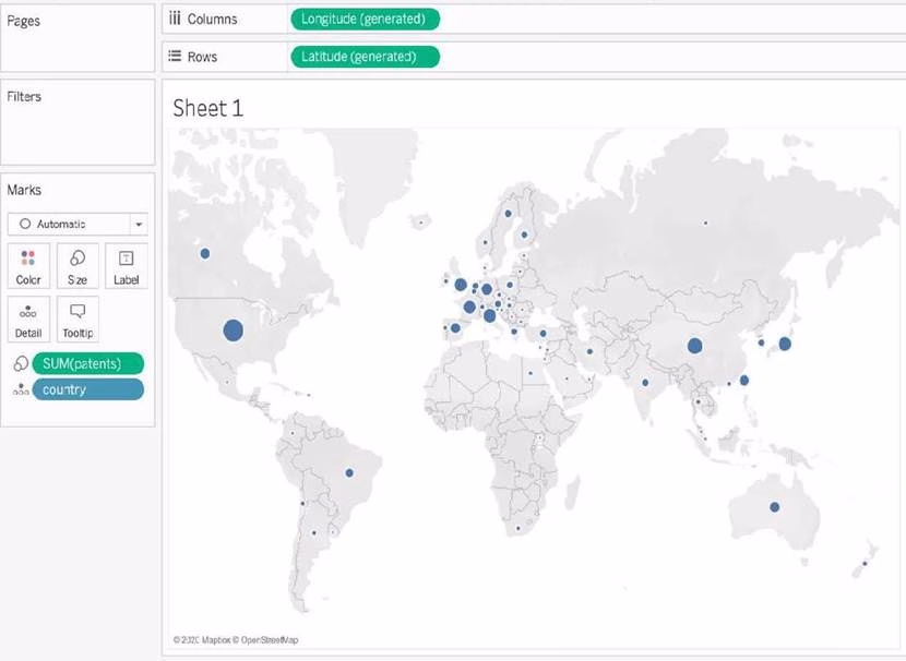

2) But, this isn’t all right? We need to focus on the year 2013.
This can be done by using the year column as it is (continuous) in the filter shelf, or by converting it to discrete first and then using it:
DOWNLOAD THE DATASET FROM: https://drive.google.com/drive/folders/1WXzqsrNmXVdmQ-574wld4InEplyKT8RP?usp=sharing (if you haven’t already)
Using the cwurData table, plot a Map to see which country had the Second highest number of patents in the Year 2013?
- A . United States
- B . France
- C . United Kingdom
- D . Canada
B
Explanation:
Follow along to get the correct answer:
Drag Country to the view, and then Patents to the Size Mark on the Marks shelf as follows:
2) But, this isn’t all right? We need to focus on the year 2013.
This can be done by using the year column as it is (continuous) in the filter shelf, or by converting it to discrete first and then using it:
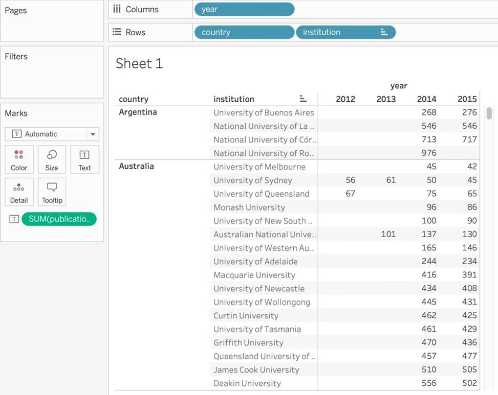
Using the cwurData table, create a cross-tab showing the number of Publications per Country broken down by Institution, and filtered by Country to only show United Kingdown (UK).
For the University of Manchester, what percent of the total publications were contributed in 2014?
- A . 28.415%
- B . 23.497%
- C . 25.683%
- D . 22.404%
D
Explanation:
Phew! Tricky one for sure. This question tests multiple concepts and will help you revise them. We’ll be using filters, as well as quick table calculations (percent of total) for this one.
1) Firstly, let’s drag Country and Institution to the Rows shelf, and year (discrete) to the Columns shelf. Then, drag Publications to the Text Icon in the Marks Shelf.
The following is our view:

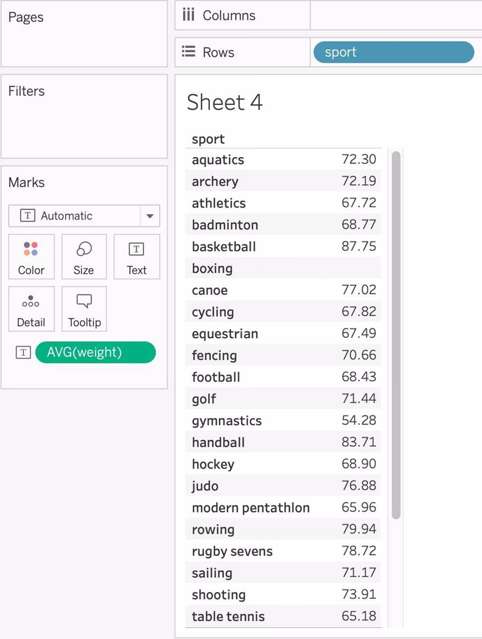
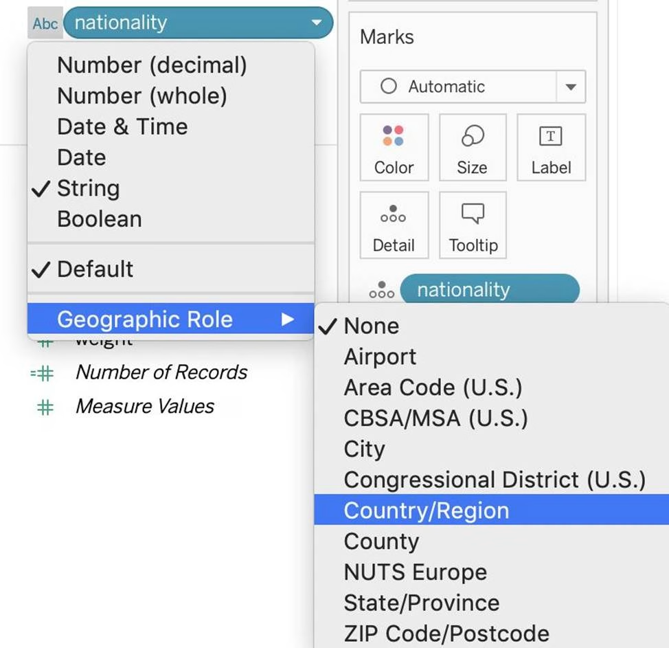
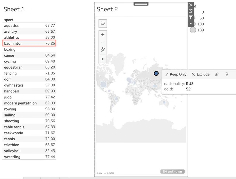
Using the atheletes table:
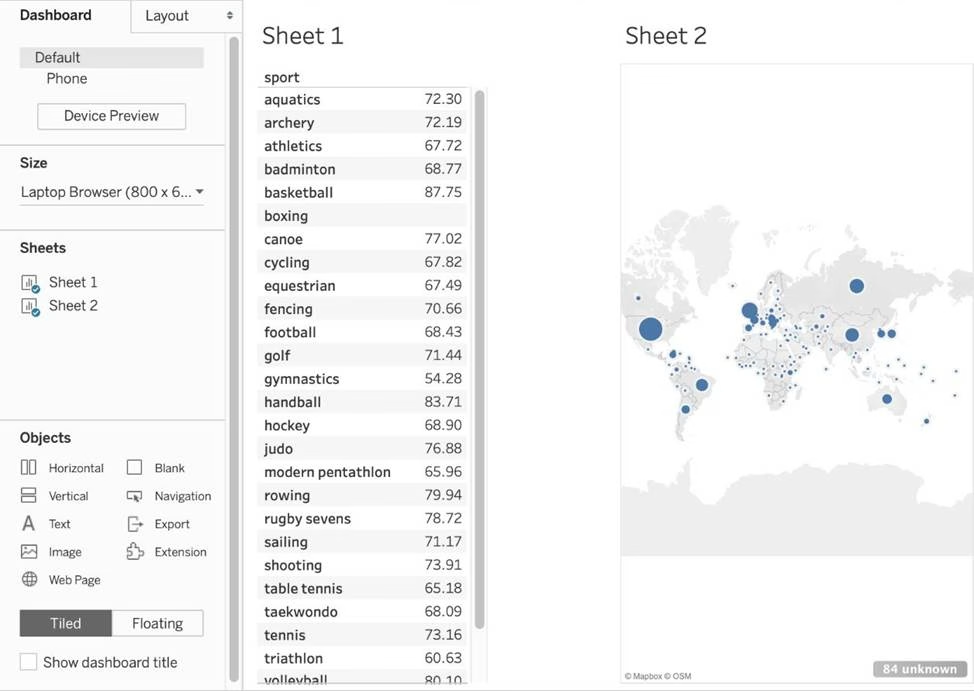
i) Create a sheet with a crosstab showing the Average weight for each sport (Sheet 1)
ii) Create a sheet with a Map showing the Total number of gold medals per Country. Use size as a Mark. (Sheet 2)
Now, Create a Dashboard containing both these sheets, and Use Sheet 2 as a Filter for Sheet 1.
What was the average weight for Badminton in Russia? (Ignore any nulls / unknowns)
- A . 76.25
- B . 65.67
- C . 68.77
- D . 4.87
A
Explanation:
Pretty common question on the Tableau Desktop Specialist exam.
1) First, lets create Sheet 1. For this, drag sport to the Row shelf, and Weight to the Text mark in the Marks shelf. Change its aggregation to Average:

2) Now, for sheet 2 – Drag nationality to the view, and gold to the size mark in the Marks shelf. NOTE: Depending on your version of Tableau, you may need to assign a Geographical role to the nationality column first as follows:

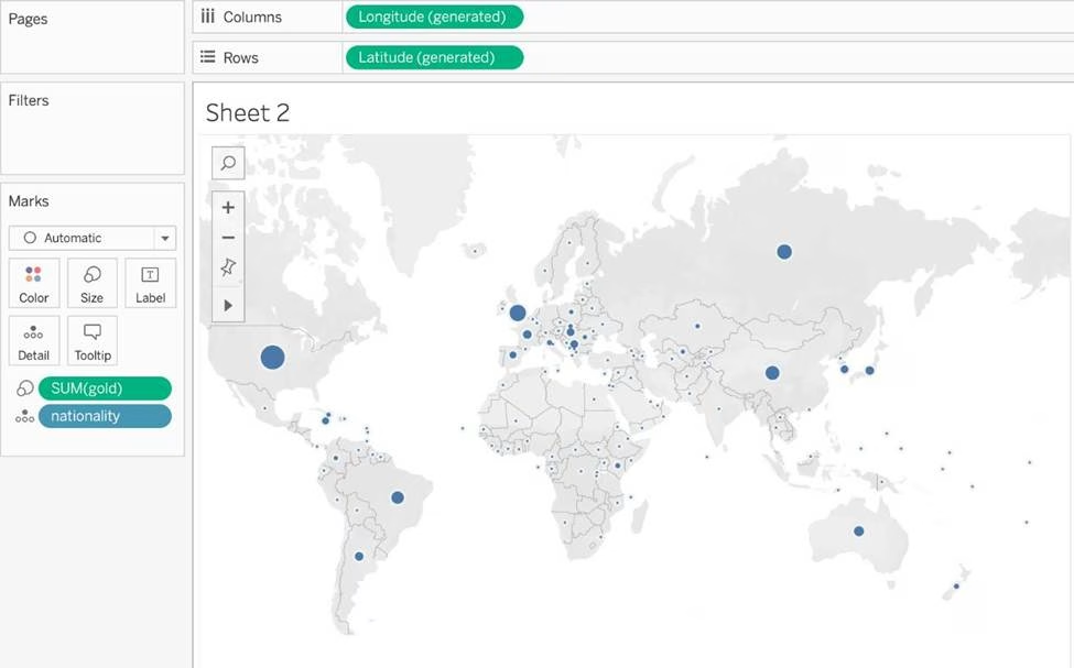

3) Now, let’s create a dashboard, and use both these sheets in it:

4) Now, for the most Important step, use SHEET 2 AS A FILTER FOR SHEET 1 as follows:
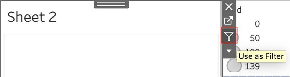

Now simply click on Russia in Sheet 2, and Sheet 1 will automatically update as follows:

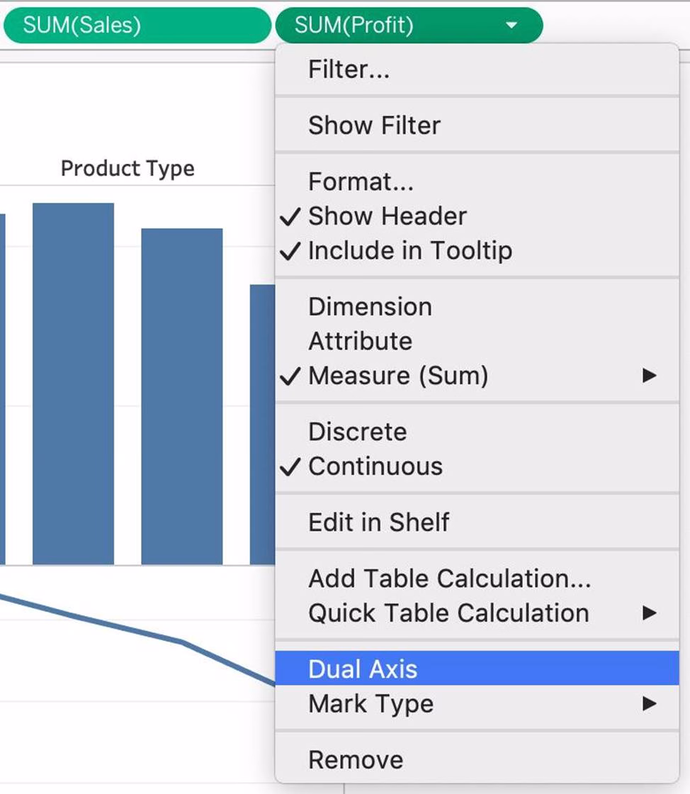
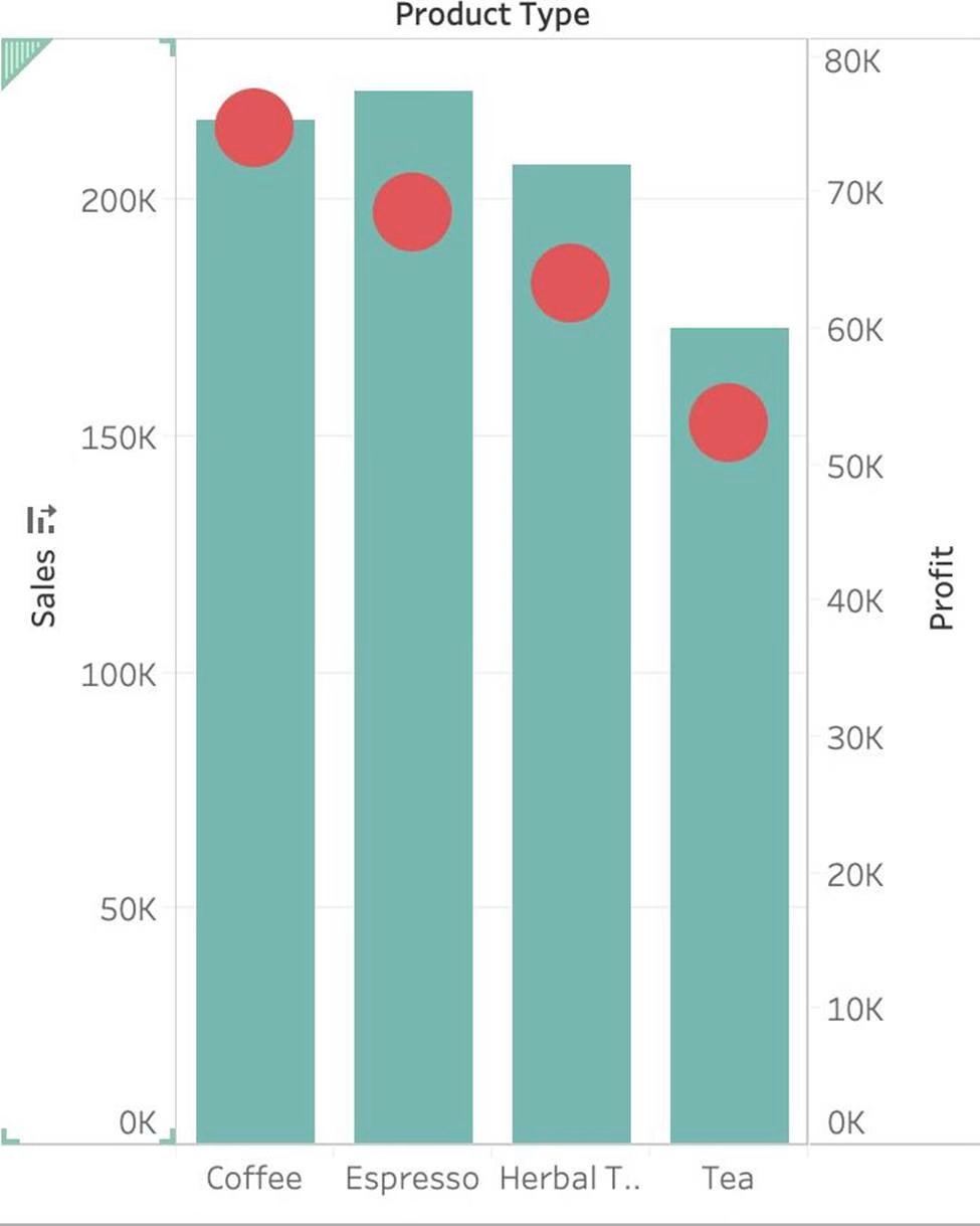
Using the CoffeeChain table, create a Dual Axis chart showing the Sales (Bar chart) and Profit (Line Chart) for each Product type.
What was the Profit for the Herbal Tea product type in 2013?
- A . 68,620
- B . 74,683
- C . 37,455
- D . 46,493
C
Explanation:
If you answered this question quickly and correctly, you’re well prepared for the exam! Most students stumble while creating a Dual axis chart, so go ahead and give yourself a pat on the back!
To create a dual axis chart for the problem mentioned:
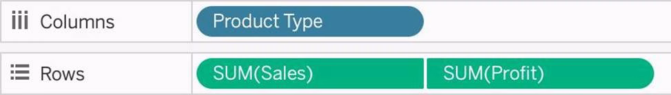
1) Drag Product Type to the column shelf, and Sales and Profit to the Row shelf:

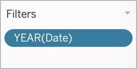
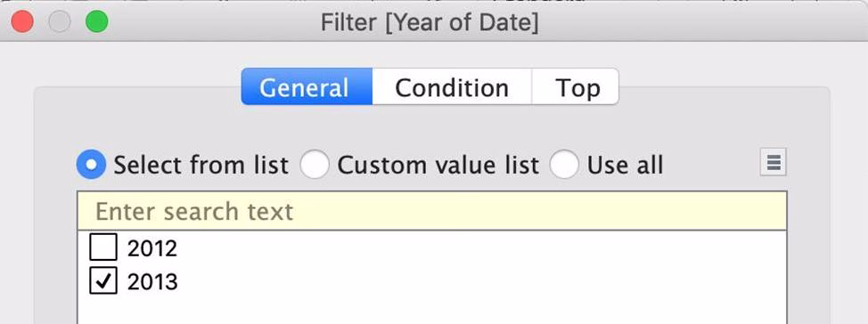
2) Now, to focus on 2013, drag Date to the filter shelf and select only 2013:


3) Now, click on the Profit pill in the Rows Shelf, and select dual axis:

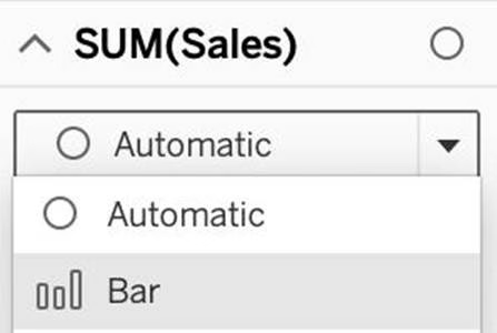
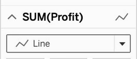
4) Now, in the marks shelf, choose Sales, and change the chart type to bar. Similarly, for Profit, change the chart type to Line.

Now the chart looks like this:

Now we change the Profit chart type to line:

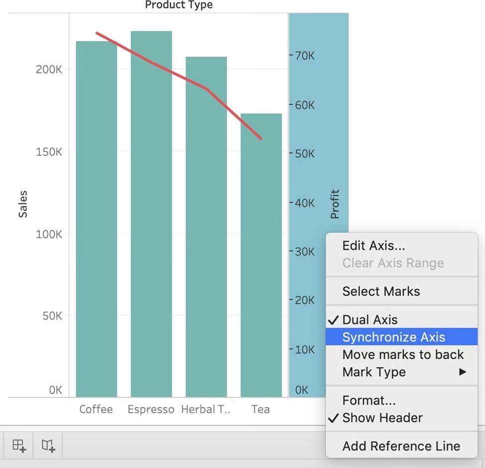

5) Finally, we synchronise the axis as follows: Right click on the axis, and choose ‘Synchronise axis’

And, our final view and answer is:
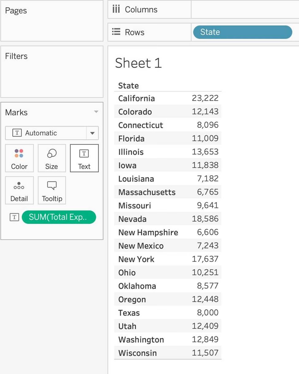
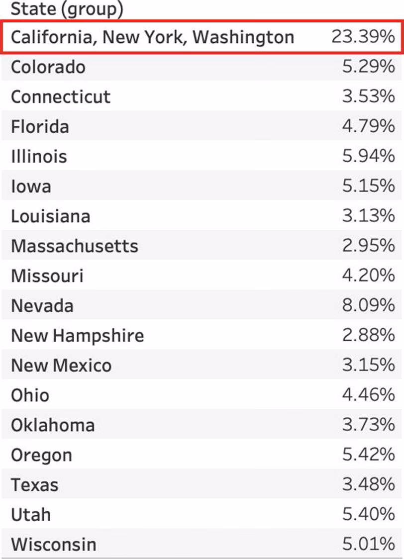
Using the CoffeeChain table, create a crosstab showing the Total Expenses per State and add Column Grand Totals to the view. Now group the states of New York, California and Washington.
What percent of the total sales does this group contribute?
- A . 25.79%
- B . 23.39%
- C . 27.73%
- D . 29.49%
C
Explanation:
We need to use the concept of Groups for this question.
Follow along:
1) First, Drag State to the Rows shelf, and Total Expenses to the Text Mark on the Marks Shelf:

2) Now, remove the SUM aggregation from Total Expenses, and add a quick table calculation -> Percent of total:
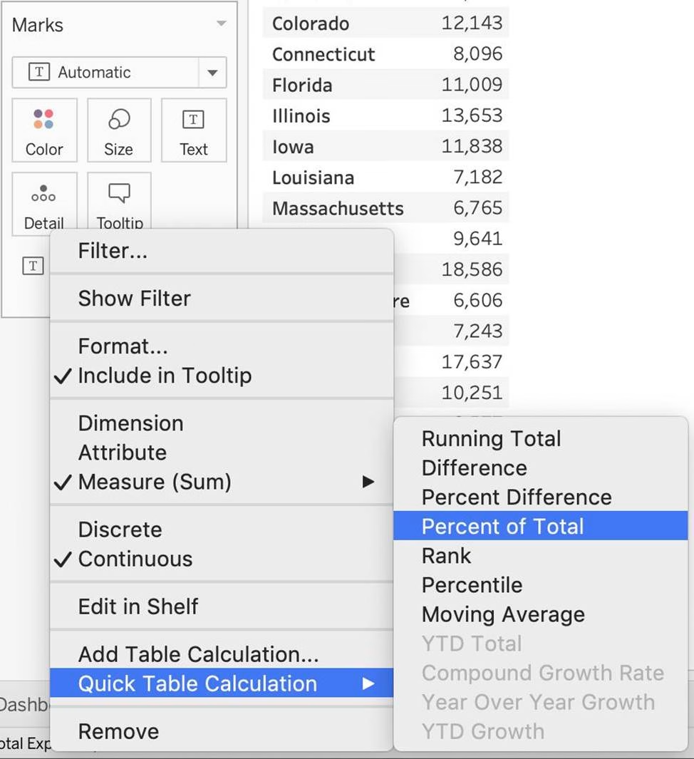

3) Next, Select the States of New York, California and Washington -> And then click the paperclip icon:
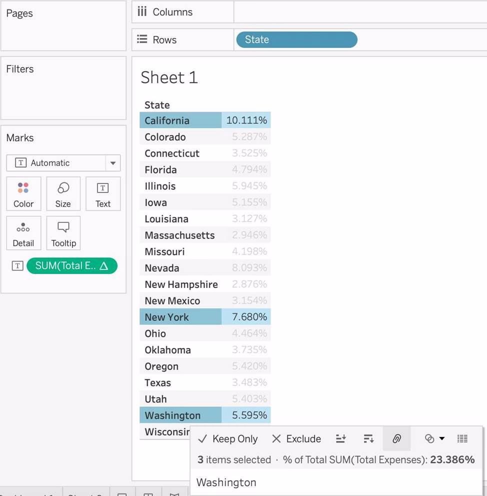

We can see the answer already: 23.386% in the view above (even before grouping!)
4) Finally, we get the following view and our answer:

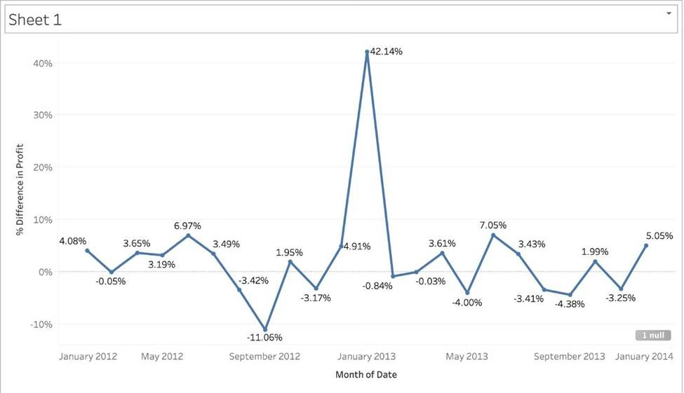
Using the CoffeeChain table, create a chart to see the monthly Percent difference change in Profit, from the beginning of 2012 to the end of 2013.
How many months saw a Negative percent difference in Profit?
- A . 9
- B . 7
- C . 10
- D . 8
C
Explanation:
Follow along to reach the correct answer:
1) First, drag Date to the Column shelf and Profit to the Rows shelf. We need to see the 2 consecutive months over this two year period (2012-2013) so this tells us we need to work with continuous dates:
Click on Date in the Column shelf and convert it to continuous month:

2) Now, click on the Profit pill in the Rows shelf, go to quick table calculation and choose Percent difference:
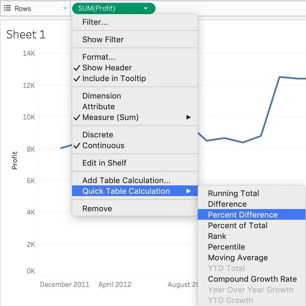

3) Finally, click on the Show mark Labels icon:


4) We finally have our view, and clearly, 10 Months have a NEGATIVE percent difference:

Question 30: Skipped
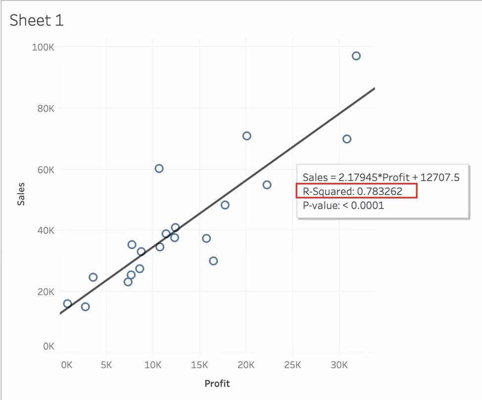
Using the CoffeeChain table, create a scatter plot of Profit (x-axis) vs Sales (y-axis) broken down by State. Add a Linear trend line to the view.
What is its R-squared value?
- A . 0.783262
- B . 0.739284
- C . 0.759329
- D . 0.748472
A
Explanation:
Trend lines have become popular questions in recent Tableau examinations.
Follow along:
1) First drag Sales to the Rows shelf and Profit to the Columns shelf:

You will only see a single mark since the view is aggregated.
2) Now, break down this view by state. Drag State into Detail on the Marks shelf (or directly to the view):

3) Finally, move to the Analytics pane, and drag Trend line to the view.
When you drag it, select the Linear option!:
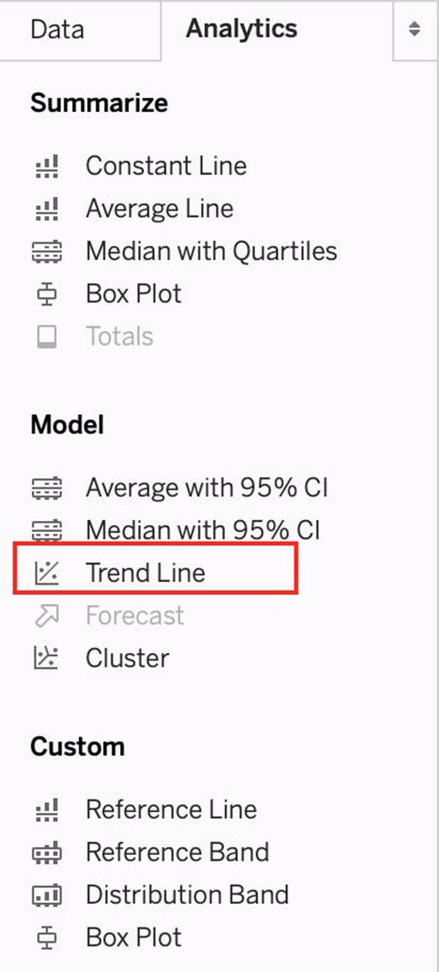

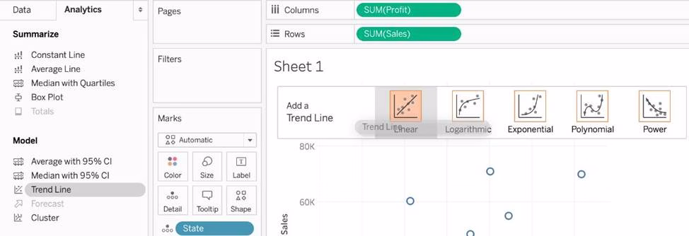
4) The following is our view. Hover over the trend line to see the R-squared value:

For a ____________ sort, no matter how the data changes, the values will always stay in the sort order we kept stuff in.
- A . Random
- B . Manual
- C . Topological
- D . Hierarchical
B
Explanation:
For a manual sort, no matter how the data changes, the values will always stay in the sort order you kept stuff in.
From the official website:
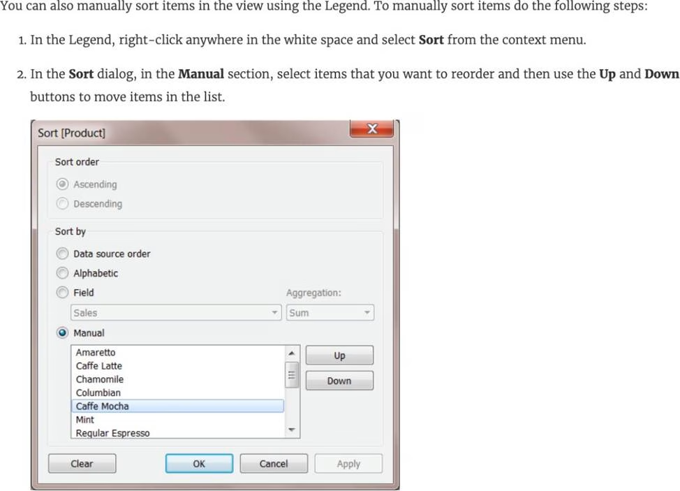

Reference: https://help.tableau.com/current/reader/desktop/en-us/reader_sort.htm
Broadly speaking, after an importing a dataset in Tableau Desktop, all fields in it are broken down into _______________________
- A . Dimensions and Measures
- B . Rows and Columns
- C . Labels and Values
- D . Numbers and Headers
A
Explanation:
When you connect to a new data source, Tableau assigns each field in the data source as dimension
or measure in the Data pane, depending on the type of data the field contains. You use these fields to
build views of your data.
Further,
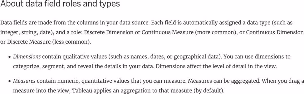

Reference: https://help.tableau.com/current/pro/desktop/en-us/datafields_typesandroles.htm
To connect Tableau to a CSV data source what type of connection should you use?
- A . Spatial
- B . Excel
- C . Text
- D . JSON
C
Explanation:
Tableau recognises a CSV file as a TEXT file, and therefore it is the correct option.
The following are the steps to import a CSV file:
1) From the data connection screen, click on Text:
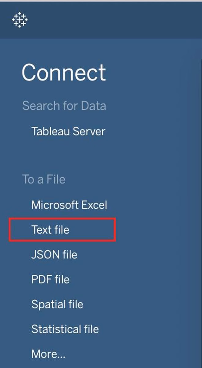

2) Choose the appropriate file, and click Open:
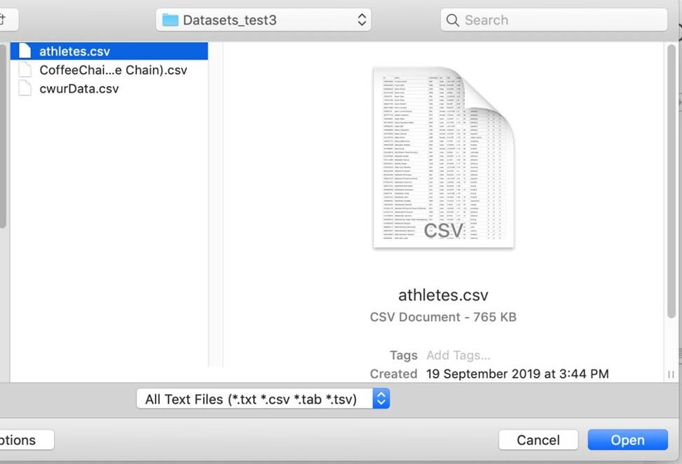

3) Finally, Tableau imports the data as shown below:
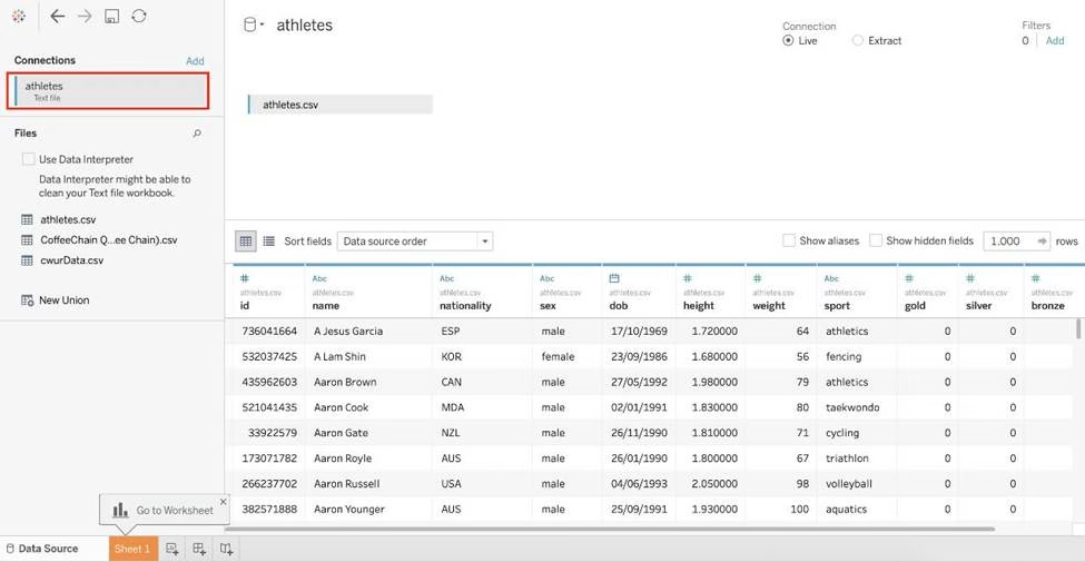

Reference: https://intellipaat.com/community/46338/how-to-import-csv-file-in-tableau
Which of the following are valid ways to copy a worksheet visualisation as an image?
- A . By simply clicking Control + V on the keyboard
- B . By clicking on Worksheet in the Tableau Main Menu above, and choosing Copy->Image
- C . Using the Marks shelf and choosing Copy->Image
- D . By right clicking on the worksheet visualisation and selecting Copy->Image
B, D
Explanation:
The following are 2 correct ways to copy the worksheet visualisation as an image:
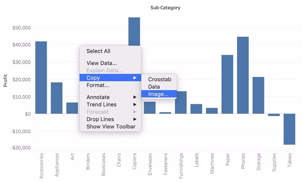

AND
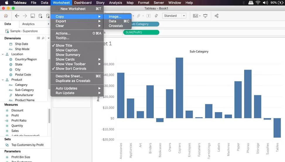
Reference: https://help.tableau.com/current/pro/desktop/en-us/save_export_image.htm
You want to add Custom shapes to your visualisation.
Where can you add these new shapes?
- A . In Downloads -> My Tableau Repository -> Shapes
- B . In My Computer -> C: -> Tableau -> Shapes
- C . In Program Files -> Tableau -> Shapes
- D . In My Documents -> My Tableau Repository -> Shapes
D
Explanation:
Here’s how to add image files to your repository:
1) Find image file on the internet. I try to find consistent image formats if I plan to use a set of shapes such as logos or flags.
2) Download the image to your computer.
3) Drag images into your My Documents -> My Tableau repository -> Shapes folder.
4) Open Tableau and your new shapes will automatically be included in your "edit shapes" menu.
Reference: https://www.tableau.com/about/blog/2016/2/how-use-custom-shapes-filters-your-dashboard-50200
Which of the following is a valid way to create Sets in Tableau?
- A . In the Data pane, right-click a dimension and select Create > Set.
- B . In the Tableau Main Menu, Choose Worksheet and select Create > Set
- C . In the Tableau Main Menu, choose Dashboard and select Create > Set
- D . In the Data pane, right-click a measure and select Create > Set.
A
Explanation:
There are two types of sets: dynamic sets and fixed sets. The members of a dynamic set change when the underlying data changes. Dynamic sets can only be based on a single dimension.
To create a dynamic set:
1) In the Data pane, right-click a dimension and select Create > Set.
2) In the Create Set dialog box, configure your set.
You can configure your set using the following tabs:
General: Use the General tab to select one or more values that will be considered when computing the set.
You can alternatively select the Use all option to always consider all members even when new members are added or removed.

None of the other options exist, and therefore are incorrect answers.
Reference: https://help.tableau.com/current/pro/desktop/en-us/sortgroup_sets_create.htm
Which of the following can you use to create a Histogram?
- A . 2 measures
- B . 1 measure
- C . 2 dimensions
- D . 1 dimension
B
Explanation:
A histogram is a chart that displays the shape of a distribution. A histogram looks like a bar chart but groups values for a continuous measure into ranges, or bins.
The basic building blocks for a histogram are as follows:
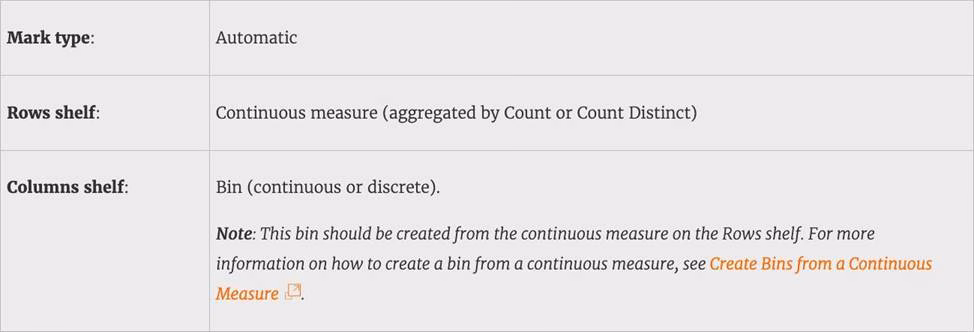


Demo:

Reference: https://help.tableau.com/current/pro/desktop/en-us/buildexamples_histogram.htm
If you see the following Filter, then you’re working with _______________________ Larger image
- A . Grouped Dates
- B . Date Functions
- C . Date Parts
- D . Date Values
D
Explanation:
Dates in Tableau will behave differently depending on whether they are a Datepart (blue) or a Datevalue (green). This affects how the axes display/behave and also how visualisations such as line charts will display. The difference essentially boils down to Dateparts behaving like a dimension as opposed to a measure which is how Datevalues behave. This means that Dateparts behave like discrete categories on the view whereas Datevalues are more like continuous numeric values.
Dateparts are discrete and they behave the same as dimension filters. If all dates are used on the filter then each individual date will be a datepart that can be selected/excluded. This is the same for each level of date, if datepart months is placed on filters January to December will be tick-able options in the filter. This also means that conditions and top/bottom filters can be applied to datepart filters like any other dimension filter. Datevalues placed on filters behave like measure filters. A min and a max date can be set and there is a relative dates option which allows you to choose things like only show the previous 3 months or years etc.

Reference: https://www.thedataschool.co.uk/harry-cooney/tableau-dateparts-vs-datevalues/
Dragging a ______________ to colour creates distinct colours for each item whereas dragging a ______________ to colour creates a gradient
- A . Discrete value, Continuous Value
- B . Geographic Value, Discrete Value
- C . Continuous Value, Discrete Value
- D . Longitude, Latitude
A
Explanation:
Remember that dragging a discrete value to colour creates distinct colours for each item whereas dragging a continuous value to colour creates a gradient. (Same for Map)
From the official documentation:
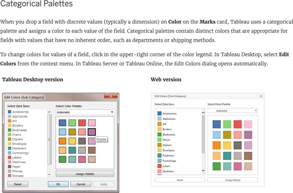


Reference: https://help.tableau.com/current/pro/desktop/en-us/viewparts_marks_markproperties_color.htm
When exporting a worksheet as an image in Tableau, which of the following file formats are available?
- A . Portable Network Graphic (.PNG)
- B . JPEG Image (.JPG, .JPEG)
- C . Tagged Image File Format (TIFF)
- D . Windows Bitmap (.BMP)
A, B, D
Explanation:
The following options are available when an image is Exported:
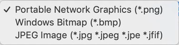

NOTE: When we Copy an image rather than exporting it, then the image is copied to the clipboard in the TIFF file format! However, it is not available when EXPORTING an image.
Reference: https://help.tableau.com/current/pro/desktop/en-us/save_export_image.htm