Tableau TDS-C01 Tableau Desktop Specialist Online Training
Tableau TDS-C01 Online Training
The questions for TDS-C01 were last updated at Nov 23,2024.
- Exam Code: TDS-C01
- Exam Name: Tableau Desktop Specialist
- Certification Provider: Tableau
- Latest update: Nov 23,2024
Using the CoffeeChain table, create a Dual Axis chart showing the Sales (Bar chart) and Profit (Line Chart) for each Product type.
What was the Profit for the Herbal Tea product type in 2013?
- A . 68,620
- B . 74,683
- C . 37,455
- D . 46,493
C
Explanation:
If you answered this question quickly and correctly, you’re well prepared for the exam! Most students stumble while creating a Dual axis chart, so go ahead and give yourself a pat on the back!
To create a dual axis chart for the problem mentioned:
1) Drag Product Type to the column shelf, and Sales and Profit to the Row shelf:
2) Now, to focus on 2013, drag Date to the filter shelf and select only 2013:
3) Now, click on the Profit pill in the Rows Shelf, and select dual axis:
4) Now, in the marks shelf, choose Sales, and change the chart type to bar. Similarly, for Profit, change the chart type to Line.
Now the chart looks like this:
Now we change the Profit chart type to line:
5) Finally, we synchronise the axis as follows: Right click on the axis, and choose ‘Synchronise axis’
And, our final view and answer is:
Data blending simulates a traditional _________________ Join
- A . Inner
- B . Right
- C . Full Outer
- D . Left
D
Explanation:
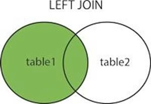
Data blending simulates a traditional left join. The main difference between the two is when the aggregation is performed. A join combines the data and then aggregates. A blend aggregates and then combines the data.
From the official website:
Reference: https://help.tableau.com/current/pro/desktop/en-us/multiple_connections.htm
Question 45: Skipped
You have just created a histogram and now want to be able to change the size of bins dynamically. Using which of the following will easily satisfy your requirement?
- A . Sets
- B . Groups
- C . Calculation
- D . Parameters
D
Explanation:
A parameter is a global placeholder value such as a number, date, or string that can replace a constant value in a calculation, filter, or reference line.
For example, you may create a calculated field that returns True if Sales is greater than $500,000 and otherwise returns False. You can replace the constant value of “500000” in the formula with a parameter. Then, using the parameter control, you can dynamically change the threshold in your calculation.
For example –
Reference: https://help.tableau.com/current/pro/desktop/en-us/parameters_create.htm
True or False: It is possible to change the Geographic Role of a dimension
- A . True
- B . False
A
Explanation:
A geographic role associates each value in a field with a latitude and longitude value. Assigning a geographic role based on the type of location (such as state versus postcode) helps ensure that your data is plotted correctly on your map view. For example, you can assign the City geographic role to a field that contains a list of city names. To assign a geographic role to a field:
In the Data pane, click the data type icon next to the field, select Geographic Role, and then select the geographic role you want to assign to the field.
When you assign a geographic role to a field, Tableau adds two fields to the Measures area of the Data pane: Latitude (generated) and Longitude (generated).
These fields contain latitude and longitude values and are assigned the Latitude and Longitude geographic roles. If you double-click each of these fields, Tableau adds them to the Columns and Rows shelves and creates a map view using the Tableau background map.
Reference: https://help.tableau.com/current/pro/desktop/en-us/maps_geographicroles.htm
A field that shows average home values for the United States in 2016 is most likely :
- A . A discrete date part dimension
- B . A continuous date value dimension
- C . A geographical dimension
- D . An aggregated measure
D
Explanation:
This question is directly from the Official Tableau Desktop Specialist exam guide.
Since we are talking about the AVERAGE home values for the United States in 2016, the question is directly offering us a hint that the answer has something to do with aggregation and that too the values tell us that we’re working with MEASURES.
Date part and Date values don’t really make much sense given the question, and neither does geography.
Therefore, the answer naturally is "An aggregated measure".
Dates in Tableau are typically treated as ______________
- A . Dimensions
- B . Measures
A
Explanation:
For relational data sources, dates and times are automatically placed in the Dimensions area of the Data pane and are identified by the date or date-time icon. For example, the Order Date and Ship Date dimensions from an Excel data source are shown below:
When you place a relational date on a shelf, the field name is automatically modified to reflect the default date level. Tableau defines the default date level to be the level at which there are multiple instances. For example, if the date field includes multiple years, the default level is year. However, if the date field contains data for just one year but includes multiple months, then the default level is month.
Reference: https://help.tableau.com/current/pro/desktop/en-us/dates.htm
Which of the following options best describe measures?
- A . They are categorical, qualitative
- B . They are categorical, quantitative
- C . They are numerical, qualitative
- D . They are numerical, quantitative
D
Explanation:
Data fields are made from the columns in your data source. Each field is automatically assigned a data type (such as integer, string, date), and a role: Discrete Dimension or Continuous Measure (more common), or Continuous Dimension or Discrete Measure (less common).
Dimensions contain qualitative values (such as names, dates, or geographical data). You can use dimensions to categorize, segment, and reveal the details in your data. Dimensions affect the level of detail in the view.
Measures contain numeric, quantitative values that you can measure. Measures can be aggregated. When you drag a measure into the view, Tableau applies an aggregation to that measure (by default).
Reference: https://help.tableau.com/current/pro/desktop/en-us/datafields_typesandroles.htm
________________ can only create header. _______________ will create header and axis both.
- A . Dimensions, Measures
- B . Measures, Dimensions
- C . Groups, Sets
- D . Dates, Strings
A
Explanation:
Using the Sample superstore as a reference:
1) Let’s plot a bar chart showing SUM(Quantity) for each Segment:
2) Right click on the x-axis (Segment):
Notice we don’t have an option to edit the axis, only header. This is because only continous values form the AXIS.
3) Similarly, right click on the y-axis (Quantity):
Now we have the option to edit BOTH the axis and the header.
Reference: https://help.tableau.com/current/pro/desktop/en-us/view_parts.htm
Which of the following are valid ways to show Mark Labels in the visualisation?
- A . Click on the Show mark labels icon in the Toolbar
- B . Drag the measure to the Text label in the Marks Card
- C . Click on Data in the Menu bar and Choose Show Mark Labels
- D . Click on Analysis in the Menu bar and choose Show Mark Labels
A,B,D
Explanation:
The following showcase how you can show mark labels. Using the Sample Superstore dataset:
1) Let’s create a Bar chart showing the sales for each sub-category:
2) Now you can show labels by: