Tableau TDS-C01 Tableau Desktop Specialist Online Training
Tableau TDS-C01 Online Training
The questions for TDS-C01 were last updated at Nov 23,2024.
- Exam Code: TDS-C01
- Exam Name: Tableau Desktop Specialist
- Certification Provider: Tableau
- Latest update: Nov 23,2024
Which of the following are FALSE about Joins?
- A . Joins can be defined at the time of query dynamically
- B . May drop unmatched measure values
- C . They are displayed with Venn diagram icons between physical tables
- D . Joined tables are never merged into a single table.
- E . They are a more dynamic way than relationships to combine data
A,D,E
Explanation:
According to the official documentation:
Joins are a more static way to combine data. Joins must be defined between physical tables up front, before analysis, and can’t be changed without impacting all sheets using that data source. Joined tables are always merged into a single table. As a result, sometimes joined data is missing unmatched values, or duplicates aggregated values.
Joins –
1) Are displayed with Venn diagram icons between physical tables
2) Require you to select join types and join clauses
3) Joined physical tables are merged into a single logical table with a fixed combination of data
4) May drop unmatched measure values
5) May duplicate aggregate values when fields are at different levels of detail
6) Support scenarios that require a single table of data, such as extract filters and
aggregation
Explanation:
Reference: https://help.tableau.com/current/online/en-us/datasource_relationships_learnmorepage.htm
Which of the following shapes does a Heat Map use by default?
- A . Square
- B . Line
- C . Text
- D . Circle
A
Explanation:
By default, the shape that a Heap map uses is a "Square". See below:
Reference: https://help.tableau.com/current/pro/desktop/en-us/buildexamples_highlight.htm
True or False: Trend lines can only be used with numeric or date fields
- A . True
- B . False
A
Explanation:
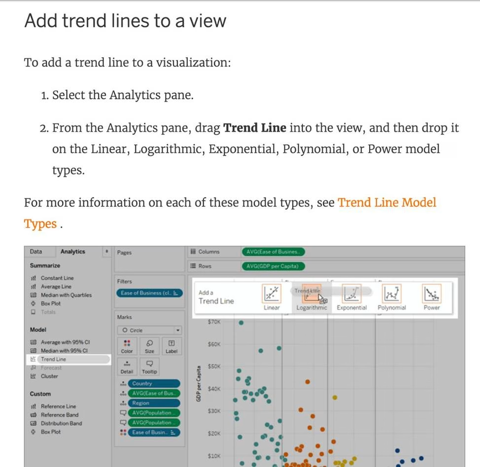
You can show trend lines in a visualization to highlight trends in your data.
To add trend lines to a view, both axes must contain a field that can be interpreted as a number. For example, you cannot add a trend line to a view that has the Product Category dimension, which contains strings, on the Columns shelf and the Profit measure on the Rows shelf.
However, you can add a trend line to a view of sales over time because both sales and time can be interpreted as numeric values.
Reference: https://help.tableau.com/current/pro/desktop/en-us/trendlines_add.htm
Given a map, which of the following fields can be placed in Size,Shape,Detail,Color
- A . Profit, State, Number of Records, Sales
- B . Region, Country, Profit, State
- C . Longitude, Country, State, Sales
- D . Sales, State, Country, Profit
D
Explanation:
Since Sales is a measure, it can easily be depicted via size.
To drill down and change the level of detail, Country is the correct choice since it will contain STATE. We can then depict the various states by different shapes such as circle, square etc.
Finally, the Profit can be depicted via a color! Eg – Red for poor and green for excellent profits!
Reference: https://www.tableau.com/learn/tutorials/on-demand/aggregation-granularity-and-ratio-calculations
Which of the following are True for Measure Names?
- A . It contains all the measures in your data, collected into a single field with continuous values.
- B . When you add it to a view, all of the measure names appear as row or column headers in the view.
- C . When working with a text table showing Profit for each Category,
when you add Sales to the text table (by dragging it and dropping it in the view), the measure names field is automatically dragged to the row and filter shelves. - D . It contains the names of all measures in your data, collected into a single field with discrete values.
B,C,D
Explanation:
It contains all the measures in your data, collected into a single field with continuous values – This is the definition for ‘Measure Values’.
All others are True w.r.t. Measure Names!
The Measure Names field contains the names of all measures in your data, collected into a single field with discrete values.
Graphical user interface, text, application, email
Description automatically generated
Documentation: https://help.tableau.com/current/pro/desktop/en-us/datafields_understanddatawindow_meavalues.htm
Which of the following are valid options to define the scope of a reference line? Choose 3.
- A . Pane
- B . Table
- C . Section
- D . Window
- E . cell
- F . Axis
A,B,E
Explanation:
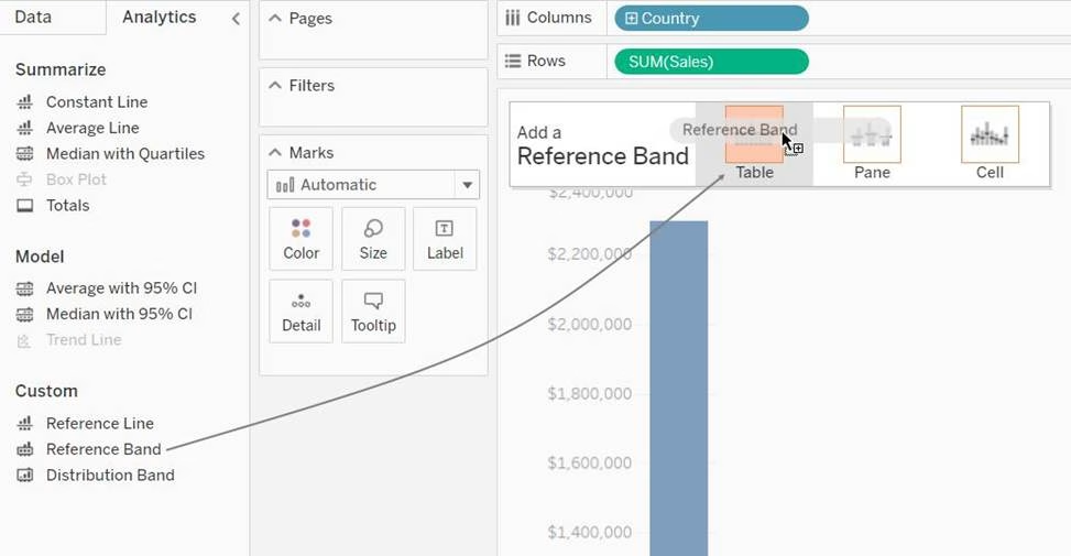
When we create a reference line, we get the following 3 options for the scope:
Graphical user interface, chart
Description automatically generated
Reference: https://help.tableau.com/current/pro/desktop/en-us/reference_lines.htm
You clicked Sheet 1 from the data source page, and now you have opened the Tableau Desktop workspace as shown above.
What is the main thing that you do here?
- A . Clean the data
- B . Preview the data
- C . Create visualisations to analyze your data
- D . Rename the fields and change data types
C
Explanation:
The Tableau workspace consists of menus, a toolbar, the Data pane, cards and shelves, and one or more sheets. Sheets can be worksheets, dashboards, or stories. For details on dashboard or story workspaces, see Create a Dashboard or The Story Workspace.
Graphical user interface, application
Description automatically generated
The main thing you do in the workspace is to create visualisations to analyze your data.
Renaming data fields, cleaning the data, previewing the data can all be done in the Data source window.
Reference: https://help.tableau.com/current/pro/desktop/en-us/environment_workspace.htm
If you see a Blue field, generally it will add _____________ to the view
- A . axis
- B . both
- C . none
- D . headers
D
Explanation:
Important question!
Reference: https://help.tableau.com/current/pro/desktop/en-us/datafields_typesandroles.htm
If you use a percent difference Quick Table Calculation, what value will be the first data value?
- A . null
- B . -1
- C . 0000
- D . 0
A
Explanation:
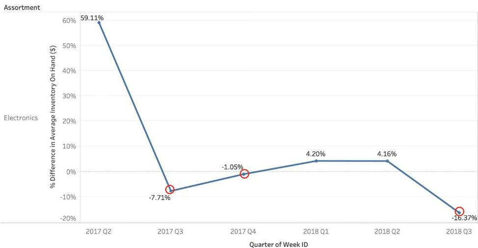
When using a Percent difference, Tableau calculates what the percent change has occured as compared to the last data value. BUT, for the first data value, there is no previous value to compare it to. Hence, it appears as NULL.
Chart, line chart
Description automatically generated
True or False: The Highlighting action can be disabled for the entire workbook.
- A . True
- B . False
A
Explanation:
Yes, it is possible to disable highlighting for the entire workbook.
For more information: https://help.tableau.com/current/pro/desktop/en-gb/actions_highlight.htm