

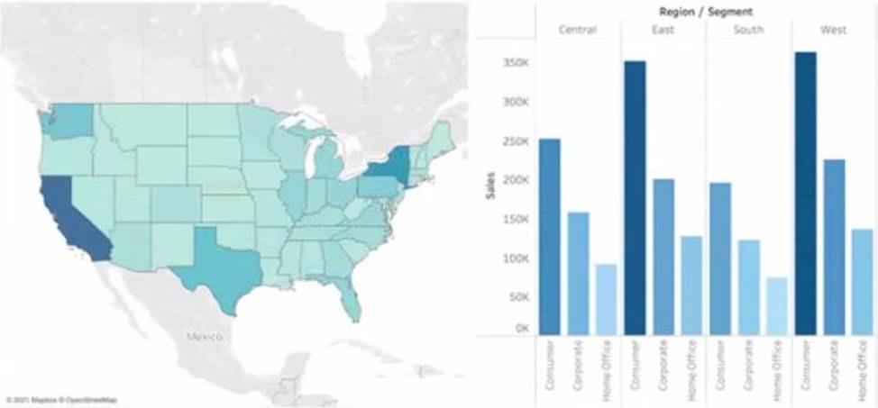
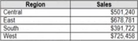
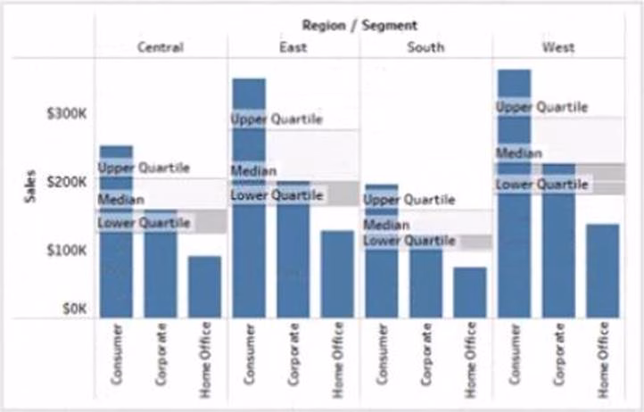
You have the following box plot that shows the distribution of average profits made in every state by region.
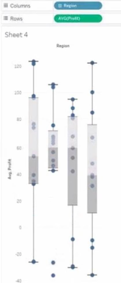

Which region has the smallest distribution of profits?
- A . South
- B . Cast
- C . Central
- D . West
C
Explanation:
The central region has the smallest distribution of profits because it has the smallest interquartile range (IQR), which is the distance between the first and third quartiles of the box plot. The IQR measures the spread of the middle 50% of the data. The smaller the IQR, the less variation in the data.
Reference: https://help.tableau.com/current/pro/desktop/en-us/buildexamples_boxplot.htm https://www.statisticshowto.com/probability-and-statistics/interquartile-range/
HOTSPOT
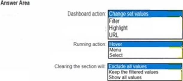
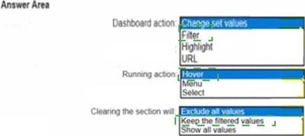
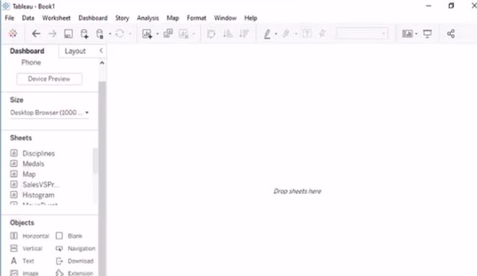
You have the following dashboard.
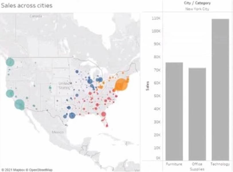

When a user selects a only on the map the data on the bar chart must show only the data for the selected city. The data in the bar chart must change only when the user selects a different city How should you configure the dashboard action? (Use the dropdowns in the Answers Area to select the correct options.)

Explanation:
To configure the dashboard action, you should select Filter as the action type, Select as the run action on option, and All Fields as the target filters option. This will ensure that when a user selects a city on the map, the bar chart will show only the data for the selected city based on all fields in common between the two worksheets. The action will run only when the user selects a different city.
Reference:
https://help.tableau.com/current/pro/desktop/en-us/actions.htm https://help.tableau.com/current/pro/desktop/en-us/actions_filter.htm
You have the following dashboard that contains two visualizations.

You want to show only visualization at time. Users must be able to switch between visualizations.
What should you me?
- A . A parameter and a calculated filed
- B . Worksheet actions
- C . Showhide buttons
- D . Dashboard actions
A
Explanation:
Showhide buttons are a feature that allows you to show or hide a layout container on a dashboard. You can use showhide buttons to create a toggle effect that switches between two visualizations. You need to place each visualization in a separate layout container and then add a showhide button for each container. You can customize the appearance and behavior of the buttons to suit your needs.
Reference:
https://help.tableau.com/current/pro/desktop/en-us/dashboards_organize_floating_layoutcontainers.htm
https://help.tableau.com/current/pro/desktop/en-us/dashboards_showhide.htm
You publish a dashboard tut uses an attract. The extract refreshes every Monday at 10:00.
You need to ensure that the extract also refreshes on the last day of the month at 18:00.
What should you do?
- A . From Tableau Desktop, open the Publish Workbook dialog box and configure the schedule.
- B . From Tableau Server select the workbook select Refresh Extracts and then add a new extract refresh
- C . From Tableau Server. select Schedules find the schedule of the extract, and change the frequency to the Last day of the month
- D . From Tableau Server. select Schedules and change the priority of the existing schedule
B
Explanation:
To refresh an extract on Tableau Server, you need to select the workbook, select Refresh Extracts, and then add a new extract refresh. You can specify the frequency and time of the refresh, as well as any custom options. You can have multiple extract refreshes for the same workbook with different schedules.
Reference:
https://help.tableau.com/current/server/en-us/refresh_extracts.htm
https://help.tableau.com/current/server/en-us/refresh_extracts_add.htm
On Tableau Server, you can manage the scheduling of extract refreshes by selecting the specific workbook and configuring additional refresh schedules as needed. This allows for multiple refresh
A colleague provides you with access to a folder that contains the following files:
• Sates.csv
• Bookl.twb
• Sates.hyper
• Export.mdb
Which He contains an extract?
- A . Export mdb
- B . Book1.twb
- C . Sales.hyper
- D . Sales.csv
C
Explanation:
You have the following tiled dashboard that has one sheet.

You want to replace fit sheet with Sheet2.
What should you do?
- A . Right-click Sheet2 and select Add to Dashboard.
- B . Select Sheets and click the Swap Sheet button next to Sheet2.
- C . From the context menu of Sheet3. select Remove Dashboard item
- D . Drag Sheet2 to the dashboard.
- E . From the context menu of Sheet3. select Deselect
B
Explanation:
To replace a sheet on a tiled dashboard, you can simply drag the new sheet from the Sheets pane to the dashboard and drop it over the existing sheet. This will replace the old sheet with the new one and keep the same size and position. Alternatively, you can right-click on the old sheet and select Replace Data Source, then choose the new sheet from the list.
Reference:
https://help.tableau.com/current/pro/desktop/en-us/dashboards_organize_floating_layoutcontainers.htm
https://help.tableau.com/current/pro/desktop/en-us/dashboards_replace_datasource.htm
You have the following line chart that shows the average sales by month.
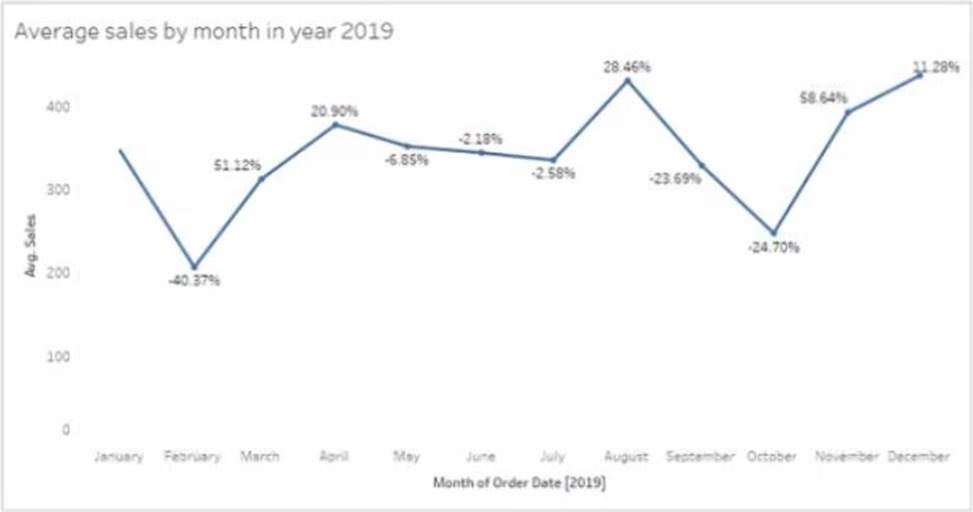

Which month had the biggest increase in swage sales compared to me previous month in 2019?
- A . August
- B . October
- C . December
- D . November
B
Explanation:
To find the month that had the biggest increase in average sales compared to the previous month in 2019, you need to compare the slopes of the line segments between each pair of months. The steeper the slope, the greater the increase. Based on the line chart, October had the steepest slope, meaning it had the biggest increase in average sales compared to September in 2019.
Reference:
https://help.tableau.com/current/pro/desktop/en-us/buildexamples_line.htm https://www.mathsisfun.com/algebra/line-equation-slope.html
You are the owner of an alert.
You receive an email notification that the alert was suspended
From where can you resume the suspended alert?
- A . The Data Source page of Tableau Desktop
- B . The Notification area of Tableau Prep
- C . The My Content area of Tableau web pages
- D . The Shared with Ma page
C
Explanation:
To resume a suspended alert, you need to go to the My Content area of Tableau web pages, where you can see all the alerts that you own or subscribe to. You can click on the alert name and then select Resume from the menu. You can also edit or delete the alert from there.
Reference:
https://help.tableau.com/current/pro/desktop/en-us/alerts.htm https://help.tableau.com/current/pro/desktop/en-us/alerts_manage.htm
HOTSPOT
You have the following dataset.
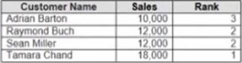

Yon need to calculate the ranking shown in the Rank field.
How should you complete the formula? (Use the dropdowns in the Answer Area to select the correct options to complete the formula)
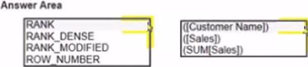

Explanation:
To calculate the ranking shown in the Rank field, you need to use the RANK_UNIQUE function, which returns the unique rank of each value in a partition. You need to specify the expression as SUM([Sales]), which calculates the total sales for each product. You also need to specify the order as descending, which means that the highest sales will have the lowest rank. Finally, you need to specify the restart as every [Category], which means that the ranking will reset for each category.
Reference:
https://help.tableau.com/current/pro/desktop/en-us/functions_functions_tablecalculation.htm
https://help.tableau.com/current/pro/desktop/en-us/calculations_calculatedfields_lod_rank.htm
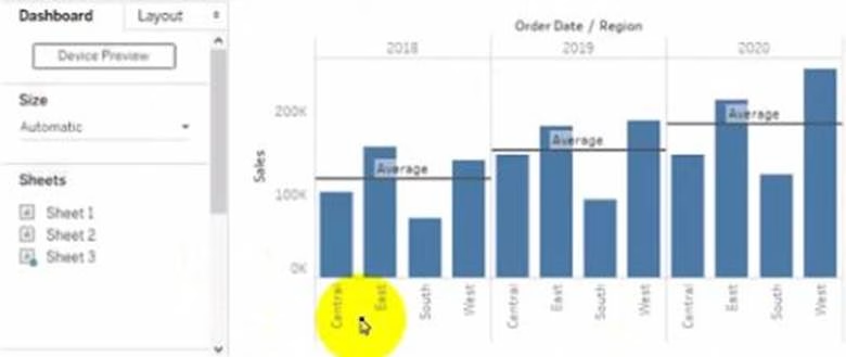
You have the Mowing dashboard.
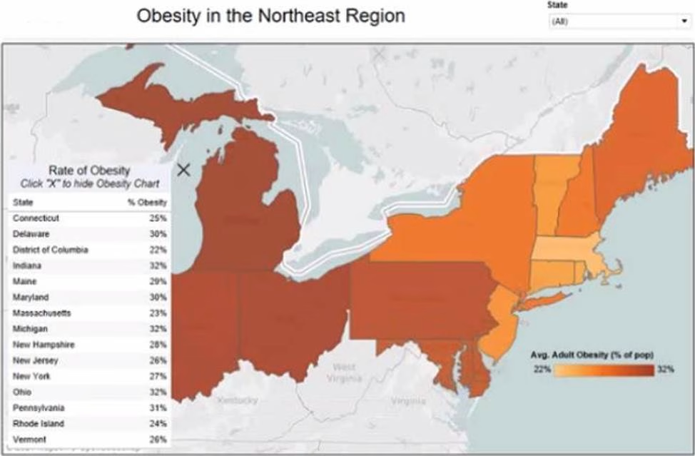

Which two elements are floating? Choose two.
- A . The state filter
- B . The color legend
- C . The map
- D . The Rate of Obesity chart
- E . The little
BD
Explanation:
To identify which elements are floating on a dashboard, you can look for a gray border around them when you select them. Alternatively, you can open the Layout pane and see which elements have a pin icon next to them. The pin icon indicates that the element is floating and can be moved freely on the dashboard. Based on these criteria, the state filter and the color legend are floating elements on the dashboard.
Reference:
https://help.tableau.com/current/pro/desktop/en-us/dashboards_organize_floating_layoutcontainers.htm
https://help.tableau.com/current/pro/desktop/en-us/dashboards_create_layouts.htm
You have a database that includes field named sales, City and Region.
You have the following chart that shows the number of sales made in different cities.
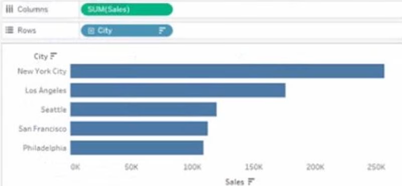

You want to dynamically show the corresponding region when users hover their mouse over any of the bars.
What should you do?
- A . Right-click a in the chat, select Annotate and then select Mark.
- B . Right-click a bar in the chart select Mark Label and then select Always show.
- C . Edit the aliases for City.
- D . Drag Region to Tooltip on the Marks card
D
Explanation:
To show the corresponding region when users hover their mouse over any of the bars, you need to drag Region to Tooltip on the Marks card. This will add Region as a field in the tooltip text that appears when users hover over a mark. You can also customize the tooltip text by editing it in the Tooltip dialog box.
Reference:
https://help.tableau.com/current/pro/desktop/en-us/buildmanual_shelves.htm
https://help.tableau.com/current/pro/desktop/en-us/formatting_tooltips.htm
You want to connect a Tableau workbook to a dataset in a Microsoft Excel spreadsheet.
What should you do from Tableau Desktop?
- A . From the Data menu select New Data Source
- B . From the Data menu select Replace Data Source
- C . From the File menu select Import Workbook
- D . From the File menu select New
A
Explanation:
To connect a Tableau workbook to a dataset in a Microsoft Excel spreadsheet, you need to select New Data Source from the Data menu. This will open the Connect pane, where you can choose Microsoft Excel as your data source and browse for your spreadsheet file. You can then drag and drop your sheets or tables to join or union them in the data source page.
Reference:
https://help.tableau.com/current/pro/desktop/en-us/connect_basic.htm
https://help.tableau.com/current/pro/desktop/en-us/connect_excel.htm
You plan to create a visualization that has a dual axis chart. The dual axis chart will contain a shape chart and a line chart will use the same measure named Population on the axis. You need to configure be shapes to be much larger than the line.
What should you do?
- A . Duplicate Population Drag the duplicate to the second Marks card and configure the see of the marks independently
- B . Create a custom shape that is larger than the default shape and add the shape to the Shapes folder in My Repository
- C . For the second axis select Shape on the Marks card From Select Shape Palette select Custom and then select Reset
- D . Change Population to a discrete dimension
A
Explanation:
To configure the shapes to be much larger than the line, you need to duplicate Population and drag it to the second Marks card. This will create a dual axis chart with two measures on one axis. You can then select Shape on one Marks card and Line on another Marks card, and adjust the size of each mark independently using the Size slider or menu.
Reference:
https://help.tableau.com/current/pro/desktop/en-us/multiplemeasures_dualaxes.htm
https://help.tableau.com/current/pro/desktop/en-us/marks_markproperties_size.htm
You have a dashboard that contains confidential information about patients health. The data needs to always be up to date tor a team of healthcare workers.
How should you share me dashboard with the healthcare workers?
- A . Publish the dashboard to Tableau Public
- B . Print the dashboard to PDF
- C . Publish aw dashboard to Tableau Server
- D . Export the dashboard as a .twbx
C
Explanation:
To share a dashboard that contains confidential information about patients health and needs to always be up to date for a team of healthcare workers, you should publish it to Tableau Server. This will allow you to control who can access and interact with your dashboard, as well as schedule automatic refreshes of your data source or extract. Publishing to Tableau Public would expose your data to anyone on the internet, printing to PDF would not update your data, and exporting as a .twbx would require sending a large file that might not be compatible with other versions of Tableau.
Reference:
https://help.tableau.com/current/pro/desktop/en-us/publish_workbooks_share.htm
https://help.tableau.com/current/pro/desktop/en-us/publish_workbooks_tableauserver.htm
You have the following dataset.

Which Level of Detail (LOD) expression should you use to calculate tie grand total of all the regions?
- A . {FIXED: [Region] SUM Sales}
- B . {FIXED: SUM Sales}
- C . {Fixed: [Region]: TOTAL Sales}
- D . {FIXED: TOTAL (Sales)}
D
Explanation:
To calculate the grand total of all the regions, you need to use a Level of Detail (LOD) expression that ignores any dimensions in the view and returns the total sum of sales. The FIXED keyword allows you to specify the level of detail for the calculation, and the TOTAL function returns the sum of all values in the expression. Therefore, the correct LOD expression is {FIXED: TOTAL (Sales)}.
Reference:
https://help.tableau.com/current/pro/desktop/en-us/calculations_calculatedfields_lod.htm
https://help.tableau.com/current/pro/desktop/en-us/functions_functions_tablecalculation.htm#TOTAL
You have the following data source in tableau Server.

You need to ensure that the data is updated every hour.
What should you select?
- A . New
- B . Extract Refreshes
- C . Connected Workbooks
- D . Connections
B
Explanation:
To ensure that the data is updated every hour, you need to select Extract Refreshes from the data source menu on Tableau Server. This will allow you to add a new extract refresh schedule or edit an existing one. You can specify the frequency and time of the refresh, as well as any custom options or credentials. New will create a new data source, Connected Workbooks will show you which workbooks use this data source, and Connections will show you which tables or files are connected to this data source.
Reference:
https://help.tableau.com/current/server/en-us/refresh_extracts.htm
https://help.tableau.com/current/server/en-us/refresh_extracts_add.htm
You have a line chart on a worksheet.
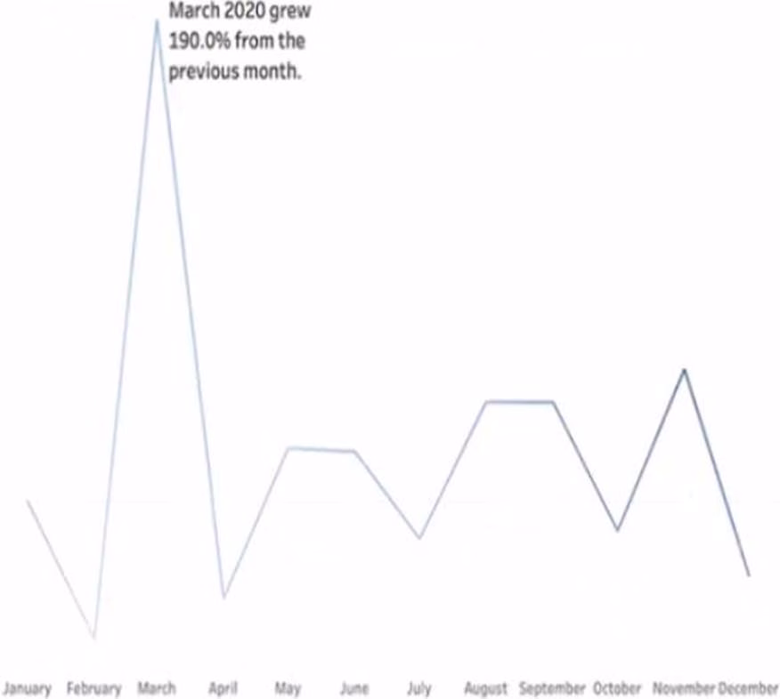

You want to add a comment to March 2020 as shown in the following visualization.
What should you do?
- A . Drag the growth rate to Text on the Marks card
- B . Enable captions
- C . Annotate March 2020
- D . Add a tooltip
C
Explanation:
To add a comment to March 2020 on a line chart, you need to annotate that mark. You can right-click on the mark and select Annotate > Mark from the menu. This will open a dialog box where you can type your comment and format it as you like. You can also drag and drop the annotation to position it on the worksheet. Dragging the growth rate to Text on the Marks card will add a label to every mark on the line chart, enabling captions will show a description of the worksheet at the bottom, and adding a tooltip will show a text box when users hover over a mark.
Reference:
https://help.tableau.com/current/pro/desktop/en-us/formatting_annotations.htm
https://help.tableau.com/current/pro/desktop/en-us/formatting_annotations_create.htm
You want to add a comment to March 2020 as shown in the following visualization.
You have the following sets in a Tableau workbook
• Top N Customers
• Customers of 2020
• Top N Products
• Sellers of 2020
Which two sets can you combine? Choose two
- A . Sellers of 2020
- B . Customers of 2020
- C . Top N Products
- D . Top N Customers
BD
Explanation:
To combine two sets, they must have at least one dimension in common. In this case, Customers of 2020 and Top N Customers both have Customer Name as a dimension, so they can be combined using set operations such as union, intersection, or difference. Sellers of 2020 and Top N Products have different dimensions (Seller Name and Product Name), so they cannot be combined.
Reference:
https://help.tableau.com/current/pro/desktop/en-us/sets.htm
https://help.tableau.com/current/pro/desktop/en-us/sets_create.htm#combine-sets
DRAG DROP
You company has two divisions located in the United States and Germany Bach division has a separate database.
The following is a sample of the sales data for the division in the United States.

The following is a sample of the sales data for me division in Germany.
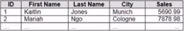

You have population data in a file named Populatio.csv. the following is a sample of the data.
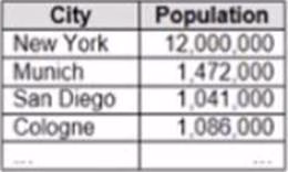

You plan to create a visualization that ml show tie sales per capita for each salesperson Each salesperson must be identified by identified by their full name.
You need to prepare the data to support the planned visualization. The data source must support being published.
Which four actions should you perform in order? (Place the four correct options n order Use the arrows to move Options to Answer Area arrows to re-order the options. Use Answer Area arrows to re-order the options)
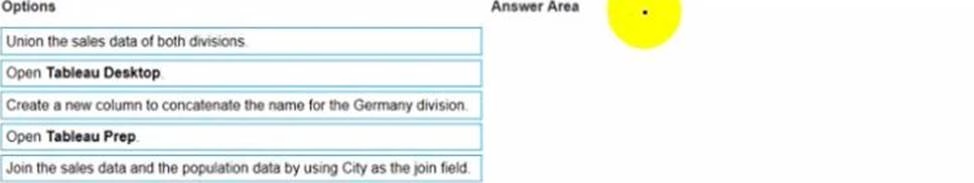

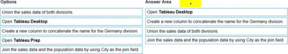
Explanation:
The correct order of the four actions is:
Open Tableau Prep
Create a new column to concatenate the name for the Germany division
Union the sales data of both divisions
Join the sales data and the population data by using Country as the join field
The first action is to open Tableau Prep, which is a tool that allows you to prepare and shape your data for analysis. You can connect to various data sources, clean and transform your data, and output it to Tableau Desktop or Tableau Server.
The second action is to union the sales data of both divisions, which means appending them together. This will create a single table that contains all the rows from both tables, with null values for any missing fields. You can use the Union step in Tableau Prep to drag and drop your tables and create a union.
The third action is to create a new column to concatenate the name for the Germany division, which means combining the first name and last name into one field. This will make it consistent with the name field in the United States division, and allow you to identify each salesperson by their full name. You can use the Clean step in Tableau Prep to create a calculated field that uses the CONCAT function to join the two fields.
The fourth action is to join the sales data and the population data by using Country as the join field, which is a common field between them. This will add the population data for each country to the sales data, which is needed to calculate the sales per capita. You can use the Join step in Tableau Prep to drag and drop your tables and choose the join type and fields.
Reference:
https://help.tableau.com/current/prep/en-us/prep_get_started.htm
https://help.tableau.com/current/prep/en-us/prep_union.htm
https://help.tableau.com/current/prep/en-us/prep_clean.htm
https://help.tableau.com/current/prep/en-us/prep_join.htm
DRAG DROP
You have the following dataset.
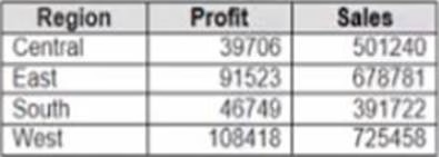

You need to create the following worksheet.
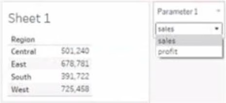

The table must show either profit or sales based on the selection from the Parameter 1 menu.
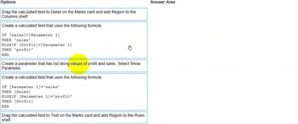
Which three actions should you perform in orders? (Place the three correct options in order Use the arrows to move Options lo Answer Area Use Answer Area arrows to reorder the options)

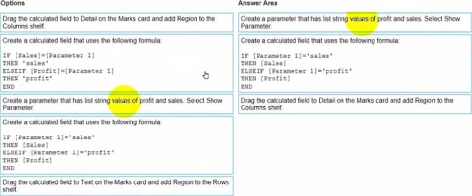
Explanation:

Open the link to Book1 found on the desktop. Open Disciplines worksheet.
Filter the table to show the members of the Top10 set and the members of the Bottom10 set. There should be a total of 20 rows.

Open the link to Book1 found on the desktop. This will open the Tableau workbook that contains the Disciplines worksheet.
Click on the Disciplines tab at the bottom of the workbook to open the worksheet. You will see a table that shows the disciplines, sales, and profit for each salesperson.
Click on the drop-down arrow next to Salesperson on the Filters shelf. This will open a menu that allows you to filter by different criteria.
Select Set from the menu. This will show you the sets that are available for the Salesperson field. You will see Top10 and Bottom10 as two sets that have been created based on the sales ranking.
Check the boxes next to Top10 and Bottom10. This will filter the table to show only the members of these two sets. You can also click on All to deselect all other values.
Click OK to apply the filter. You will see that the table now shows 20 rows, 10 for each set.
Reference:
https://help.tableau.com/current/pro/desktop/en-us/sets.htm https://help.tableau.com/current/pro/desktop/en-us/filtering.htm
Open the link to Book1 found on the desktop. Open Disciplines worksheet.
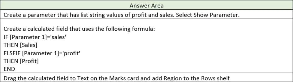
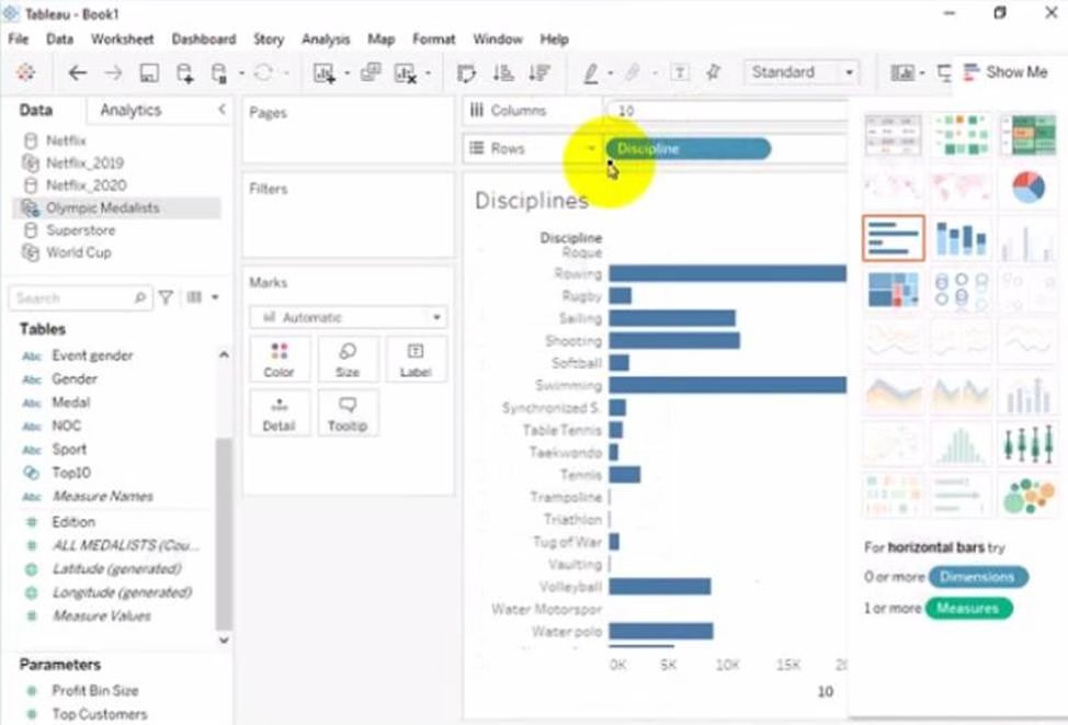
Filter the table to show the Top 10 NOC based on the number of medals won.

Open the link to Book1 found on the desktop. This will open the Tableau workbook that contains the Disciplines worksheet.
Click on the Disciplines tab at the bottom of the workbook to open the worksheet. You will see a table that shows the NOC, discipline, and medals for each country.
Drag Medals from the Measures pane to the Filters shelf. This will open a dialog box that allows you to filter by different criteria.
Select Top from the dialog box. This will show you options to filter by the top or bottom values of a field.
Enter 10 in the text box next to By field. This will filter by the top 10 values of Medals.
Select NOC from the drop-down list next to By field. This will filter by the top 10 values of NOC based
on Medals.
Click OK to apply the filter. You will see that the table now shows only 10 rows, one for each NOC with the highest number of medals.
Reference:
https://help.tableau.com/current/pro/desktop/en-us/filtering.htm
https://help.tableau.com/current/pro/desktop/en-us/filtering_topn.htm
Open the link to Book1 found on the desktop. Use the Superstore data source.
Split the Customer Name field into two fields named First Name and Last Name.

Open the link to Book1 found on the desktop. This will open the Tableau workbook that uses the Superstore data source.
Go to the Data Source tab at the bottom of the workbook to see the data source page. You will see a table that shows the fields and values from the Superstore data source.
Right-click on Customer Name in the table and select Split from the menu. This will split the field into two fields based on a separator, which is a space by default. You will see two new fields named Customer Name – Split 1 and Customer Name – Split 2 in the table.
Right-click on Customer Name – Split 1 and select Rename from the menu. Type First Name as the new name and press Enter. This will rename the field as First Name.
Right-click on Customer Name – Split 2 and select Rename from the menu. Type Last Name as the new name and press Enter. This will rename the field as Last Name.
Reference:
https://help.tableau.com/current/pro/desktop/en-us/datasource_prepare.htm
https://help.tableau.com/current/pro/desktop/en-us/split.htm
https://help.tableau.com/current/pro/desktop/en-us/renamefield.htm
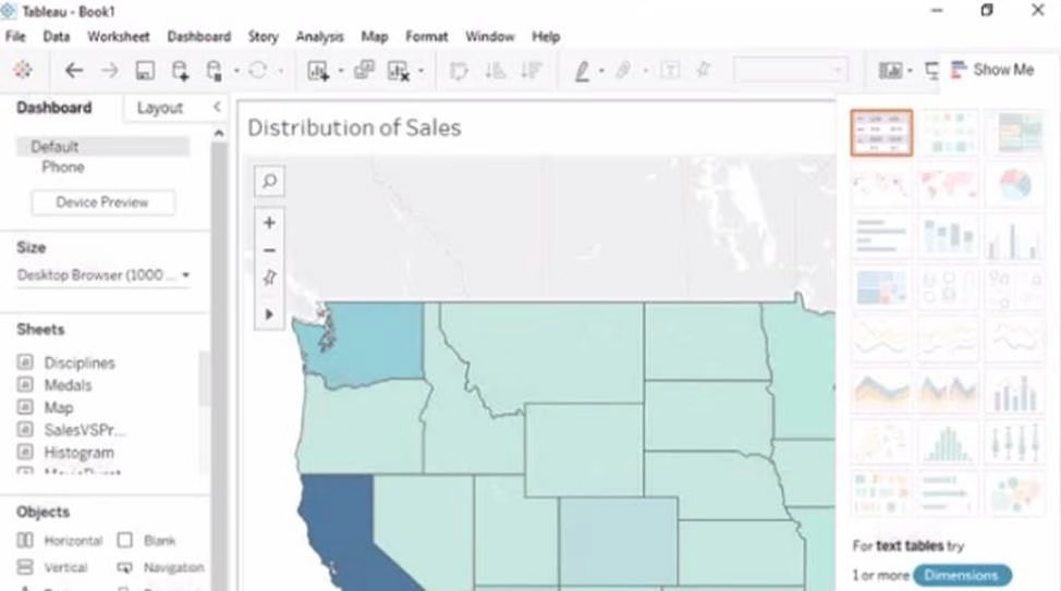
Open the Link to Book1 found on the desktop. Open Map worksheet and use Superstore data source.
Create a filed map to show the distribution of total Sales by State across the United States.
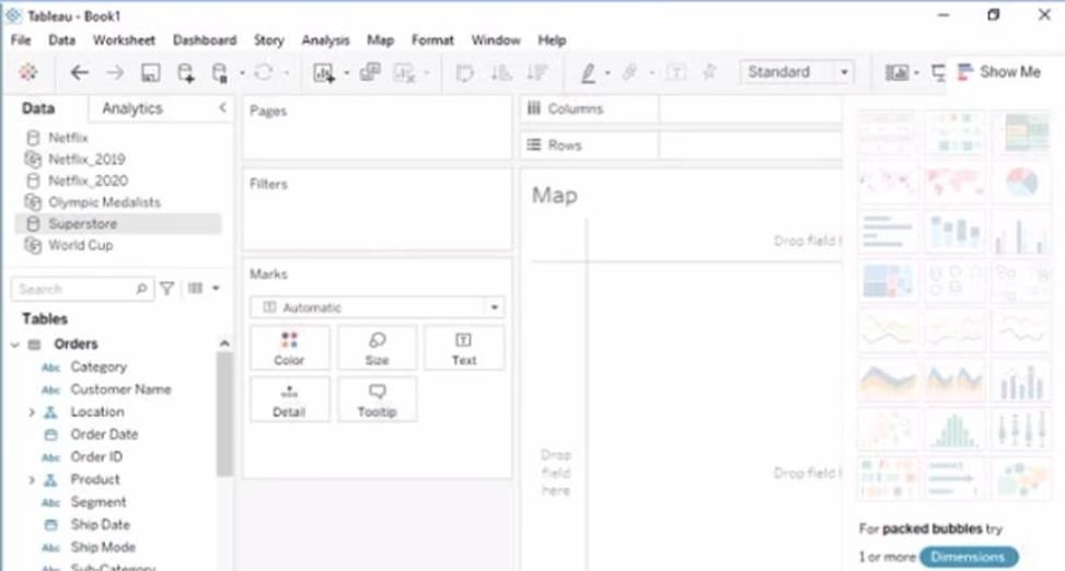

Open the link to Book1 found on the desktop. This will open the Tableau workbook that uses the Superstore data source.
Click on the Map tab at the bottom of the workbook to open the Map worksheet. You will see a blank worksheet with no marks.
Drag State from the Dimensions pane to Detail on the Marks card. This will create a map that shows each state as a mark. You may need to zoom in or out to see the whole map.
Drag Sales from the Measures pane to Color on the Marks card. This will create a filled map that shows the distribution of total Sales by State across the United States. The color legend will show you the range of values and colors for Sales.
Optionally, you can adjust the color scheme, transparency, size, and borders of the marks by clicking on the Color menu on the Marks card. You can also add labels, tooltips, or filters to enhance your map.
Reference:
https://help.tableau.com/current/pro/desktop/en-us/maps.htm
https://help.tableau.com/current/pro/desktop/en-us/maps_howto_filled.htm
https://help.tableau.com/current/pro/desktop/en-us/marks_markproperties_color.htm
Open the link to Book1 found on the desktop. Open SalesVSProfit worksheet.
Add a distribution band on Profit to show the standard deviation from- 1 to 1.
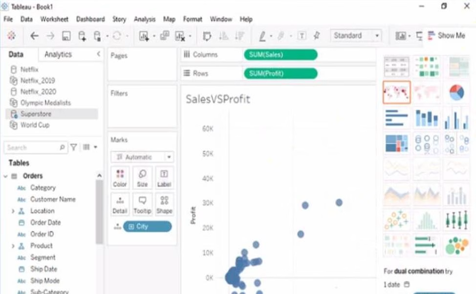

Open the link to Book1 found on the desktop. This will open the Tableau workbook that contains the SalesVSProfit worksheet.
Click on the SalesVSProfit tab at the bottom of the workbook to open the worksheet. You will see a scatter plot that shows the relationship between Sales and Profit for each Sub-Category.
Click on the Analytics tab on the left side of the workbook to open the Analytics pane. You will see a list of analytical objects that you can drag and drop onto your worksheet.
Drag Distribution Band from the Analytics pane to Profit on the Rows shelf. This will add a distribution band on Profit that shows the average and confidence interval for each Sub-Category. Click on the Edit button on the distribution band to open the Edit Distribution Band dialog box. You will see options to customize your distribution band.
Change the Band From value to -1 and the Band To value to 1. This will change the distribution band to show the standard deviation from -1 to 1, which means one standard deviation below and above the average.
Click OK to apply the changes. You will see that the distribution band now shows a narrower range of values for Profit.
Reference:
https://help.tableau.com/current/pro/desktop/en-us/analytics.htm
https://help.tableau.com/current/pro/desktop/en-us/analytics_distributionband.htm
https://help.tableau.com/current/pro/desktop/en-us/analytics_distributionband_edit.htm
Open the link to Book1 found on the desktop. Open the Histogram worksheet and use the Superstone data source.
Create a histogram on the Quantity field by using bin size of 3.
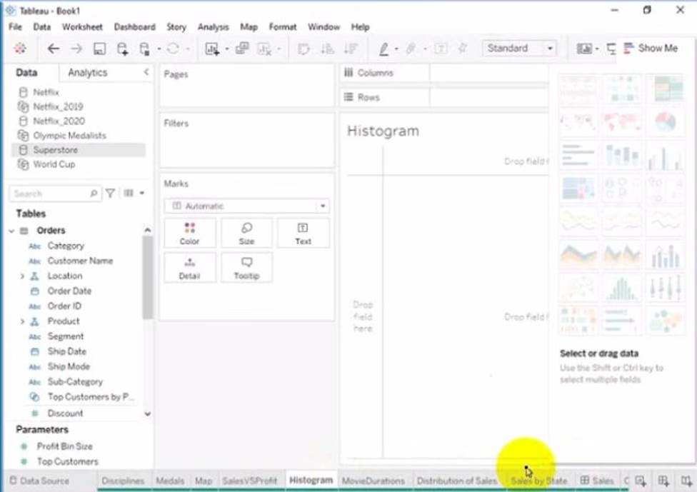

Click on the Histogram tab at the bottom of the workbook to open the Histogram worksheet. You will see a blank worksheet with no marks.
Right-click on Quantity in the Measures pane and select Create Bins from the menu. This will open a dialog box that allows you to create bins for the Quantity field. Bins are groups of values that are treated as one unit in a histogram.
Enter 3 in the Size of bins text box. This will set the bin size to 3, which means that each bin will contain values that are 3 units apart. For example, one bin will contain values from 0 to 2, another bin will contain values from 3 to 5, and so on.
Click OK to create the bins. You will see a new field named Quantity (bin) in the Measures pane with a # sign next to it.
Drag Quantity (bin) from the Measures pane to Columns on the worksheet. This will create a histogram that shows the distribution of Quantity by bins. You will see bars that represent the frequency or count of values in each bin.
Optionally, you can adjust the width, color, and labels of the bars by using the options on the Marks card. You can also add filters, tooltips, or annotations to enhance your histogram.
Reference:
https://help.tableau.com/current/pro/desktop/en-us/histograms.htm
https://help.tableau.com/current/pro/desktop/en-us/calculations_bins.htm
https://help.tableau.com/current/pro/desktop/en-us/buildmanual_histograms.htm
Open the link to Book1 found on the desktop. Open the Movie Durations worksheet.
Replace the existing data source with the Netflix_2019 data source.
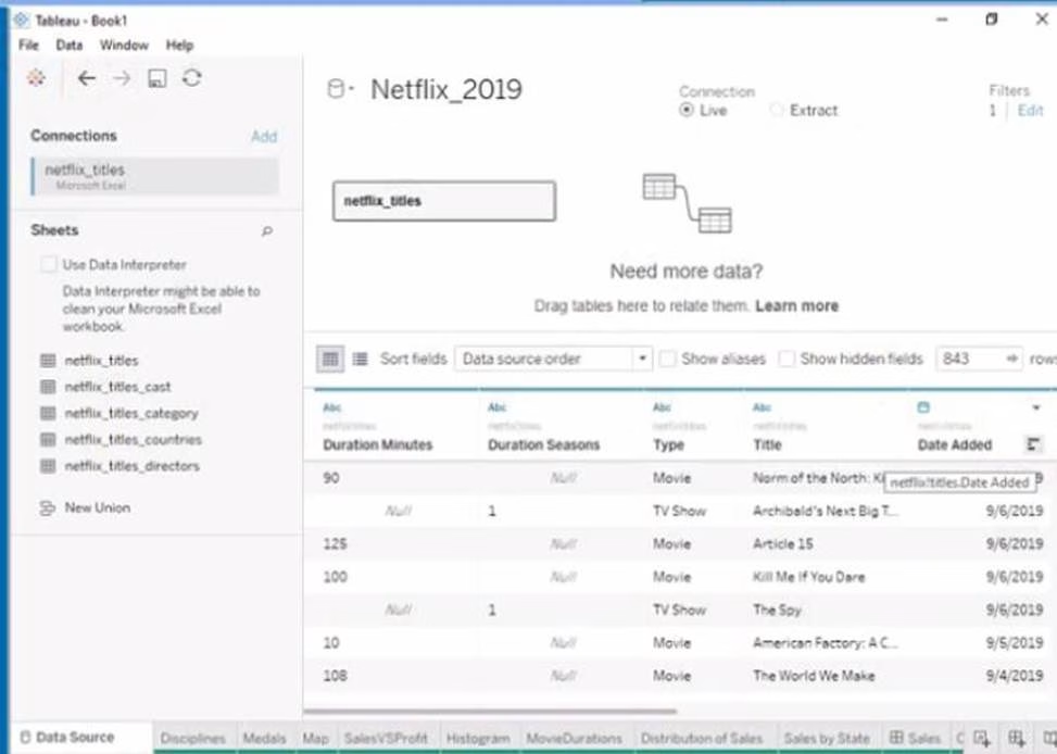

Open the link to Book1 found on the desktop. This will open the Tableau workbook that contains the Movie Durations worksheet.
Click on the Movie Durations tab at the bottom of the workbook to open the worksheet. You will see a bar chart that shows the number of movies by duration for the existing data source.
Go to the Data Source tab at the bottom of the workbook to see the data source page. You will see a table that shows the fields and values from the existing data source.
Click on the drop-down arrow next to the data source name at the top of the page and select Replace Data Source from the menu. This will open a dialog box that allows you to replace your data source with another one.
Select Netflix_2019 from the list of available data sources and click OK. This will replace your existing data source with the Netflix_2019 data source and update your worksheet accordingly. You may need to fix any broken fields or calculations that result from the replacement.
Reference:
https://help.tableau.com/current/pro/desktop/en-us/datasource_replace.htm https://help.tableau.com/current/pro/desktop/en-us/datasource_replace_workbook.htm
Open the link to Book1 found on the desktop. Open the sales dashboard.
Add the Sales by State sheet in a Show/Hide button to the right side of the dashboard.

Open the link to Book1 found on the desktop. This will open the Tableau workbook that contains the sales dashboard.
Click on the sales dashboard tab at the bottom of the workbook to open the dashboard. You will see a dashboard that shows various charts and filters related to sales data.
Drag Sales by State from the Sheets pane to the right side of the dashboard. This will add the sheet as a floating element on the dashboard. You can resize and position it as you like.
Right-click on Sales by State and select Add Show/Hide Button from the menu. This will add a button that allows you to show or hide the sheet on the dashboard. You can customize the appearance and behavior of the button by clicking on it and using the options on the Marks card.
Optionally, you can drag a vertical layout container from the Objects pane to the right side of the dashboard and place Sales by State and its button inside it. This will help you organize your dashboard elements and align them neatly.
Reference:
https://help.tableau.com/current/pro/desktop/en-us/dashboards.htm
https://help.tableau.com/current/pro/desktop/en-us/dashboards_showhide.htm
Open the link to Book1 found on the desktop. Open the CategoryPercentage worksheet.
Modify the bar chart show the percentage of sales for each Subcategory within every Category. The total percentage for every Category must be 100%.
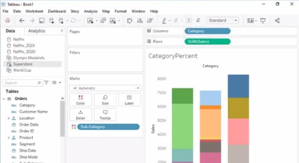

Open the link to Book1 found on the desktop. This will open the Tableau workbook that contains the CategoryPercentage worksheet.
Click on the CategoryPercentage tab at the bottom of the workbook to open the worksheet. You will see a bar chart that shows the total sales for each Subcategory across all Categories.
Right-click on Sales on the Columns shelf and select Add Table Calculation from the menu. This will open a dialog box that allows you to apply a calculation to your measure.
Select Percent of Total from the Calculation Type drop-down list. This will calculate the percentage of sales for each Subcategory out of the total sales for all Subcategories.
Select Category from the Compute Using drop-down list. This will calculate the percentage of sales for each Subcategory within every Category, instead of across all Categories. The total percentage for every Category will be 100%.
Click OK to apply the table calculation. You will see that the bar chart now shows the percentage of sales for each Subcategory within every Category.
Reference:
https://help.tableau.com/current/pro/desktop/en-us/calculations_tablecalculations.htm
https://help.tableau.com/current/pro/desktop/en-us/calculations_tablecalculations_create.htm
https://help.tableau.com/current/pro/desktop/en-us/calculations_tablecalculations_percentoftotal.htm
Open the link to Book1 found on the desktop. Open the Line worksheet.
Modify the chart to show only main and max values of both measures in each region.
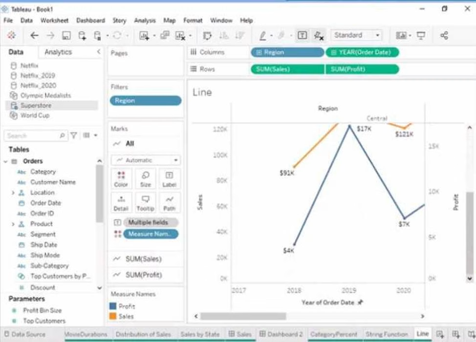

Open the link to Book1 found on the desktop. This will open the Tableau workbook that contains the Line worksheet.
Click on the Line tab at the bottom of the workbook to open the worksheet. You will see a line chart that shows the sales and profit for each month by region.
Drag Month from the Columns shelf to Filters shelf. This will open a dialog box that allows you to filter by different criteria.
Select Range of Dates from the dialog box. This will show you options to filter by a range of dates or values.
Select Minimum and Maximum from the drop-down list next to Month. This will filter by the minimum and maximum values of Month for each region. You can also enter specific values or use the sliders to adjust the range.
Click OK to apply the filter. You will see that the line chart now shows only min and max values of both measures in each region.
Reference:
https://help.tableau.com/current/pro/desktop/en-us/filtering.htm
https://help.tableau.com/current/pro/desktop/en-us/filtering_range.htm
You have the following bar chart.
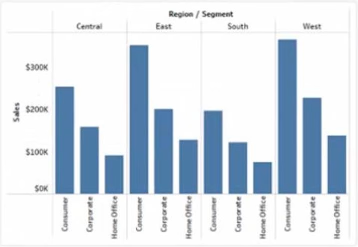

You want the chart to appear as shown in the Mowing exhibit.

What should you add?
- A . A reference band
- B . A reference line
- C . An average line
- D . A distribution band
D
Explanation:
A reference band is a shaded area that shows a range of values on an axis. You can use a reference band to highlight a target range, a confidence interval, or a standard deviation. In this case, you want to add a reference band that shows the range of values from 0 to 100 on the y-axis. This will create a shaded area behind the bars that indicates the percentage of sales. To add a reference band, you need to do the following steps:
Click on the Analytics tab on the left side of the workbook to open the Analytics pane. You will see a list of analytical objects that you can drag and drop onto your worksheet.
Drag Reference Band from the Analytics pane to Y-Axis on the worksheet. This will add a reference band on the y-axis that shows the average and confidence interval for all values.
Click on the Edit button on the reference band to open the Edit Reference Band dialog box. You will see options to customize your reference band.
Change the Band From value to 0 and the Band To value to 100. This will change the reference band to show the range of values from 0 to 100 on the y-axis.
Click OK to apply the changes. You will see that the reference band now shows a shaded area behind the bars.
Reference:
https://help.tableau.com/current/pro/desktop/en-us/analytics.htm
https://help.tableau.com/current/pro/desktop/en-us/analytics_referenceband.htm
https://help.tableau.com/current/pro/desktop/en-us/analytics_referenceband_edit.htm
DRAG DROP
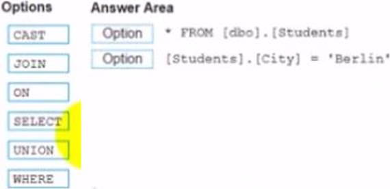
You conned to a Microsoft SQL Server database
You need to create a custom SQL query that retrieves rows from a table named Students Only students m the city of Berlin must be returned
How should you complete the query? (Drag the appropriate Options to the Answer Area and drop into the correct locations.)

Explanation:
Select
Where
The correct way to complete the query is:
SELECT * FROM [dbo] . [Students]
WHERE [Students].[City] = ‘Berlin’
The SELECT statement is used to retrieve data from a table or a view. The * symbol means that all columns will be returned. The FROM clause specifies the table or view name and the schema name. The WHERE clause is used to filter the data based on a condition. The condition is [Students].[City] = ‘Berlin’, which means that only rows where the City column of the Students table is equal to ‘Berlin’ will be returned.
The other options are not relevant for this query. CAST is a function that converts a value from one data type to another. JOIN is a clause that combines data from two or more tables based on a common field. ON is a keyword that specifies the join condition. UNION is a set operation that combines the results of two or more queries into one result set.
Reference:
https://docs.microsoft.com/en-us/sql/t-sql/queries/select-transact-sql?view=sql-server-ver15
https://docs.microsoft.com/en-us/sql/t-sql/queries/where-transact-sql?view=sql-server-ver15
https://docs.microsoft.com/en-us/sql/t-sql/functions/cast-and-convert-transact-sql?view=sql-server-ver15
https://docs.microsoft.com/en-us/sql/t-sql/queries/from-transact-sql?view=sql-server-ver15#join
https://docs.microsoft.com/en-us/sql/t-sql/language-elements/set-operators-union-transact-sql?view=sql-server-ver15
DRAG DROP
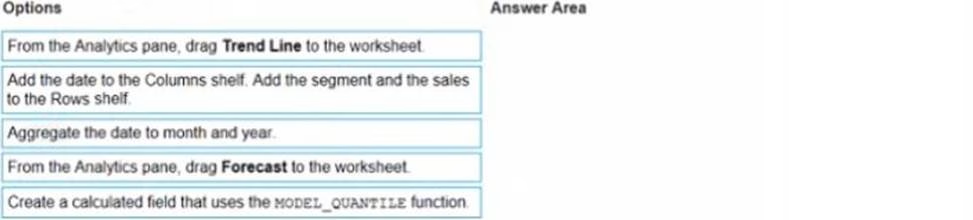
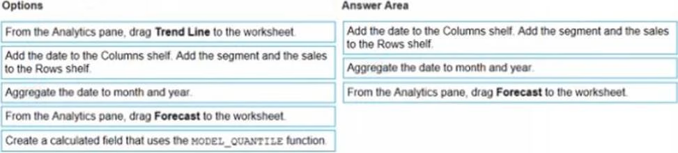
You have a dataset that contains daily sales by business segment from 2017 to the present.
You want to use monthly historical trends to predict sales by segment in the future.
Which three actions should you perform m order? (Place the three correct options in order Use the arrows to move Options lo Answer Area I In Answer Area arrows to re order the options.)

Explanation:
The correct order of the three actions is:
Add the date to the Columns shelf. Add the segment and the sales to the Rows shelf.
Aggregate the date to month and year.
From the Analytics pane, drag Forecast to the worksheet.
The first action is to add the date to the Columns shelf and the segment and the sales to the Rows shelf. This will create a line chart that shows the daily sales by segment over time. You can use the Show Me menu to choose a line chart if it is not selected by default.
The second action is to aggregate the date to month and year. This will group the daily sales into monthly sales and show the yearly trend. You can right-click on the date field on the Columns shelf and select Month (January 2017) from the menu. You can also drag Year from the Dimensions pane to the Columns shelf before or after Month.
The third action is to drag Forecast from the Analytics pane to the worksheet. This will add a forecast that predicts future sales by segment based on historical trends. You can customize the forecast by clicking on it and using the options on the Marks card.
The other options are not relevant for this scenario. Adding a trend line would show a linear or nonlinear relationship between two measures, but not a prediction of future values. Creating a calculated field that uses the model quantile function would return a value from a statistical model based on a given quantile, but not a forecast.
Reference:
https://help.tableau.com/current/pro/desktop/en-us/analytics.htm
https://help.tableau.com/current/pro/desktop/en-us/buildmanual_shelves.htm
https://help.tableau.com/current/pro/desktop/en-us/dates.htm
https://help.tableau.com/current/pro/desktop/en-us/analytics_forecast.htm
https://help.tableau.com/current/pro/desktop/en-us/functions_functions_statistical.htm#MODEL_QUANTILE
You have a Tableau workbook that contain three worksheets named Sheet1 Sheet2 and Sheet3.
You create several filters.
From the Data Source page you plan to add data source fillers
When type of filter will appear in the Edit Data Source Filters dialog box?
- A . A table calculation filter used on Sheet
- B . A top N condition filer on a dimension in Sheet 1 and Sheet2
- C . A context filler on a dimension m Sheet3
- D . A dimension filter on all the sheets
D
Explanation:
A data source filter is a filter that applies to all the worksheets that use the same data source. It filters the data before any other filters or calculations are applied. You can add a data source filter from the Data Source page by clicking on the Add button next to Filters.
The type of filter that will appear in the Edit Data Source Filters dialog box is a dimension filter on all the sheets. This means that you can choose a dimension from your data source and filter it by values, range, condition, or top/bottom. The filter will affect all the worksheets that use that dimension.
The other types of filters are not data source filters and will not appear in the Edit Data Source Filters dialog box. A table calculation filter is a filter that applies to a table calculation, such as percent of total or running total. A top N condition filter is a filter that shows only the top or bottom N values of a measure or dimension based on a condition. A context filter is a filter that creates a subset of data that other filters can use.
Reference:
https://help.tableau.com/current/pro/desktop/en-us/filtering_datasource.htm
https://help.tableau.com/current/pro/desktop/en-us/filtering.htm
https://help.tableau.com/current/pro/desktop/en-us/filtering_tablecalculations.htm
https://help.tableau.com/current/pro/desktop/en-us/filtering_topn.htm
https://help.tableau.com/current/pro/desktop/en-us/filtering_context.htm
HOTSPOT
You have a dataset that has four fields named Category. Profit Sates and Customer Name.
You need to create the following visualization.

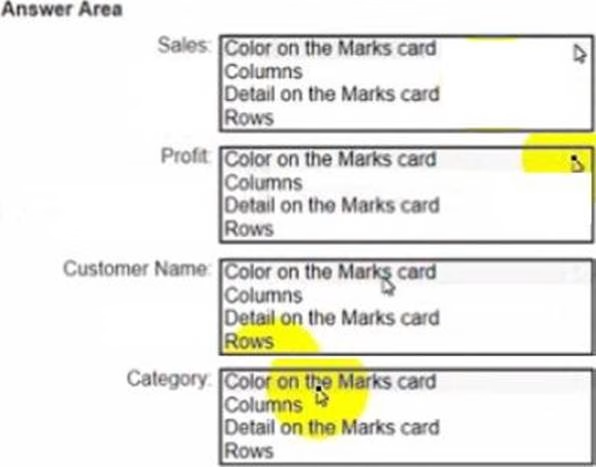

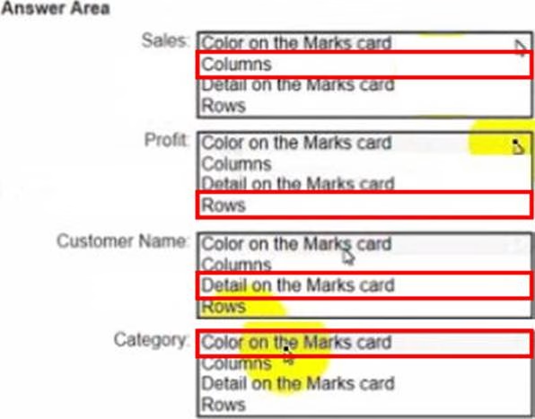
Explanation:
Sales: B. Columns
Profit: D. Rows
Customer Name: C. Detail on the Marks card
Category: A. Color on the Marks card
To create the visualization, you need to drag Sales to Columns, Profit to Rows, Customer Name to Detail on the Marks card, and Category to Color on the Marks card. This will create a scatter plot that shows the relationship between Sales and Profit for each Customer Name, with different colors for each Category.
Reference:
https://help.tableau.com/current/pro/desktop/en-us/buildmanual_shelves.htm https://help.tableau.com/current/pro/desktop/en-us/buildexamples_scatter.htm
From Tableau Desktop you sign in lo a Tableau Server site.
What appears in the list of available data sources when you search for a published data source?
- A . All the data sources published to the site
- B . All the data sources published to the Tableau Server
- C . All the data sources published to the site within the folders to which you have access
- D . All the data sources published to the Tableau Server within the folders to which you have access
C
Explanation:
When you sign in to a Tableau Server site from Tableau Desktop and search for a published data source, you will see all the data sources published to the site within the folders to which you have access. You will not see data sources published to other sites or folders that you do not have permission to view. You can also filter your search by project, owner, or tag.
Reference:
https://help.tableau.com/current/pro/desktop/en-us/connect_basic.htm
https://help.tableau.com/current/pro/desktop/en-us/connect_tableauserver.htm
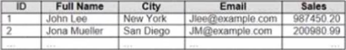
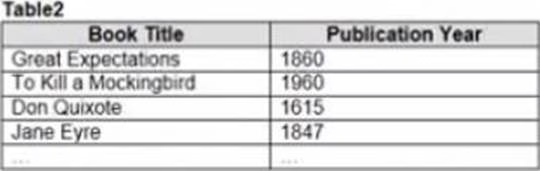
You have the following dataset in Microsoft Excel.

You are using interpreter to cleans the dataset.
Data interpreter provides the following results.

How many rows of data will be ingested into Tableau as values?
- A . 10
- B . 20
- C . 17
- D . 15
C
Explanation:
Data interpreter is a feature that helps you clean and structure your data in Excel before importing it into Tableau. It detects and removes any headers, footers, subtotals, or other elements that are not part of the actual data. It also splits any merged cells and fills in any missing values.
In this case, data interpreter provides the following results:
It removes the first three rows and the last two rows that contain headers and footers.
It splits the merged cells in column A and fills in the missing values with “Fiction” or “Non-Fiction”.
It does not remove or change any other rows or cells.
Therefore, the number of rows of data that will be ingested into Tableau as values is 17, which is the number of rows left after removing the headers and footers.
Reference:
https://help.tableau.com/current/pro/desktop/en-us/importing_cleaning_up_data.htm
https://help.tableau.com/current/pro/desktop/en-us/importing_data_interpreter.htm
You have the following chart that shows the cumulative of sales from various dates.
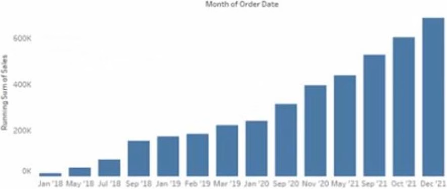

You want the months to appear as shown in the following chart.
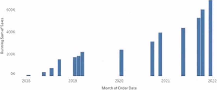

What should you do?
- A . Convert the date to Exact Date
- B . Convert the date to Continuous
- C . Select Show Misting Values for the dale
- D . Convert the date to Attribute
A
Explanation:
To make the months appear as shown in the second chart, you need to convert the date to Continuous. A continuous date is a green pill that shows a range of values on an axis. A discrete date is a blue pill that shows individual values as headers. In this case, you want to show a continuous range of months on the x-axis, instead of discrete headers.
To convert the date to Continuous, you need to do the following steps: Right-click on the date field on the Columns shelf and select Convert to Continuous from the menu. This will change the date pill from blue to green and show a continuous range of dates on the x-axis. Right-click on the date field again and select Month (January 2017) from the menu. This will change the level of detail of the date to month and year, instead of day.
Optionally, you can format the date axis by right-clicking on it and selecting Format from the menu.
You can change the scale, tick marks, labels, and other options.
The other options are not correct for this scenario. Converting the date to Exact Date will show every single date as a header, which will be too crowded and unreadable. Selecting Show Missing Values for the date will fill in any gaps in the data with null values, but it will not change how the months appear. Converting the date to Attribute will return only one value for each partition of data, which will not show any variation over time.
Reference:
https://help.tableau.com/current/pro/desktop/en-us/dates.htm
https://help.tableau.com/current/pro/desktop/en-us/dates_continuous.htm
https://help.tableau.com/current/pro/desktop/en-us/formatting.htm
You have the Mowing two tables that contains data about the books in a library.


Both tables are incomplete so there are books missing from the tables.
You need to combine the tables. The solution must ensure that all the data is retained.
Which type of join should you use?
- A . Full outer join
- B . Right join
- C . left join
- D . Inner join
A
Explanation:
To combine the two tables that contain data about books in a library and ensure that all the data is retained, you should use a full outer join. A full outer join is a type of join that returns all rows from both tables, regardless of whether there is a match or not. If there is no match, null values are filled in for the missing fields.
To perform a full outer join, you need to do the following steps:
Connect to both tables as your data sources in Tableau. You can use either live or extract connections. Drag one table to the canvas and drop it on top of another table. This will create a join between them based on a common field.
Click on the join icon between the tables and select Full Outer Join from the drop-down list. This will change the join type to full outer join and show all rows from both tables.
Optionally, you can add or remove join clauses by clicking on Add or Remove buttons next to each clause. You can also change or rename fields by clicking on them.
The other types of joins are not correct for this scenario. An inner join returns only the rows that have a match in both tables, which will exclude any books that are missing from either table. A left join returns all rows from the left table and only the matching rows from the right table, which will exclude any books that are only in the right table. A right join returns all rows from the right table and only the matching rows from the left table, which will exclude any books that are only in the left table.
Reference:
https://help.tableau.com/current/pro/desktop/en-us/joining_tables.htm
https://help.tableau.com/current/pro/desktop/en-us/join_types.htm
HOTSPOT
You have two data sources that use the same schema One data source contains order data from 2019 and the other data source contains order data from 2020. You have a worksheet that shows the orders from 2019.
You need to configure the worksheet to show the orders from 2020 without reloading the data.
Which option should you select?
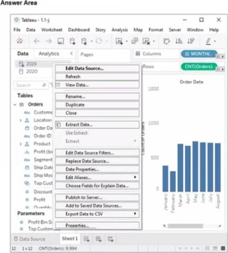

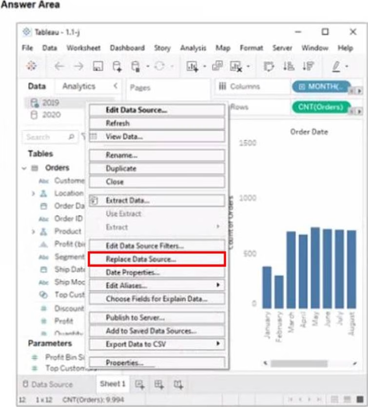
Explanation:
Replace Data Source
Replace Data Source is a feature that allows you to replace one data source with another one that has the same or similar fields and structure. It updates all the worksheets that use the original data source with the new one, without reloading the data. In this case, you want to replace the data source that contains order data from 2019 with the one that contains order data from 2020.
To replace the data source, you need to do the following steps:
Go to the Data Source tab at the bottom of the workbook to see the data source page. You will see a table that shows the fields and values from the original data source.
Click on the drop-down arrow next to the data source name at the top of the page and select Replace Data Source from the menu. This will open a dialog box that allows you to replace your data source with another one.
Select the data source that contains order data from 2020 from the list of available data sources and click OK. This will replace your original data source with the new one and update your worksheet accordingly. You may need to fix any broken fields or calculations that result from the replacement.
Reference:
https://help.tableau.com/current/pro/desktop/en-us/datasource_replace.htm
https://help.tableau.com/current/pro/desktop/en-us/datasource_replace_workbook.htm
You want to add a draft watermark to a dashboard as shown in the following exhibit.

Which type of object should you use?
- A . Image
- B . Sheet
- C . Web page
- D . Horizontal
A
Explanation:
To add a draft watermark to a dashboard, you should use a sheet as a type of object. A sheet is a worksheet that contains a chart or a table that you can add to your dashboard. You can create a sheet that shows the word “Draft” as a text mark and format it with transparency, size, and color. Then you can drag the sheet to your dashboard and position it behind your other sheets as a floating element. You can also adjust the opacity and layering of the sheet to make it look like a watermark.
Reference:
https://help.tableau.com/current/pro/desktop/en-us/dashboards.htm
https://help.tableau.com/current/pro/desktop/en-us/dashboards_create_layouts.htm
https://help.tableau.com/current/pro/desktop/en-us/dashboards_create_watermarks.htm
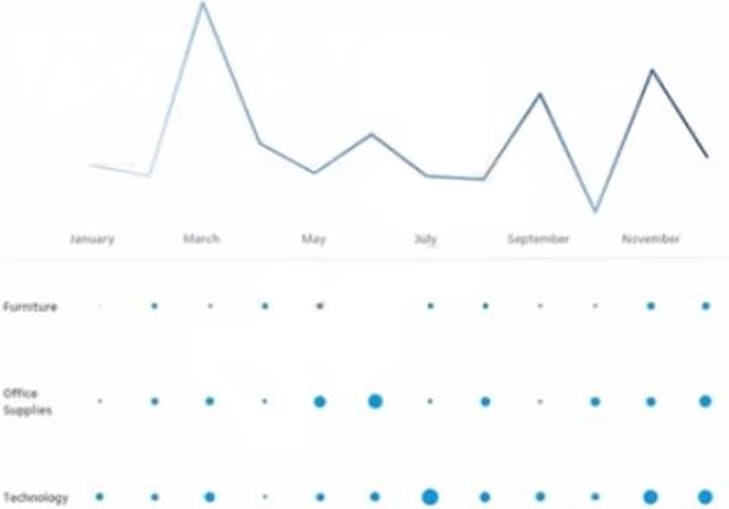
You have the following visualization.
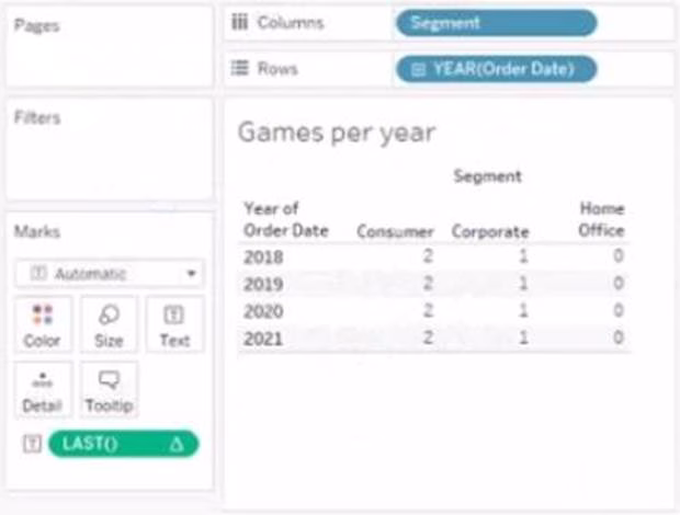

The Last() calculation is set to compute using Table (across)
Which value will appear in the crosstab for the Consumer segment of the year 2018 if you change compute to use Oder Dale?
- A . 0
- B . 2
- C . 4
- D . 3
D
Explanation:
The value that will appear in the crosstab for the Consumer segment of the year 2018 if you change compute to use Order Date is 0. The Last() calculation is a table calculation that returns the number of rows from the current row to the last row in the partition. The partition is determined by how you compute the calculation. In this case, you change compute to use Order Date, which means that the calculation will be performed for each value of Order Date.
The crosstab shows that there are two values of Order Date for the Consumer segment of the year 2018: Q1 and Q4. The Last() calculation will return 0 for Q4, because it is the last row in the partition. It will return 1 for Q1, because it is one row away from the last row in the partition.
The other options are not correct for this scenario. The Last() calculation will not return 2, 3, or 4 for any value of Order Date, because there are only two values in each partition.
Reference:
https://help.tableau.com/current/pro/desktop/en-us/calculations_tablecalculations.htm
https://help.tableau.com/current/pro/desktop/en-us/calculations_tablecalculations_functions.htm#LAST
You have the following dataset.
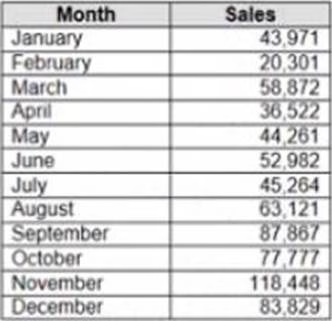

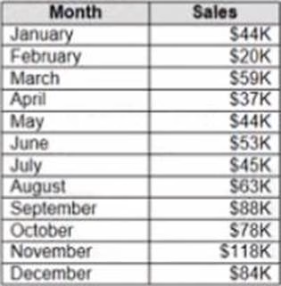

When you use the dataset in a worksheet, you want Sales to appear automatically as shown in the following table.
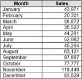
What should you do?
- A . Change the data type of the Sates field to Siring
- B . Create a calculated field that uses a formula of ‘S’ * str (Round((sales],2)) + ‘k’
- C . Change the default number format of the Sales told
- D . Create a calculated field that uses a formula of ‘S’ + stri < (Sales)/1000)).
C
Explanation:
To make Sales appear automatically as shown in the second table, you should change the default number format of the Sales field. The default number format is how Tableau displays a field when you drag it to a worksheet. You can change the default number format by right-clicking on the field and selecting Default Properties > Number Format from the menu. This will open a dialog box where you can choose a category, such as Currency or Percentage, and customize the options, such as decimal places or prefixes.
In this case, you want to change the default number format of Sales to Currency with zero decimal places and a custom prefix of “S”. This will make Sales appear as “S” followed by the rounded value in thousands.
The other options are not correct for this scenario. Changing the data type of Sales to String will not affect how it appears on a worksheet. Creating a calculated field that uses a formula will not change the default number format of Sales, but create a new field that you have to drag to a worksheet.
Converting Sales to Attribute will return only one value for each partition of data, which will not show any variation over time.
Reference:
https://help.tableau.com/current/pro/desktop/en-us/formatting.htm
https://help.tableau.com/current/pro/desktop/en-us/formatting_change_default.htm
You have the following dataset.
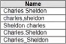

Which grouping option should you use m Tableau Prep to group al five names automatically?
- A . Pronunciation
- B . Spelling
- C . Common Characters
- D . Manual Selection
D
Explanation:
To group all five names automatically, you should use Manual Selection as a grouping option in Tableau Prep. Manual Selection is a feature that allows you to select values from your data and group them together based on your criteria. You can use Manual Selection by clicking on Group Values in Profile pane > Manual Selection from the menu. This will open a dialog box where you can select values from your data and assign them to a group.
In this case, you want to group all five names together based on their spelling variations. You can use Manual Selection by selecting all five values from your data and assigning them to a group named “Harry Potter”. This will create a new field named Grouped Field that contains “Harry Potter” as one value.
The other options are not correct for this scenario. Pronunciation is a feature that groups values based on how they sound, but it may not work well with names or uncommon words. Spelling is a feature that groups values based on common spelling errors or typos, but it may not recognize all variations or synonyms. Common Characters is a feature that groups values based on the number of characters they share, but it may not capture the meaning or context of the values.
Reference:
https://help.tableau.com/current/prep/en-us/prep_group.htm
https://help.tableau.com/current/prep/en-us/prep_group_manual.htm
You have the following dataset.

You plan to create a dashboard that will be filtered to show only data that is relevant to a specific Tableau user based on the Tableau_User_Name field You need to create a boolean calculated field to place on the data source finer.
Which formula should you use for the filter?
- A . NAMEUSERNAME()
- B . ISFULLNAMETableu_USER_NAME))=USERNAME()
- C . NAME Tableau-USER-NAME)
- D . USERNAME()=(Tableau_USER_NAME)
D
Explanation:
To create a boolean calculated field to place on the data source filter, you should use the formula USERNAME() = [Tableau_user]. This formula will return TRUE if the current Tableau user name matches the value in the Tableau_user field, and FALSE otherwise. You can use this formula as a data source filter by dragging it to the Filters shelf and selecting TRUE from the menu. This will filter the data to show only the rows that are relevant to the specific Tableau user.
The other options are not correct for this scenario. NAME([Tableau_user]) is not a valid function in
Tableau. ISFULLNAME([Tableau_user]) = USERNAME() is not a valid expression in Tableau. ‘S’ +
STR([Sales]/1000) is not a boolean expression, but a string expression that converts sales to
thousands with a prefix of “S”.
Reference:
https://help.tableau.com/current/pro/desktop/en-us/filtering_datasource.htm
https://help.tableau.com/current/pro/desktop/en-us/functions_functions_logical.htm#USERNAME
https://help.tableau.com/current/pro/desktop/en-us/calculations_calculatedfields.htm