

Two customers in an organization want to use an app that contains a finance data set. With different analysis objectives, each customer will only use a subset of that data.
Which procedure should the business analyst follow?
- A . Apply Section Access to manage the data for each customer
- B . Create multiple visualizations using set analysis
- C . Duplicate and rename the apps for each customer
- D . Unpivot, then re-associate the data tables for each customer
B
Explanation:
In Qlik Sense, Set Analysis is one of the most powerful tools available to a Business Analyst for managing different subsets of data within the same app. Since both customers are working with the same finance dataset but have different objectives, creating multiple visualizations using set analysis allows the analyst to tailor the data views for each customer without duplicating the app or creating complex data models.
Key Concepts:
Set Analysis: This feature enables the creation of expressions that define subsets of data, allowing you to filter data within specific visualizations. This is ideal when multiple users need different insights from the same underlying dataset.
Flexibility: Using set analysis, you can specify conditions within individual visualizations so that each user can focus on their own segment of the data without impacting others.
Efficiency: This method avoids redundancy by ensuring you only need one app and one data model, instead of duplicating and maintaining multiple apps or applying complex logic such as Section Access.
Why the Other Options Are Less Suitable:
An app needs to load a few hundred rows of data from a .csv text file. The file is the result of a concatenated data dump by multiple divisions across several countries. These divisions use different internal systems and processes, which causes country names to appear differently. For example, the United States of America appears in several places as ‘USA’, ‘U.S.A.’, or ‘US’.
For the country dimension to work properly in the app, the naming of countries must be standardized in the data model.
Which action should the business analyst complete to address this issue?
- A . Create a calculated master dimension expression
- B . Load a lookup table to convert values
- C . Cleanse the source text file prior to loading
- D . Use the Replace option in Data manager
B
Explanation:
In Qlik Sense, when dealing with inconsistent naming conventions across different systems or divisions (like the variation in country names), the best practice is to standardize the data during the loading process. Using a lookup table is the most efficient approach to achieve this. This involves loading a separate table that contains all variations of a country name along with the standardized version. During the load process, Qlik Sense can then map the varying names to a common value. Key Concepts:
Lookup Table: A lookup table contains key-value pairs where different versions of a data element (like country names) are mapped to a single standard value. In this case, the lookup table could have entries like USA, U.S.A., US all mapped to United States of America.
Data Standardization: This is crucial in ensuring consistent analysis across datasets. By converting variations of country names into a single consistent value, the business analyst ensures that all data visualizations and analysis will treat "USA", "US", etc., as the same entity.
Why the Other Options Are Less Suitable:
A business analyst needs to rapidly prototype an application design for a prospective customer. The only dataset provided by the customer contains 30 fields, but has over one billion rows. It will take too long to keep loading in its entirety while the analyst develops the data model.
Which action should the business analyst complete in the Data manager?
- A . Split the dataset and create a normalized star schema of associated tables
- B . Deselect text columns with unique data values to reduce the memory footprint
- C . Use the Filter data option to reduce the number of rows
- D . Truncate text fields longer than 256 characters to create preview fields
C
Explanation:
When working with large datasets, such as the one containing over a billion rows in this scenario, loading the entire dataset can be time-consuming, especially during the development phase. Qlik Sense provides a Filter data option in the Data Manager, which allows business analysts to work with a subset of the data during development. This is particularly useful for rapidly prototyping the application design.
Key Concepts:
Filter Data Option: This feature in Qlik Sense allows the analyst to load a smaller sample of the dataset for analysis and development purposes. By filtering out unnecessary rows, the business analyst can quickly build and prototype the application without waiting for the full dataset to load. Once the design is finalized, the full dataset can be reloaded.
Prototyping with Reduced Data: It’s often more efficient to work with a smaller dataset during the design phase. This allows for faster iterations and design cycles, especially when working with large datasets.
Why the Other Options Are Less Suitable:
A business analyst designs a visualization to analyze a count of products by fixed price ranges. The customer now wants the price ranges to be dynamically modified so they are configurable by the application users. The business analyst modified the dimension axis on the visualization.
Which step should the business analyst complete next?
- A . Define a variable and use it in a variable input object on the sheet
- B . Create a calculated field in Data manager, using the Class() function
- C . Load an independent source file to contain the user-defined boundary values
- D . Create the price range dimension using the Buckets feature in Data manager
A
Explanation:
To make the price ranges dynamically adjustable by the application users, a variable input object is the best approach. The business analyst can define a variable that stores the range value, which users can modify directly through a variable input control. This method allows users to change the price ranges interactively, giving them control over the ranges used in the analysis. Key Concepts:
Variable Input Object: This object allows users to interact with and modify the values of predefined variables directly within a Qlik Sense sheet, which can then be used to adjust calculations dynamically, such as defining custom ranges.
Configurable by Users: This approach gives end-users the flexibility to modify the visualization based on their specific needs without requiring backend changes or reloading the app.
Why the Other Options Are Less Suitable:
B. Create a calculated field in Data manager, using the Class() function: The Class() function is useful for creating static price ranges, but it does not allow for user interaction or dynamic updates to the ranges.
C. Load an independent source file to contain the user-defined boundary values: While this could provide configurable ranges, it’s unnecessarily complex and would require more management, and
it’s not as user-friendly as using a variable.
D. Create the price range dimension using the Buckets feature in Data manager: Similar to the Class() function, this would create static groupings, which wouldn’t be dynamically adjustable by the user.
References for Qlik Sense Business Analyst:
Dynamic Controls with Variables: Qlik Sense provides the ability to create variable input objects that allow users to control how visualizations behave dynamically. This feature is highlighted in Qlik Sense’s Business Analyst best practices when making interactive applications.
By using a variable and a variable input object, the business analyst enables user interactivity and customization, making A the correct choice.
A business analyst needs to create two side-by-side charts for a sales department with the following data:
• Number of orders
• Name of the customer
• Percentage of margin
• Total sales
The charts use a common dimension, but each chart has different measures. The analyst needs to create a color association between the two charts on the dimension values.
Which action should the business analyst take?
- A . Use nested IF statements to set the colors by expression for each dimension value
- B . Define the color values in the master measures and use the color library
- C . Select ‘By Dimension’ and ‘Persistent colors’ in the Colors property panel
- D . Use the Fieldlndex function to set the colors by expression for each dimension value
C
Explanation:
In Qlik Sense, the ‘By Dimension’ and ‘Persistent colors’ options in the Colors property panel ensure that the same dimension values have the same color across multiple charts. This is especially useful when you have two or more side-by-side charts sharing a common dimension, like customer names in this case. Persistent colors guarantee consistency in color assignment, helping users visually track the same dimension across different visualizations. Key Concepts:
By Dimension: This option ensures that each unique value of a dimension (e.g., customer name) gets a distinct color across all charts that use this setting.
Persistent Colors: This feature ensures that the colors remain the same between charts, making the visual comparison across charts easier for the users.
Why the Other Options Are Less Suitable:
A business analyst is creating a data model from several Excel files that contain several hundred thousand rows of data.
The requirements include:
• Users need to drill down to various details within the available data set.
• Several final measures will be repeatedly used. These final measures require combining several fields in a single table.
• User experience and load time is a high priority.
Which action should the business analyst take to meet these requirements?
- A . Aggregate the data to the source period
- B . Develop a master item using the required source fields
- C . Combine the various source fields in a calculated item in the Data manager
- D . Combine the source fields and create additional fields in Excel
B
Explanation:
In Qlik Sense, creating Master Items allows business analysts to define fields, dimensions, and measures that are used consistently across the app. This is particularly important for measures that will be used repeatedly. By defining these as master items, you ensure that all calculations are consistent and optimized for user experience and performance. This approach also supports drill-down capabilities while ensuring a responsive user experience. Key Concepts:
Master Items: Master Items are reusable definitions for dimensions, measures, and visualizations. When you create a measure as a Master Item, it becomes available for use across different visualizations, ensuring consistency and reducing duplication of effort.
User Experience and Load Time: Using Master Items optimizes performance, as Qlik Sense caches the results of these items, reducing the need for recalculating complex measures each time they are used.
Why the Other Options Are Less Suitable:
A project management team uses an app to monitor different projects.
• Projects may have co-dependent tasks and processes
• Some projects include subtasks
The business analyst needs to use a diagram similar to a workflow with the processes and the sub tasks represented as boxes with lines to relate them to each other. The color of the boxes could also be determined by the status of each project or task.
Which visualization should be used?
- A . Sankey chart
- B . Grid chart
- C . Org chart
- D . Network chart
D
Explanation:
A Network chart is the most suitable visualization for representing processes and tasks that have dependencies, such as projects with co-dependent tasks and subtasks. The network chart allows you to visualize relationships between nodes (in this case, tasks and subtasks) and can display them in a structured manner with lines connecting them based on their relationships. The colors of the boxes (or nodes) can be determined by the status of each project or task, which matches the requirements. Key Concepts:
Network Chart: It’s designed for showing interconnections or relationships between various elements. It is ideal when tasks or processes have dependencies or subtasks that need to be visually represented with links between them.
Color Representation: In a Network Chart, you can easily apply colors to nodes based on specific criteria, such as the status of the task, making it easier for users to track project progress at a glance.
Why the Other Options Are Less Suitable:
The sales manager is investigating the relationship between Sales and Margin to determine if this relationship is linear when choosing the dimension Customer or Product Category.
The sales manager wants to have the potential percentage Sales for each Stage (Initial to Won) of the sales process.
Which visualizations will meet these requirements?
- A . Scatter plot: Measures X-axis Sales and Y-axis Margin, Dimensions Customer or Product category Bar chart: Dimension Stage, Measure Sales
- B . Scatter plot: Measures X-axis Sales and Y-axis Margin, Alternative dimensions Customer or Product category Funnel chart: Segments Stage, Width Sales
- C . Combo chart: Measures Sales and Margin, Dimensions Customer or Product category Pie chart: Dimension Stage, Measure Sales
- D . Distribution plot: Alternative measures Sales and Margin, Alternatives dimensions Customer or Product category Bar chart: Dimension Stage, Measure Sales
B
Explanation:
For analyzing the relationship between Sales and Margin, a scatter plot is ideal, as it allows you to visualize the relationship between two measures (Sales and Margin) across various dimensions such as Customer or Product Category. The funnel chart is perfect for visualizing stages in a sales process, as it shows how sales progress from the initial stage to the final (Won) stage, with the width of each segment representing the total sales for each stage.
Key Concepts:
Scatter Plot: This type of chart is specifically designed to visualize the correlation or relationship between two measures, making it ideal for analyzing Sales versus Margin across different dimensions.
Funnel Chart: This chart is particularly suited for visualizing the sales stages, as it visually demonstrates the proportion of sales moving through each stage of the sales funnel.
Why the Other Options Are Less Suitable:
A business analyst is creating an app for the sales team.
The app must meet several requirements:
• Compare 10 top-performing sales representatives and the amount of sales for each
• Investigate margin percentage and total sales by each product category
• View distribution of sales amount
Which visualizations should be used for this app?
- A . A bar chart, scatter plot, and histogram
- B . A treemap, container, and distribution plot
- C . A bar chart, line chart, and scatter plot
- D . A treemap, box plot, and histogram
A
Explanation:
For this scenario, using a bar chart, scatter plot, and histogram provides the best coverage of the requirements. The bar chart is ideal for comparing the sales performance of the top 10 sales representatives. The scatter plot is used to analyze the relationship between margin percentage and total sales by product category. The histogram is excellent for visualizing the distribution of sales amounts.
Key Concepts:
Bar Chart: Perfect for comparing categorical data, such as sales amounts across different sales representatives.
Scatter Plot: Ideal for exploring relationships between two variables, such as margin percentage and total sales.
Histogram: Provides a clear visualization of the distribution of a continuous variable, such as sales amounts.
Why the Other Options Are Less Suitable:
B. Treemap, Container, and Distribution plot: A treemap is less effective for comparing individual sales reps, and a container does not provide a clear visualization on its own.
C. Bar chart, Line chart, and Scatter plot: A line chart is not needed in this case, as it is best for showing trends over time, which is not required here.
D. Treemap, Box plot, and Histogram: A box plot is more suited for showing statistical distributions (e.g., quartiles), which is unnecessary in this case. References for Qlik Sense Business Analyst:
Data Exploration: Bar charts, scatter plots, and histograms are among the most commonly recommended visualizations for comparing performance, analyzing relationships, and viewing distributions in Qlik Sense.
Thus, the combination of a bar chart, scatter plot, and histogram offers the most comprehensive
solution, making A the correct answer.
The VP of Finance is requesting a presentable solution that allows them to share finance information in monthly meetings with C-suite executives. Given the monthly meeting agendas, the solution must be customizable.
Which Qlik Sense feature should be implemented to meet this requirement?
- A . Storytelling
- B . Insight Advisor Chat
- C . Action Buttons
- D . Bookmarks
A
Explanation:
Storytelling in Qlik Sense allows business users to create dynamic presentations based on data insights. This feature is ideal for executives like the VP of Finance who need to share financial insights in meetings. Storytelling allows users to create guided stories from data visualizations, offering a customizable solution that can be tailored to the monthly meeting agendas. Key Concepts:
Storytelling: This feature enables users to create data-driven stories with snapshots from Qlik Sense visualizations, allowing for dynamic, customized presentations that can be updated as data changes. Customizable: The VP of Finance can customize the presentation each month to focus on relevant financial metrics and insights.
Why the Other Options Are Less Suitable:
B. Insight Advisor Chat: While helpful for querying data interactively, this option is not suited for presenting data in a structured, presentable format to executives.
C. Action Buttons: Action buttons are used for navigating or interacting within apps, but they are not relevant for creating presentations.
D. Bookmarks: Bookmarks save specific selections, but they don’t provide the dynamic, presentable format needed for meetings.
References for Qlik Sense Business Analyst:
Storytelling in Qlik Sense: This feature is often recommended for creating interactive, data-driven presentations, especially for executive-level meetings.
Thus, Storytelling offers the most effective solution for presenting financial data in a customizable format, making A the correct answer.
Refer to the exhibit.
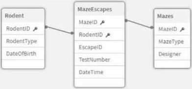

An app that will track experiments for rodents (e.g., rats and mice) that navigate mazes (labyrinths) is being developed. Individual rodents are catalogued in the Rodent table, while the Mazes table has metadata for the mazes. The MazeEscapes table holds a record of each attempt at a maze by a rodent. A business analyst needs to build a KPI that will allow users to see how many rodents have made at least one attempt at any maze.
How should the analyst construct the KPI?
- A . • Create RodentlD AS RodentID_Counter in the MazeEscapes table.
• Use Count (Distinct RodentlD Counter) as the KPI expression. - B . • Create 1 AS RodentID_Counter in the Rodent table.
• Use Sum (RodentlD Counter) as the KPI expression. - C . Create 1 AS RodentID_Counter in the MazeEscapes table.
• Use Sum (RodentlD Counter) as the KPI expression. - D . • Create RodentlD AS RodentlD Counter in the Rodent table.
• Use Count (Distinct RodentID Counter) as the KPI expression.
A
Explanation:
In this case, we need to count how many unique rodents have made at least one attempt at any maze. Since the relationship between the Rodent table and the MazeEscapes table is a one-to-many relationship (each rodent may attempt several mazes), the best approach is to base the calculation on the MazeEscapes table, as it holds the actual records of rodent attempts.
By creating a new field RodentID_Counter in the MazeEscapes table, the analyst ensures that each rodent’s attempt is captured. Using the Count (Distinct RodentID_Counter) as the KPI expression then accurately counts each unique rodent that has made at least one attempt, without counting multiple attempts by the same rodent.
Key Concepts:
Distinct Count: The distinct count ensures that rodents who have made multiple maze attempts are only counted once.
MazeEscapes Table: This table holds the records of each attempt, making it the correct source for this KPI.
Why the Other Options Are Less Suitable:
B. Sum (RodentID_Counter) in the Rodent table: This would incorrectly sum the number of rodents rather than counting unique attempts, leading to inaccurate results.
C. Sum (RodentID_Counter) in the MazeEscapes table: Summing the counter would not account for the distinct rodents, leading to incorrect counting.
D. RodentID_Counter in the Rodent table: This would not correctly reflect the rodents that have made an attempt, as not every rodent in the Rodent table may have attempted a maze. References for Qlik Sense Business Analyst:
Distinct Count in KPI: It is best practice to use Count(Distinct …) when working with KPIs that require unique counts, such as counting distinct rodents in this scenario.
Thus, A is the verified answer because it ensures that each rodent is counted once, based on their attempts in the MazeEscapes table.
A business analyst needs to create a visualization that compares two measures over time using a continuous scale that includes a range. The measures will be Profit and Revenue.
Which visualization should the business analyst use?
- A . Line chart
- B . Bullet chart
- C . Bar chart
- D . Scatter plot
A
Explanation:
A line chart is the most appropriate visualization for comparing two continuous measures (Profit and Revenue) over time. Line charts are designed to show trends and patterns over a continuous scale (such as time), making it ideal for this scenario where we need to observe how both Profit and Revenue vary across a period.
Key Concepts:
Continuous Scale: Line charts are specifically suited for continuous data like time, making them the preferred choice when tracking changes over time for multiple measures.
Dual Measure Comparison: A line chart allows you to plot two measures on the same axis, making it easy to compare their trends over the same period.
Why the Other Options Are Less Suitable:
B. Bullet chart: A bullet chart is used to compare a single measure against a target, not for tracking two measures over time.
C. Bar chart: Bar charts are better suited for comparing categorical data, not continuous measures over time.
D. Scatter plot: Scatter plots are used to compare relationships between two measures but are not
suited for continuous time-based comparisons.
References for Qlik Sense Business Analyst:
Line Charts for Time Series Data: Line charts are the recommended visualization for comparing multiple measures over time in Qlik Sense, especially when working with continuous data like Profit and Revenue.
Thus, the line chart is the best choice for this scenario, making A the correct answer.
The VP of Sales asks a business analyst to include a KPI object on the sales dashboard that shows total sales value for the year 2022, regardless of selections. Existing fields in the data model include Sales and Year.
How should the business analyst write the measure for the KPI object?
- A . Sum ({ < year="|" ‘2022,="" }="" /> } Sales)
- B . Sum ({ $ < year="{" ‘2022*="" )="" /> } Sales)
- C . Sum ({ 1 < year="{" ‘2022’="" )="M /> ) Sales)
- D . Sum (1 { < year="(" ‘2022’="" )="" /> ) Sales)
C
Explanation:
In this scenario, the VP of Sales wants to see the total sales for the year 2022 regardless of selections. This requirement is best handled using Set Analysis in Qlik Sense. The key to achieving this is using the set identifier 1, which ignores the user’s selections and ensures the calculation is based on the entire dataset. The expression Sum( { 1 < year = { ‘2022’ } > } Sales) calculates the sum of sales for the year 2022, irrespective of any other selections made in the app.
Key Concepts:
Set Identifier 1: This identifier ensures that the calculation is performed on the entire dataset, ignoring any selections or filters applied by the user.
Year Filtering: The expression < year = { ‘2022’ } > ensures that only sales from the year 2022 are included in the calculation.
Why the Other Options Are Less Suitable:
A banking organization needs a dashboard that shows the following:
• A KPI indicator for current year (CY) versus last year (LY) revenue
• A scatter plot that shows the cost versus revenue of product categories
• A treemap that shows average customer satisfaction rating based on regions
• A table that shows CY cost by record number, financial instrument, and bank
In addition to the customer satisfaction rating, which fields should be used to create the required measures?
- A . CY Revenue, LY Revenue, CY Cost
- B . CY Revenue, LY Revenue, Cost
- C . Revenue and Cost
- D . Revenue and CY Cost
A
Explanation:
The banking dashboard requires several KPIs and visualizations based on current year (CY) and last year (LY) revenue, as well as cost and customer satisfaction. To build the required measures, the fields CY Revenue, LY Revenue, and CY Cost are necessary because they provide the comparison between the current and previous year, as well as cost-related data for the specific calculations. Key Concepts:
KPI for CY vs LY Revenue: This requires both CY Revenue and LY Revenue fields.
Scatter Plot for Cost vs Revenue: This comparison requires both CY Revenue and CY Cost to create the necessary relationship in the scatter plot.
Treemap for Customer Satisfaction: In addition to the customer satisfaction rating, the field CY Revenue would likely be used for additional insights by region.
Table with CY Cost: The table requires CY Cost data along with other relevant fields like record number, financial instrument, and bank.
Why the Other Options Are Less Suitable:
B. CY Revenue, LY Revenue, Cost: While this covers the revenue fields, it does not specifically include CY Cost, which is needed for the table and scatter plot.
C. Revenue and Cost: This option is too general and does not distinguish between current year and last year revenue, which is essential for the KPI.
D. Revenue and CY Cost: This does not include LY Revenue, which is required for the KPI.
References for Qlik Sense Business Analyst:
Comparison Measures in Qlik Sense: In Qlik Sense, comparisons across time periods like CY and LY require specific fields to calculate accurate insights, and it’s essential to ensure the appropriate fields are included for each visualization.
Thus, A provides the correct set of fields for the required dashboard, making it the verified answer.
A data analyst is working on a new Qlik Sense application and realizes that some of the required data sources have already been used in previous applications. To streamline the data loading process and maintain consistency, the analyst decides to leverage existing data connections.
What actions should the analyst take to utilize the pre-existing data connections in Qlik Sense?
- A . Copy the script from the old application and paste it into the new application’s script editor
- B . Access the Data load editor and select the desired data connection from the list of available connections
- C . Export the data connection from the old application and import it into the new one
- D . Use a Qlik Sense extension to search and replicate data connections from other applications
B
Explanation:
In Qlik Sense, data connections are reusable objects that allow multiple apps to connect to the same data sources. To leverage existing connections, the business analyst should go to the Data Load Editor and select the desired connection from the list of available connections. This ensures that the analyst uses the same data sources, promoting consistency across apps.
Key Concepts:
Data Connections: Qlik Sense allows users to create and manage connections to external data sources. These connections can be reused across multiple applications.
Data Load Editor: This is where existing data connections can be accessed and used in new applications, streamlining the data loading process.
Why the Other Options Are Less Suitable: